High-Contrast Display Serif

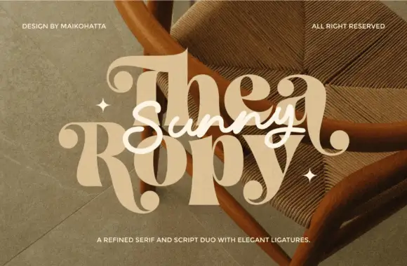
Harvest Autumn + Evoire
Pairs sculptural editorial warmth with Harvest Autumn's clean modern geometry.
Inspect Evoire specimenDisclosure: MakerFileHub may earn a commission from qualifying purchases via paid links on this page. How our links work.
Rounded informal mixed case with long t feet and open curved shoulders
Harvest Autumn sets a fat rounded sans in warm brown on cream, its strokes an even monoline, its terminals fully rounded and its bowls wide enough that the word looks cut from clay.
Paid link
Get this fontProject & layout blueprintsAt-a-glance maker compatibility
Sturdy stroke walls and open counters weed cleanly on adhesive vinyl, HTV apparel film, and cut cardstock.
Visual anatomy & craft review
Harvest over Autumn fills the card with soft curves, the r and the t keeping short arms and the h and the n opening broad arches. Every stroke carries the same weight, so nothing in the word feels faster or slower than the rest, and the corners are softened until the letters look pressed rather than drawn. Two banner ribbons sit above and below, one naming the release and one the style, in the same warm palette. It is a friendly display sans that gives a page warmth without a script, and its limit is subtlety: at small sizes the round shapes and the even weight make it read as a generic rounded face.
Rounded informal mixed case with long t feet and open curved shoulders
Two-font hierarchy recipes
Tested contrast partners — pairing Harvest Autumn with grounded secondary typography.
Harvest Autumn + Evoire
Pairs sculptural editorial warmth with Harvest Autumn's clean modern geometry.
Inspect Evoire specimen
Harvest Autumn + Simple Alphabet
Introduces organic movement on pull-quotes, signatures and gift tags.
Inspect Simple Alphabet specimenPractical applications
Concrete hierarchy, scale and production guidance tailored to Harvest Autumn’s stroke geometry.
The warm rounded letterforms feel seasonal without a leaf or a gourd, and the fat strokes read on a board seen from a car park.
Hierarchy & layout recipe
Print a 900 by 400 mm board: set the patch name at 110 mm on one row, keep 34 mm of clear ground beneath before the opening hours at 20 mm, and keep 38 mm of border so the rounded ends stay inside the frame.
Pre-production check
Warm brown ink shifts on a dark board; check a painted sample before the sign is finished.
The soft letters suit a community meal better than a formal serif, and the short greeting stays warm on a folded card at place setting size.
Hierarchy & layout recipe
Print a 105 by 148 mm card: set the greeting at 28 pt across one row, keep 16 mm of clear ground beneath before the time at 10 pt, and keep 14 mm of margin on each side of the fold.
Pre-production check
Rounded strokes print thicker than they look on screen; check the proof before the card batch.
The friendly weight reads as homemade rather than industrial, and a short product name fits the wide bowls on a small jar label.
Hierarchy & layout recipe
Print a 55 by 85 mm jar label: set the product at 18 pt on one row, keep 9 mm of clear ground beneath before the weight at 6 pt, and keep 6 mm to the die edge so no bowl is trimmed.
Pre-production check
The rounded ends gain weight in print; check a label proof before the preserve run. Print a sample and re-check it at final size.
Technical & licence verification
Confirm included OTF/TTF/WOFF formats, full glyph tables and licence coverage on the live store page before batch production.
Closest visual alternatives
Matched across letterform anatomy, stroke behaviour and craft applications.
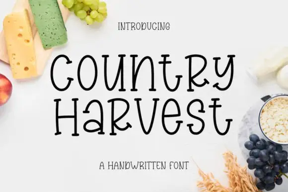
Tall hand-drawn mixed case with small feet and uneven crossbars
Country Harvest shows black two-line lettering on a white food-styled cover. Tall slim bodies mix upper- and lowercase shapes, including a narrow rounded o, an open curved y and a wide crossbar on the t, while the lower line sets a small rounded a beside a prominent capital-like R.
Ideas for this font
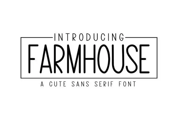
Tall light capitals with long oval O bowls and narrow straight diagonal joins
Farmhouse Blackcraft draws a tall skinny sans by hand, keeps the strokes slightly uneven and the letters narrow, and sets the word in black inside a thin ruled frame.
Ideas for this font
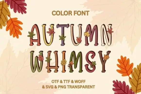
Slim uneven serif capitals with little leaves across muted fills
Autumn Whimsy sets slender rounded colour capitals in a warm autumn palette — mustard, plum, olive, cream — and grows small oak and maple leaves out of the top of each letter.
Ideas for this font
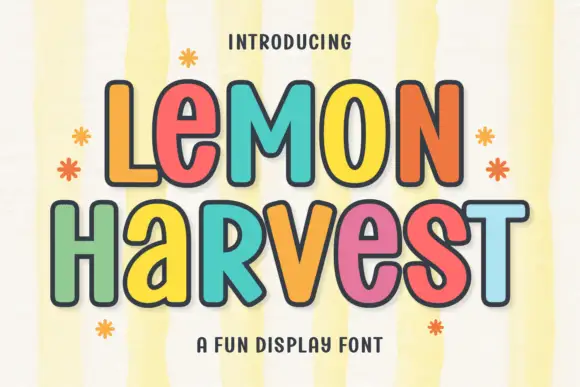
Multicolour playful caps
Lemon Harvest is a multicolour playful display in five warm colours with a dark outline on a pale striped ground: rounded caps with even strokes, a slight bounce, small flower and sparkle ornaments around the block, and a tracked caption beneath in a rounded sans.
Ideas for this font
Same independent foundry
Allow optional Google Analytics to measure visits and catalogue actions. Your search words and notes are not included. Privacy & storage