Editorial Serif Anchor

Thanksgiving + Things
Anchors Thanksgiving's fluid strokes with crisp Roman proportions on wedding suites, headers and packaging.
Inspect Things specimenDisclosure: MakerFileHub may earn a commission from qualifying purchases via paid links on this page. How our links work.
Tall quirky creative display
Thanksgiving is a tall creative display in near-black on a pale wood ground: narrow letters with curled details on the T and the G, small inward flicks on the stems, and an uneven but upright rhythm, with autumn leaves at the edges, so the pair reads as a modern seasonal card.
Paid link
Get this fontProject & layout blueprintsAt-a-glance maker compatibility
Weld or Unite overlapping script joins into one continuous vector path before sending to the blade.
Visual anatomy & craft review
The word is set once, wide, and the drawing is a tall display with small drawn gestures: the crossbar of the T curls at both ends, the G carries an inward hook, and the stems waver by a hair, which keeps the face from reading as a plain condensed sans. The rhythm is slightly uneven, so the word looks set by hand, and the narrow width lets a long word fill the frame without a second line. The counters are open, which is what keeps a tall light face readable at banner size. The ground is a pale wood photograph with soft leaves at the corners, and the captions above and below are tracked caps in a small grotesque, so the display is the only drawn element on the page.
Quirky, tall, creative, modern
Two-font hierarchy recipes
Tested contrast partners — pairing Thanksgiving with grounded secondary typography.
Thanksgiving + Things
Anchors Thanksgiving's fluid strokes with crisp Roman proportions on wedding suites, headers and packaging.
Inspect Things specimen
Thanksgiving + Nyxar
Keeps small-scale dates, URLs, nutrition facts and care instructions crisp and legible below script titles.
Inspect Nyxar specimenPractical applications
Concrete hierarchy, scale and production guidance tailored to Thanksgiving’s stroke geometry.
A tall quirky display reads as a modern seasonal invitation rather than a traditional serif card, and the open counters keep a long word readable at card size.
Hierarchy & layout recipe
A6 card: the greeting at 30 pt, the details in a 9 pt sans, and a leaf at the head. Keep 12 mm margins and print one ink on a cream card so the curled details stay crisp at home-print resolution.
Pre-production check
Check the 30 pt greeting on a home printer, where a small flick can disappear; keep the details above 0.5 mm. Confirm the 9 pt details keep a 4.5:1 contrast and that the leaf clears the trim.
A tall narrow display fits a long flavour name on a small jar label, and the quirky details make a seasonal batch look designed rather than generic.
Hierarchy & layout recipe
Print a 60 by 80 mm label: the preserve at 15 pt, the weight in a 6 pt sans, and the date at 5 pt. Keep 4 mm inside the die and print one ink on an uncoated stock so the thin strokes read as printed.
Pre-production check
Check the 15 pt preserve on uncoated stock, where a hairline stem can fade; keep the size above 12 pt. Confirm the 5 pt date reads on the jar and that the label survives a chill cabinet.
A creative display looks seasonal without a photograph, and the tall letters fit a long event name across an A4 where a wide face would wrap to three lines.
Hierarchy & layout recipe
A4 print: the headline at 46 mm, the stalls in a 10 mm sans, and the times in 12 mm. Keep 20 mm margins and print one colour on coloured paper so the notice stands out among plain sheets.
Pre-production check
Check the A4 at two metres, where a thin stem can thin out behind glass; keep the ink solid. Confirm the 10 mm stalls read at arm's length and that the headline fits without wrapping.
Technical & licence verification
Confirm included OTF/TTF/WOFF formats, full glyph tables and licence coverage on the live store page before batch production.
Closest visual alternatives
Matched across letterform anatomy, stroke behaviour and craft applications.
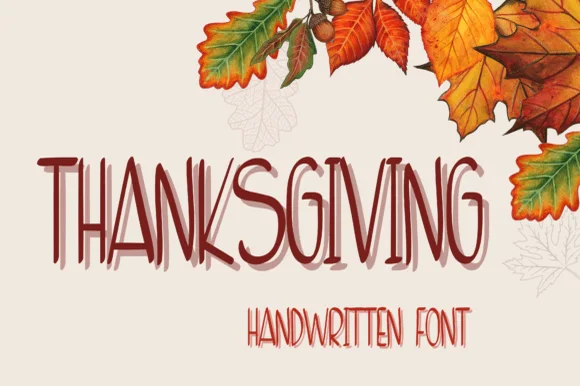
Tall layered handwriting
Thanksgiving is a tall handwriting face in dark red on cream: narrow letters drawn with a light pen, a second offset layer behind each word in a paler tone, and a smaller companion line beneath, framed by watercolour autumn leaves, so the pair reads as a hand-written seasonal card.
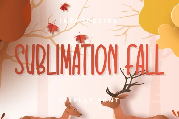
Tall skinny farmhouse handwritten print sans
Sublimation Fall is a tall, slender farmhouse handwritten print font (zero leaves attached—usable all year!) channeling classic pottery-mug minimalism.
Ideas for this font
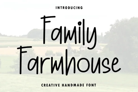
Tall condensed hand-printed farmhouse marker font
Family Farmhouse is a tall, narrow hand-printed marker typeface with long vertical stems, gently bounced baselines, and clean print legibility.
Ideas for this font
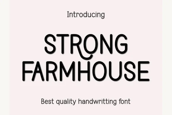
Tall rounded handwritten caps
Strong Farmhouse is a tall handwritten face in black on white: narrow rounded capitals with a slight forward lean, a quirky R whose leg curls into a swash, and uneven letter heights that keep the pair of words from reading as a constructed sans.
Ideas for this font
Same independent foundry
Allow optional Google Analytics to measure visits and catalogue actions. Your search words and notes are not included. Privacy & storage