Editorial Serif Anchor

Strong Farmhouse + Alerigue
Anchors Strong Farmhouse's fluid strokes with crisp Roman proportions on wedding suites, headers and packaging.
Inspect Alerigue specimenDisclosure: MakerFileHub may earn a commission from qualifying purchases via paid links on this page. How our links work.
Tall rounded handwritten caps
Strong Farmhouse is a tall handwritten face in black on white: narrow rounded capitals with a slight forward lean, a quirky R whose leg curls into a swash, and uneven letter heights that keep the pair of words from reading as a constructed sans.
Paid link
Get this fontProject & layout blueprintsAt-a-glance maker compatibility
Weld or Unite overlapping script joins into one continuous vector path before sending to the blade.
Visual anatomy & craft review
The two words are stacked and the drawing is a quick hand with a fine marker: the stems are tall and narrow, the shoulders of the R and the M are rounded, and the R's leg is dragged into a small curl that swings under the following letter. Heights drift from letter to letter, and the S sits slightly higher than its neighbours, which is what gives the line its written feel. The stroke weight is constant, so the face holds at small sizes, and the counters are open enough that the narrow letters never close. The ground is plain white with a single line of copy above and below set in a rounded grotesque, which is the honest way to present a display hand that is meant to be paired with a plain text face rather than used as one.
Handwritten, tall, rounded, casual
Two-font hierarchy recipes
Tested contrast partners — pairing Strong Farmhouse with grounded secondary typography.
Strong Farmhouse + Alerigue
Anchors Strong Farmhouse's fluid strokes with crisp Roman proportions on wedding suites, headers and packaging.
Inspect Alerigue specimen
Strong Farmhouse + Prime Nordic
Keeps small-scale dates, URLs, nutrition facts and care instructions crisp and legible below script titles.
Inspect Prime Nordic specimenPractical applications
Concrete hierarchy, scale and production guidance tailored to Strong Farmhouse’s stroke geometry.
A tall handwritten face reads as a hand-painted sign, and the narrow letterforms let a long nursery name fit a board without losing height.
Hierarchy & layout recipe
Print 800 by 500 mm: the name at 150 mm cap height in two lines, the opening hours in a 30 mm grotesque, and a hand-drawn rule beneath. Keep 35 mm between the display and the hours so the curled leg of the R never touches the smaller line.
Pre-production check
Check the R's swash at full size, where the curl can collide with the following letter; open the spacing for that pair. Confirm the 30 mm hours read from six metres and that the rule sits clear of the descenders.
A handwritten face gives a baking mix the look of a kitchen label, and the tall narrow letters let a long product name fit a small carton face.
Hierarchy & layout recipe
Print a 70 by 100 mm carton face: the name at 18 pt, the flavour in a 7 pt grotesque, and the weight in 6.5 pt. Keep 6 mm of clear space around the word and print one ink on a pale board so the hand reads as pen.
Pre-production check
Check the 18 pt name on the carton board, where the narrow counters can fill; increase the stroke contrast by choosing a smoother stock. Confirm the 6.5 pt weight reads on the shelf and that the name stays on one line.
A handwritten face signals a welcoming classroom rather than an administrative office, and the tall letters stay readable from the end of a corridor.
Hierarchy & layout recipe
Print an A4 sign: the teacher's name at 60 mm cap height, the room number at 30 mm, and a small rule between. Keep 20 mm margins and print one ink on a light card so the narrow letters have contrast.
Pre-production check
Check the sign at three metres, where a thin handwritten stroke can fade on a pale card; use a dark ink. Confirm the 30 mm room number reads from down the corridor and that the sign sits flat without glare.
Technical & licence verification
Confirm included OTF/TTF/WOFF formats, full glyph tables and licence coverage on the live store page before batch production.
Closest visual alternatives
Matched across letterform anatomy, stroke behaviour and craft applications.
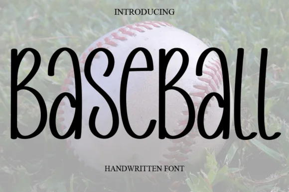
Tall skinny mixed-case farmhouse marker print
Baseball (by salma studio) is actually a tall, skinny rounded marker handwritten font—great for farmhouse crafts rather than blocky varsity jerseys!
Ideas for this font
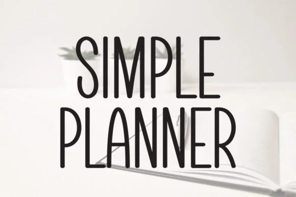
Tall skinny minimalist monoline planner caps & sans
Simple Planner is a tall, slender minimalist handwritten sans packing long headings neatly into narrow planner columns and spine labels.
Ideas for this font

Tall condensed farmhouse marker display sans (NOT a script!)
Bakery Shop is actually a tall, condensed marker print display font (zero connected cursive!) built for farmhouse canisters and chalkboard menus!
Ideas for this font
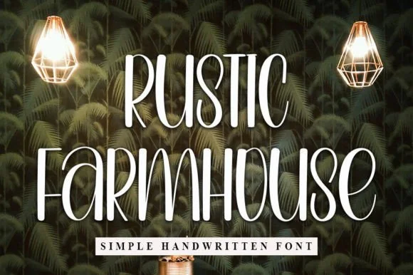
Tall skinny print with a high waist
Rustic Farmhouse is a tall skinny handwritten print in white over dark palm wallpaper: condensed capitals with a high waist, a fine even stroke and a slight lean, shown with two pendants lamps lighting the wall behind.
Same independent foundry
Allow optional Google Analytics to measure visits and catalogue actions. Your search words and notes are not included. Privacy & storage