Editorial Serif Anchor

Tacky Journal + Askinо
Anchors Tacky Journal's fluid strokes with crisp Roman proportions on wedding suites, headers and packaging.
Inspect Askinо specimenDisclosure: MakerFileHub may earn a commission from qualifying purchases via paid links on this page. How our links work.
Messy handwriting family
Tacky Journal is a messy handwriting family in black on a photographed notepad: three weights from light to bold, narrow letters with uneven baselines, tall ascenders and blunt terminals, with small arrows naming each weight in orange and a note about the natural-look features beneath.
Paid link
Get this fontProject & layout blueprintsAt-a-glance maker compatibility
Weld or Unite overlapping script joins into one continuous vector path before sending to the blade.
Visual anatomy & craft review
The plate stages the family on a lined notepad, which is the honest context for a handwriting face sold for journalling: the text sits on a ruled line and the drift between the letters is visible against the rule. The drawing is a narrow hand with a bouncing baseline and uneven spacing, so a paragraph reads as written rather than set, and the three weights let a page carry a heading and a note in the same hand. Because the stroke varies by weight, the family covers small annotated text as well as larger headings, which is unusual for a handwriting face and worth demonstrating. The orange arrows and the small labels are part of the product sheet, and the photograph of a bed and a floor of belongings is deliberately casual.
Handwritten, messy, casual, natural
Two-font hierarchy recipes
Tested contrast partners — pairing Tacky Journal with grounded secondary typography.
Tacky Journal + Askinо
Anchors Tacky Journal's fluid strokes with crisp Roman proportions on wedding suites, headers and packaging.
Inspect Askinо specimen
Tacky Journal + Modern Heritage
Keeps small-scale dates, URLs, nutrition facts and care instructions crisp and legible below script titles.
Inspect Modern Heritage specimenPractical applications
Concrete hierarchy, scale and production guidance tailored to Tacky Journal’s stroke geometry.
A messy handwriting family reads as a personal note, and the three weights cover both a label headline and the small print on the same sheet.
Hierarchy & layout recipe
Print a 60 by 80 mm label: the product in the bold at 15 pt, the detail in the regular at 8 pt, and the price at 7 pt. Keep 4 mm inside the die and print one ink on a cream stock so the uneven strokes read as pen.
Pre-production check
Check the 8 pt detail on cream, where a light weight can fade; use the regular or bold. Confirm the 7 pt price reads on the shelf and that the label sits flat on a jar.
A handwriting face gives a worksheet a personal, modelled hand that children can imitate, and the three weights let a teacher build a heading and example lines from one family.
Hierarchy & layout recipe
A4 worksheet: the title in the bold at 18 pt, the example lines in the regular at 12 pt with 20 pt leading, and the instructions in a 9 pt sans. Keep 20 mm margins and print one colour on white.
Pre-production check
Check the 12 pt examples on white, where a light weight can thin out after photocopying; use the regular. Confirm the 9 pt instructions read at arm's length and that the ruled space matches the leading.
A messy hand reads as a note tucked into a parcel, and the bold weight holds at card size while the light weight suits a longer message.
Hierarchy & layout recipe
A6 folded card: the greeting in the bold at 24 pt, the message in the light at 10 pt with 15 pt leading, and a small heart. Keep 14 mm margins and print one ink on a cream card.
Pre-production check
Check the 10 pt light message at table distance, where a thin stroke can grey out; switch to the regular. Confirm the 24 pt greeting reads across the table and that the card folds without cracking the ink.
Technical & licence verification
Confirm included OTF/TTF/WOFF formats, full glyph tables and licence coverage on the live store page before batch production.
Closest visual alternatives
Matched across letterform anatomy, stroke behaviour and craft applications.
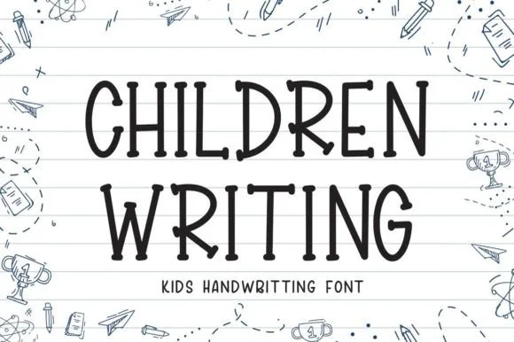
Neat elementary notebook-lined classroom print
Children Writing is a tidy, cheerful uppercase/print handwritten font with soft marker-dot terminals built for school and kid crafts.
Ideas for this font
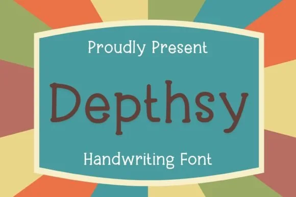
Neat rounded monoline classroom & journal print sans (NOT a serif!)
Depthsy is actually a clean, friendly monoline handwritten print sans (zero typewriter serifs despite seller copy!) built for everyday legibility.
Ideas for this font
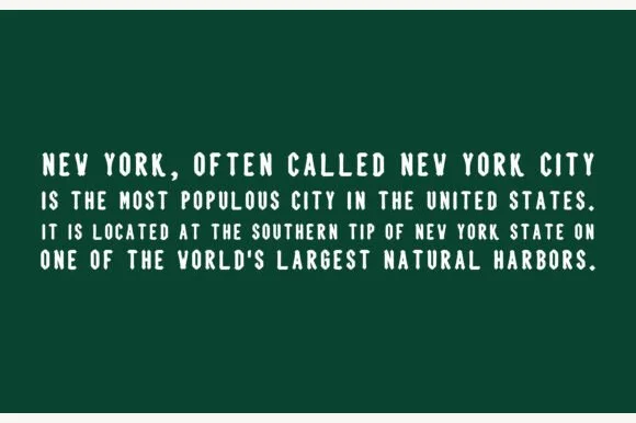
Clean condensed handwritten rounded sans (ZERO Gothic blackletter!)
Blackletter (by ABC Font) is actually a super-clean, friendly condensed handwritten print sans—ZERO Gothic blackletter or serif strokes despite its bizarre title!
Ideas for this font
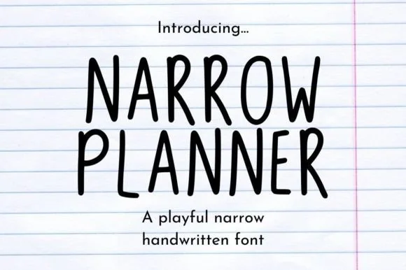
Narrow handwritten caps
Narrow Planner is a narrow handwritten face in black on ruled paper: tall condensed capitals drawn with a wobbly monoline stroke, uneven letter heights, and a lowercase that reads as the same hand at a normal width.
Ideas for this font
Same independent foundry
Allow optional Google Analytics to measure visits and catalogue actions. Your search words and notes are not included. Privacy & storage