Editorial Serif Anchor

Narrow Planner + The Avenue Editorial
Anchors Narrow Planner's fluid strokes with crisp Roman proportions on wedding suites, headers and packaging.
Inspect The Avenue Editorial specimenDisclosure: MakerFileHub may earn a commission from qualifying purchases via paid links on this page. How our links work.
Narrow handwritten caps
Narrow Planner is a narrow handwritten face in black on ruled paper: tall condensed capitals drawn with a wobbly monoline stroke, uneven letter heights, and a lowercase that reads as the same hand at a normal width.
Paid link
Get this fontProject & layout blueprintsAt-a-glance maker compatibility
Weld or Unite overlapping script joins into one continuous vector path before sending to the blade.
Visual anatomy & craft review
The two words are stacked and the drawing is a quick hand with a fine pen: the stems are narrow and the letters are tall, which lets a long word fit a notebook width, and the heights drift by a millimetre so the line looks written rather than set. The stroke weight is constant, the terminals are rounded, and the letters carry a slight forward lean that reads as speed. The counters stay open because the stroke is thin, so the face holds at the small sizes a planner uses. The ground is ruled notebook paper with a margin line, and the caption beneath is set in the same hand at a smaller size, which is exactly the context the face was drawn for.
Narrow, handwritten, playful, casual
Two-font hierarchy recipes
Tested contrast partners — pairing Narrow Planner with grounded secondary typography.
Narrow Planner + The Avenue Editorial
Anchors Narrow Planner's fluid strokes with crisp Roman proportions on wedding suites, headers and packaging.
Inspect The Avenue Editorial specimen
Narrow Planner + Limited Coffee
Keeps small-scale dates, URLs, nutrition facts and care instructions crisp and legible below script titles.
Inspect Limited Coffee specimenPractical applications
Concrete hierarchy, scale and production guidance tailored to Narrow Planner’s stroke geometry.
A narrow handwriting face fits long subject names into a planner column, and the thin stroke stays legible at the small sizes a timetable uses.
Hierarchy & layout recipe
Print A5 planner pages: the headings at 16 pt, the subject lines at 9 pt, and the days at 7 pt in the same hand. Keep the type within the ruled columns and leave 3 mm between the written line and the rule.
Pre-production check
Check the 9 pt subject lines on the printed page, where the thin stroke can fade on a home printer; print at high quality. Confirm the 7 pt day labels read at arm's length and that no letter sits on a printed rule.
A handwriting face gives a stationery label the look of a notebook page, and the narrow width lets a long product name fit a slim wrap label.
Hierarchy & layout recipe
Print a 40 by 90 mm label: the brand at 15 pt, the product at 11 pt, and the size at 7 pt. Keep the label to one ink on a cream stock so the writing reads as pen rather than as a graphic device.
Pre-production check
Check the 11 pt product name on the wrap label, where the narrow letters can crowd; open the tracking slightly at that size. Confirm the 7 pt size reads at arm's length and that the label wraps without creasing across the type.
A handwriting line gives a feature about study habits the tone of a note in the margin, and the narrow capitals fit a short quote into a tight column.
Hierarchy & layout recipe
Set the quote at 30 pt in a 55 mm column, the attribution in an 8 pt sans beneath at 6 mm, and a 0.5 pt rule above. Keep the quote to three lines and set it on a plain field rather than in a tinted box.
Pre-production check
Check the quote at 30 pt in the narrow column, where a long word can overrun the measure; break the line by hand rather than tracking it. Confirm the 8 pt attribution keeps a 4.5:1 contrast and that the rule clears the tallest letter by 8 mm.
Technical & licence verification
Confirm included OTF/TTF/WOFF formats, full glyph tables and licence coverage on the live store page before batch production.
Closest visual alternatives
Matched across letterform anatomy, stroke behaviour and craft applications.
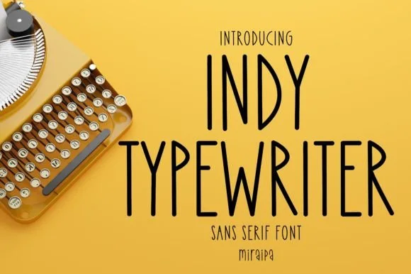
Tall condensed handwritten monoline sans serif (NOT a serif typewriter!)
Indy Typewriter is actually a tall, friendly monoline handwritten sans serif—zero serifs or mechanical slabs despite the 'Typewriter' name!
Ideas for this font
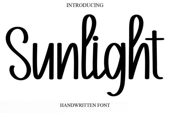
Tall condensed bouncy upright marker font
Sunlight is a tall, clean upright marker handwritten font with rounded loops and semi-connected farmhouse bounce.
Ideas for this font
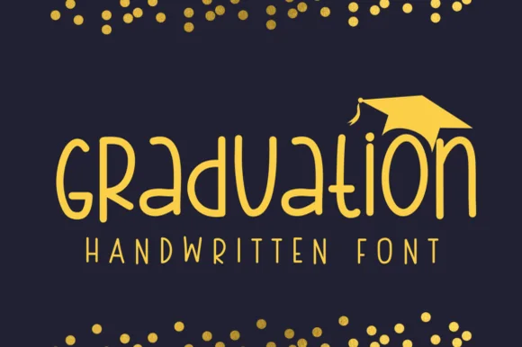
Geometric circular-bowl monoline classroom print sans
Graduation (by Sirinart) is a clean geometric monoline handwritten sans mixing circular lowercase 'a/d/o' bowls into sleek celebratory titles!
Ideas for this font
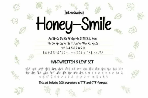
Neat tall handwritten print sans + botanical leaf dingbat bundle (OTF & TTF)
Honey–smile ('Honey-Smile') is a clean tall handwritten print sans bundled with matching botanical leaf illustrations across 200 characters (TTF & OTF)!
Ideas for this font
Allow optional Google Analytics to measure visits and catalogue actions. Your search words and notes are not included. Privacy & storage