High-Contrast Display Serif

Sunshine Vacation + Lumera Editorial
Pairs sculptural editorial warmth with Sunshine Vacation's clean modern geometry.
Inspect Lumera Editorial specimenDisclosure: MakerFileHub may earn a commission from qualifying purchases via paid links on this page. How our links work.
Duo
Sunshine Vacation is a two-face set: a chunky brush sans with rounded corners for the main word and a light natural script that leans, both shown on a sun-faded coral ground with a palm and a sunset.
Paid link
Get this fontProject & layout blueprintsAt-a-glance maker compatibility
Weld or Unite overlapping script joins into one continuous vector path before sending to the blade.
Visual anatomy & craft review
VACATION fills the middle of the card in a fat brush sans, cream on coral, with rounded corners, uneven stroke ends and a hand-painted wobble. Above it Sunshine is set in the script — a thin monoline hand with a steep slant, looping ascenders and an open, airy flow — and below, a line of small type in the same script explains the pairing. A palm tree and a low sun with rays sit at the right, and the whole card is textured to look like a sun-bleached print. The pairing is the product: the brush sans does the shouting and the script does the talking, and because the two are drawn by the same hand they share a warmth that a mixed pairing usually loses.
A retro duo — a bold brush sans paired with a natural script
Two-font hierarchy recipes
Tested contrast partners — pairing Sunshine Vacation with grounded secondary typography.
Sunshine Vacation + Lumera Editorial
Pairs sculptural editorial warmth with Sunshine Vacation's clean modern geometry.
Inspect Lumera Editorial specimen
Sunshine Vacation + Autography
Introduces organic movement on pull-quotes, signatures and gift tags.
Inspect Autography specimenPractical applications
Concrete hierarchy, scale and production guidance tailored to Sunshine Vacation’s stroke geometry.
The duo supplies both a headline and a strapline from one purchase, and the faded palette suits a bar that is open only in the warm months.
Hierarchy & layout recipe
Print a 600 by 400 mm board: set the bar name at 100 pt in the brush face, keep 22 mm of clear ground beneath before the strapline at 20 pt in the script, and hold 24 mm of border on all sides.
Pre-production check
The script thins out at distance; print one board and read the strapline from five metres before the set.
The script gives a couple an informal voice, and the brush face names the place without a photograph of a shoreline, which keeps the print affordable.
Hierarchy & layout recipe
Print a 105 by 148 mm card: set the place at 40 pt in the brush face with the date at 11 pt in the script, keep 16 mm of clear ground between them, and hold 12 mm of margin at the card edge.
Pre-production check
Sun-faded colours print grey on white; print one card on the intended board and check the coral before the batch.
The duo lets one label carry a large flavour word and a small line of provenance without a second typeface or a drawn logo, and both still read at arm's length.
Hierarchy & layout recipe
Print a 50 by 90 mm bottle label: set the flavour at 20 pt in the brush face, keep 7 mm of clear ground beneath before the volume at 4.5 pt in the script, and hold 5 mm from the label edge.
Pre-production check
Condensation softens both faces; print one label, chill the bottle and check the strapline before the run.
Technical & licence verification
Confirm included OTF/TTF/WOFF formats, full glyph tables and licence coverage on the live store page before batch production.
Closest visual alternatives
Matched across letterform anatomy, stroke behaviour and craft applications.

Contrasting sans capitals and fine signature duo
Brown Carolina Duo contrasts broad high-contrast capitals with a much finer narrow slanted script, set dark on a plain cream field, where the capital R legs sweep below the neighbouring letters and the script carries long tails that run past the ends of both words.
Ideas for this font
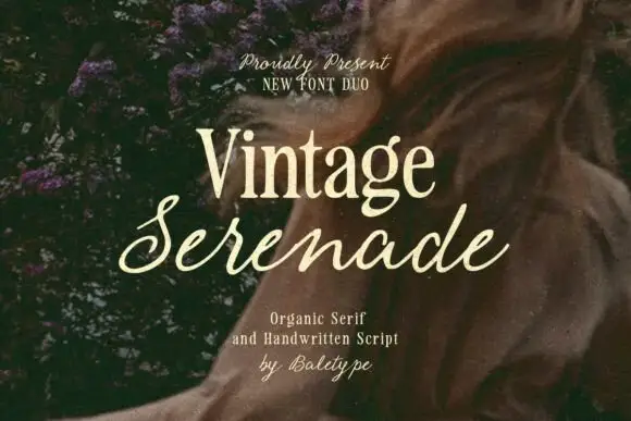
Compact organic serif paired with a long slanted handwritten script
Vintage Serenade pairs a compact organic serif with a long slanted script, so a card carries a firm printed name and a flowing second line that runs well beyond it on both sides.
Ideas for this font
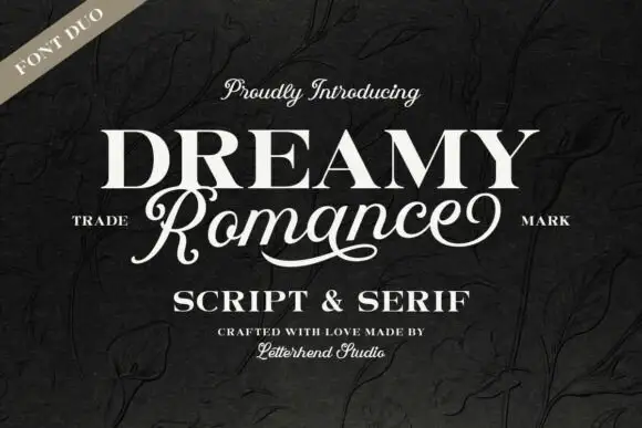
Heavy upright serif heading paired with a flowing script
Dreamy Romance shows bold white serif capitals above a slanted connected script word: the script capital R closes a loop while a long curved underline sweeps beneath the middle of the word, so one card holds a solid statement and a written line.
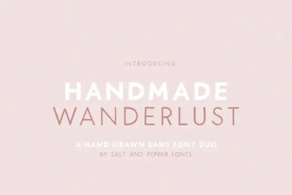
Spaced sans capitals shown in thick white and thin muted-pink lines
Handmade Wanderlust Duo shows two centred uppercase words on a soft pink background, where Handmade is white and noticeably heavier while Wanderlust beneath is thin, muted pink and more widely spaced, with slightly uneven edges and broad A and M diagonals.
Ideas for this font
Same independent foundry
Allow optional Google Analytics to measure visits and catalogue actions. Your search words and notes are not included. Privacy & storage