Neutral Sans Workhorse

Comic Toon 3d + Borsen
Lets Comic Toon 3d own the focal silhouette while handling secondary copy, sizing and subheads cleanly.
Inspect Borsen specimenDisclosure: MakerFileHub may earn a commission from qualifying purchases via paid links on this page. How our links work.
Rounded orange capitals with pale bevel highlights and thick dark depth
Comic Toon 3d gives orange block capitals a chunky bevelled appearance, where yellow and pale highlights run near the upper and left edges and dark navy sides step down to suggest depth, while a diagonal grey-orange divide crosses the background behind the letters.
Paid link
Get this fontProject & layout blueprintsAt-a-glance maker compatibility
Sturdy stroke walls and open counters weed cleanly on adhesive vinyl, HTV apparel film, and cut cardstock.
Visual anatomy & craft review
The faces stay rounded and heavy, the highlights run on one side, the navy sides repeat the silhouette and the depth steps downward. That single-light bevel is the character: the word reads as extruded rather than outlined, which is why the sample keeps one short word. The depth is a drawing rather than an editable 3D model, so check whether the file ships a flat version, keep 44 pt and add any shadow yourself. The depth is a drawing rather than an editable effect, so a flat version has to be built in layout, and at 30 pt the highlight and the shadow merge into one edge and the word reads as a solid block.
Rounded orange capitals with pale bevel highlights and thick dark depth
Two-font hierarchy recipes
Tested contrast partners — pairing Comic Toon 3d with grounded secondary typography.
Comic Toon 3d + Borsen
Lets Comic Toon 3d own the focal silhouette while handling secondary copy, sizing and subheads cleanly.
Inspect Borsen specimen
Comic Toon 3d + Svara
Grounds bold display lettering with classic typographic authority on posters, badges and apparel.
Inspect Svara specimenPractical applications
Concrete hierarchy, scale and production guidance tailored to Comic Toon 3d’s stroke geometry.
The bevelled caps give a card impact, and the heavy forms hold a short name at 36 pt on an A6 sheet, where the pale highlights read at arm's length.
Hierarchy & layout recipe
Print an A6 card: set the name at 36 pt on one row, keep 18 mm of clear ground beneath for the depth, and draw any extrusion in layout so the file stays one flat colour.
Pre-production check
A drawn extrusion at 1 mm reads as a misregistration; check the proof and keep the offset at 3 mm.
The rounded blocks read across a hall, and the heavy strokes hold a two-word sign at 56 mm on a printed board, where the navy depth separates it from the ground.
Hierarchy & layout recipe
Print a 600 by 300 mm board: set the sign at 56 mm on one row, keep 26 mm of clear ground beneath for the depth, and keep 26 mm of border so the stepped sides are not cut.
Pre-production check
The highlight side can shimmer at banner size; check the mounted board from three metres and flatten the light if it does.
The chunky bevels suit a playful interior, and the rounded faces hold a short name at 48 mm on an acrylic panel, where the pale edge catches the room light.
Hierarchy & layout recipe
Cut a 500 by 250 mm acrylic panel: set the name at 48 mm on one row, keep 22 mm of clear ground beneath before the hours at 14 pt, and keep 22 mm of margin for the fixings.
Pre-production check
A flat version may not be included; check the file before planning a single-colour print or a vinyl cut.
Technical & licence verification
Confirm included OTF/TTF/WOFF formats, full glyph tables and licence coverage on the live store page before batch production.
Closest visual alternatives
Matched across letterform anatomy, stroke behaviour and craft applications.
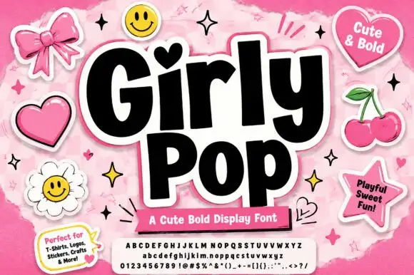
Heavy playful sans with a heart dot and slightly tilted letter bodies
Girly Pop is a heavy playful sans in which the letters stand at slightly different tilts, the i carries a heart dot and the weight stays maximal from first letter to last.
Ideas for this font
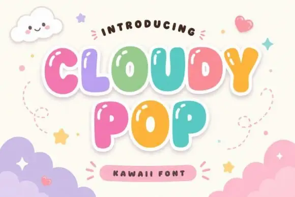
Rounded bubble capitals with small counters and a soft white sticker outline
Cloudy Pop is a rounded bubble capital alphabet with small counters and a soft white outline, so a word reads as a set of inflated stickers that can sit on any background.
Ideas for this font
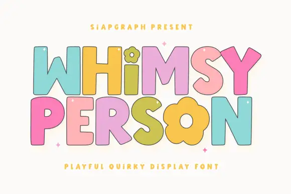
Simple broad letters with flower-shaped details
Whimsy Person is a playful capital display: fat rounded letters with a black contour, each in a different pastel colour, with the i and the o of the second word drawn as flower heads.
Ideas for this font
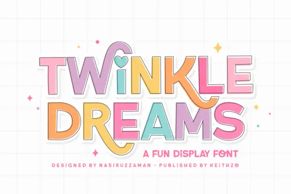
Block display with heart and swash accents
Twinkle Dreams combines firm block capitals with a heart-shaped dot above the i and curling extensions on selected letters, where the R and K tails swing below the main rows, each letter takes a pastel fill with a fine dark edge and the whole block sits on a faint grid.
Ideas for this font
Same independent foundry
Allow optional Google Analytics to measure visits and catalogue actions. Your search words and notes are not included. Privacy & storage