Editorial Serif Anchor

Study Club + The Lumina Awesome
Anchors Study Club's fluid strokes with crisp Roman proportions on wedding suites, headers and packaging.
Inspect The Lumina Awesome specimenDisclosure: MakerFileHub may earn a commission from qualifying purchases via paid links on this page. How our links work.
Monoline script with loopy ascenders
Study Club is a monoline script in pink on white: rounded letters with open loops, tall ascenders, a tilted baseline and a wide entry stroke, framed by a pink rule with a bow, strawberries and carrots at the corners.
Paid link
Get this fontProject & layout blueprintsAt-a-glance maker compatibility
Weld or Unite overlapping script joins into one continuous vector path before sending to the blade.
Visual anatomy & craft review
Two words are stacked and the face is a monoline script: the stroke is even and moderately thick, the S opens with a wide entry loop, the t carries a crossbar that crosses the ascender, the u and the d stay round, the y drops a tail that curls left, and the baseline tilts a few degrees so the block reads as written on a card rather than set on a page. The letters connect with soft joins, so each word reads as a ribbon, and the loops are large enough that the face looks open rather than dense. The composition is framed by a rounded pink rule, a bow sits at the top centre, and small drawn strawberries and carrots are placed at the corners, with a tracked line at the foot naming the style. The palette is pink on white. Study Club is a monoline script for stationery, planners, cards and packaging with a soft tone, and it needs a light ground and a size above about fourteen points.
Monoline, loopy, sweet
Two-font hierarchy recipes
Tested contrast partners — pairing Study Club with grounded secondary typography.
Study Club + The Lumina Awesome
Anchors Study Club's fluid strokes with crisp Roman proportions on wedding suites, headers and packaging.
Inspect The Lumina Awesome specimen
Study Club + Modern Limited
Keeps small-scale dates, URLs, nutrition facts and care instructions crisp and legible below script titles.
Inspect Modern Limited specimenPractical applications
Concrete hierarchy, scale and production guidance tailored to Study Club’s stroke geometry.
A soft monoline script makes a planner feel personal, and the even stroke stays readable on a cover printed in one colour.
Hierarchy & layout recipe
Print a 148 by 210 mm cover: set the title at 36 pt over two lines, keep 16 mm of clear ground beneath before the term at 11 pt, and hold 14 mm of margin on all four sides.
Pre-production check
A tilted baseline on a cover can look crooked against the trim; proof one cover and check the alignment.
A sweet monoline suits notebooks and pens, and the looped forms fill a small label without needing any decoration beside them.
Hierarchy & layout recipe
Print a 50 by 35 mm label: set the brand at 11 pt on one line, keep 3.5 mm of clear ground on all four sides, and hold the label 8 mm from the top edge of the pack.
Pre-production check
At eleven points the loops can close; print one on the real stock and check before the order.
A soft script heading eases a page about study habits, and the monoline keeps it from looking like a greeting card pinned to a wall.
Hierarchy & layout recipe
Print a 210 by 280 mm page: set the heading at 34 pt on one line, keep 14 mm of clear ground beneath before the standfirst at 11 pt, and hold 20 mm of margin on all four sides.
Pre-production check
A light script above a dense text page can look frivolous; proof the spread and compare the weights.
Technical & licence verification
Confirm included OTF/TTF/WOFF formats, full glyph tables and licence coverage on the live store page before batch production.
Closest visual alternatives
Matched across letterform anatomy, stroke behaviour and craft applications.
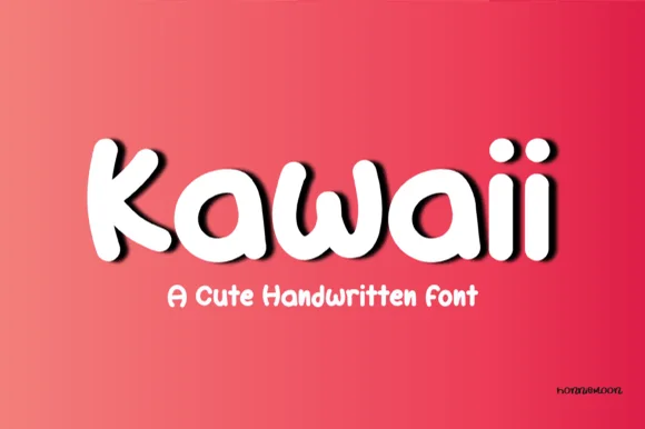
Plump marshmallow-cord connected kawaii script
Kawaii (by Honiiemoon) is an ultra-plump, pillow-soft connected marshmallow script with round bubble 'i' dots and super-fast Cricut weeding!
Ideas for this font
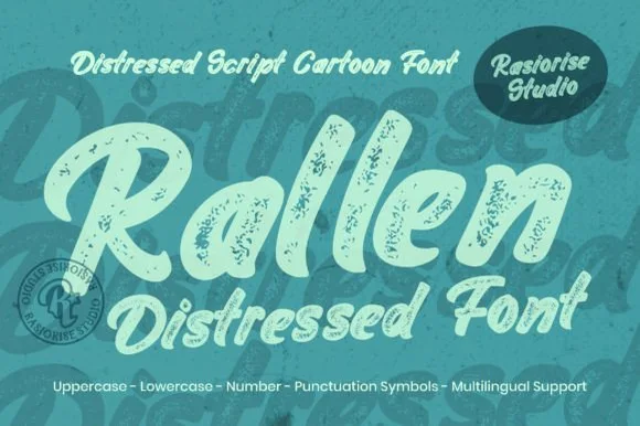
Distressed cartoon script
Rallen is a distressed cartoon script in mint on teal: a fat slanted script with swollen downstrokes, blunt joins and a heavy speckled wear that chips the edges, set as one large word with a smaller line beneath and a tracked list of contents at the foot.
Ideas for this font
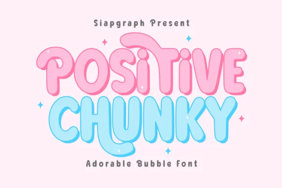
Soft bubble display with outline
Positive Chunky is a soft bubble display in pink and blue with a white contour on a pale ground: fat rounded letters with almost circular bowls, small counters, a gentle bounce and a light inner highlight, with four-point sparkles around the block and a tracked note beneath.
Ideas for this font
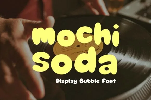
Ultra-soft pillowy Japanese-snack & mochi bubble lowercase
Mochi Soda is a super-plump, marshmallow-soft rounded bubble font with squishy organic lowercase and plump circular i-dots.
Ideas for this font
Same independent foundry
Allow optional Google Analytics to measure visits and catalogue actions. Your search words and notes are not included. Privacy & storage