Editorial Serif Anchor

Crispy Oatmilk + Resquel
Anchors Crispy Oatmilk's fluid strokes with crisp Roman proportions on wedding suites, headers and packaging.
Inspect Resquel specimenDisclosure: MakerFileHub may earn a commission from qualifying purchases via paid links on this page. How our links work.
Heavy rounded script with heart-shaped dots and thick connected stems
Crispy Oatmilk is a heavy rounded script in which the stems stay thick through the joins and the dots on the i are drawn as small hearts, so a two-word phrase reads as a friendly painted label.
Paid link
Get this fontProject & layout blueprintsAt-a-glance maker compatibility
Weld or Unite overlapping script joins into one continuous vector path before sending to the blade.
Visual anatomy & craft review
The capital C opens as a broad crescent and the capital O of the second word closes a wide round bowl, and the letters between them keep the same load: the r and the i stay short, the s reverses through two fat curves, the p drops a heavy descender and the y curls its tail. Weight never thins: joins carry the same thickness as the stems, which is what makes the phrase read as one painted object rather than a written line. The hearts above the i and the l are the only open decoration, and because the strokes are wide the counters survive at 14 pt on a label. The pale splash behind, the pink ink, the white outline and the small caption band are presentation; the script is the two words.
Heavy · Rounded · Hearted
Two-font hierarchy recipes
Tested contrast partners — pairing Crispy Oatmilk with grounded secondary typography.
Crispy Oatmilk + Resquel
Anchors Crispy Oatmilk's fluid strokes with crisp Roman proportions on wedding suites, headers and packaging.
Inspect Resquel specimen
Crispy Oatmilk + Swaraga
Keeps small-scale dates, URLs, nutrition facts and care instructions crisp and legible below script titles.
Inspect Swaraga specimenPractical applications
Concrete hierarchy, scale and production guidance tailored to Crispy Oatmilk’s stroke geometry.
The heavy connected stems hold on a curved bottle label where a light script would vanish, and the heart dots give the brand a mark without a second graphic.
Hierarchy & layout recipe
Set the brand at 13 pt on a 60 by 90 mm bottle label, keep the volume in a 6 pt sans, and leave 7 mm at the sides so the thick joins are not squeezed by the curve.
Pre-production check
A curved label compresses the outer letters of a heavy script; check a printed label on the actual bottle and widen the margins first.
The rounded weight fills a card with two words, and the heart dots carry the warm tone without an illustration at 30 pt.
Hierarchy & layout recipe
Set the greeting at 30 pt on a 148 by 105 mm card, set the sender in a 7 pt sans at the foot, and leave 16 mm of margin so the thick ends stay inside the trim.
Pre-production check
Heavy joins at 30 pt can merge into a mass; check the proof at final size and open the tightest joins rather than reducing the weight.
The painted weight reads across a room and the heart dots stay visible at 80 mm, which is what a party banner needs at a distance.
Hierarchy & layout recipe
Set the greeting at 80 mm on a 1.2 m fabric banner, set the name at 50 mm beneath it, and leave 30 mm at each end so the curled tail stays inside the hem.
Pre-production check
Fabric printing softens a fat script further; check a proof at final size and open the counters before the run.
Technical & licence verification
Confirm included OTF/TTF/WOFF formats, full glyph tables and licence coverage on the live store page before batch production.
Closest visual alternatives
Matched across letterform anatomy, stroke behaviour and craft applications.
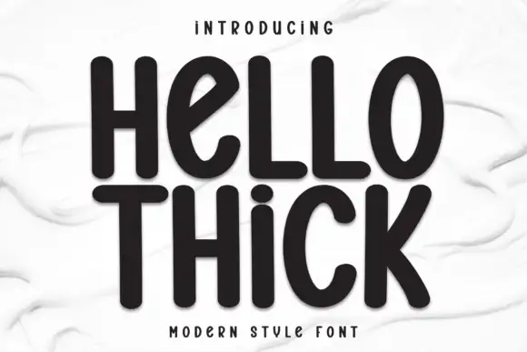
Thick rounded unjoined display letters with a soft shadow
Hello Thick is display lettering in which the strokes are very heavy and rounded, the letters stand apart rather than joining, and the mild slant keeps the line moving, so a word reads as inflated handwriting.
Ideas for this font

Heavy looped script with a heart dot
Wishful Women is a heavy looped script in pink with a pale glow on a gingham ground: fat rounded strokes, tall loops on the W, a heart in place of the dot on the i and a soft outline that lifts the words off the pattern.
Ideas for this font

Heavy calligraphy with large curled terminals
Thick Black combines heavy rounded stems with large looping T, B and k forms, where two stacked words sit with tight middle counters and sweeping outer terminals, and a faint landscape runs behind the lettering as separate artwork.
Ideas for this font
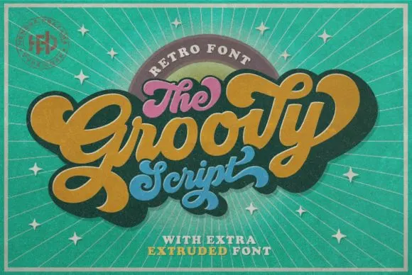
Retro connected script
Groovy is a compact connected script drawn from late-sixties and seventies advertising, where the letters join in a rounded loop and the whole word keeps the squat, cheerful proportions of that period rather than the tall slant of a calligraphic hand.
Same independent foundry
Allow optional Google Analytics to measure visits and catalogue actions. Your search words and notes are not included. Privacy & storage