Modern Grotesque Body

Storybook + Taught
Creates crisp high-hierarchy contrast beneath Storybook headlines across menus, websites and labels.
Inspect Taught specimenDisclosure: MakerFileHub may earn a commission from qualifying purchases via paid links on this page. How our links work.
Descriptive serif with storybook curls
Storybook is a descriptive serif on a fantasy landscape: thick even strokes, curly terminals that flick upward on the S and the C, a single-storey a and a k with a looping leg, printed black on a page that appears to rise out of an open book.
Paid link
Get this fontProject & layout blueprintsAt-a-glance maker compatibility
Sturdy stroke walls and open counters weed cleanly on adhesive vinyl, HTV apparel film, and cut cardstock.
Visual anatomy & craft review
The word sits above a hill that turns out to be the spread of an open book, and the face is built for that storybook register: moderate contrast, thick stems with hairline joins, and terminals that curl into small spirals on the S, the C and the y, while the b and the k carry loops that lift the word off a strict baseline. The letters are slightly wide and the counters generous, so the word stays legible in the middle of an illustration, and the spacing is loose enough that each curl reads separately rather than merging into a fringe. The supporting lines use a contrasting italic for the introductory word and a smaller roman for the descriptor, which is how a children's book title page is usually set. The image is warm and low-contrast at the edges, and the type is placed where the sky is palest, so the lettering never fights the illustration.
Storybook, whimsical, warm, illustrated
Two-font hierarchy recipes
Tested contrast partners — pairing Storybook with grounded secondary typography.
Storybook + Taught
Creates crisp high-hierarchy contrast beneath Storybook headlines across menus, websites and labels.
Inspect Taught specimen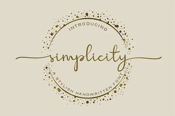
Storybook + Simplicity
Adds a warm human signature touch for 1-to-3-word callouts without competing against structured serif capitals.
Inspect Simplicity specimenPractical applications
Concrete hierarchy, scale and production guidance tailored to Storybook’s stroke geometry.
A curled serif reads as a book title rather than a party flyer, which is exactly the tone wanted when the party theme is a favourite story, and it stays legible at small sizes.
Hierarchy & layout recipe
A6 card: the word at 32 pt, the child's name at 24 pt in the same face, and the details in a 9 pt roman beneath. Keep 15 mm margins and place the illustration in the lower third so the type sits on the pale sky.
Pre-production check
Check the curls at 32 pt, where the spiral terminals can fill in on a home printer; thicken the thinnest part of the curl by 0.1 mm if needed. Confirm the 9 pt details keep a 4.5:1 contrast and that neither line sits over the illustration's dark foliage.
A descriptive serif with curls signals that a list is meant to be read for pleasure, which is the point of a reading list handed to a seven-year-old.
Hierarchy & layout recipe
A4 portrait: the title at 48 pt across the top, the list in a 12 pt roman at 16 pt leading, and the class name in 9 pt caps at the foot. Keep the list in one column with 6 mm between entries so the curls of the title never crowd the first line.
Pre-production check
Check the 12 pt list on the school printer, where a descriptive serif's hairline joins can break; if so, print the list in the companion roman weight. Confirm the title's curl clears the first list entry by 8 mm and that the 9 pt caps stay readable from a metre.
A curled serif gives a nursery print the look of a page torn from a book, and because the strokes are even it stays readable in the low light of a child's room.
Hierarchy & layout recipe
A3 print: the word at 90 mm cap height, a single line of the same face at 24 mm beneath, and a 5 mm illustrated border. Keep everything to one ink on a warm paper so the print reads as a book page rather than a poster.
Pre-production check
Check the curls at 90 mm, where the spiral terminals must stay at least 1.5 mm wide to print cleanly, and confirm the second line's loops do not touch the border. Read the print from the doorway to make sure the word holds at a glance.
Technical & licence verification
Confirm included OTF/TTF/WOFF formats, full glyph tables and licence coverage on the live store page before batch production.
Closest visual alternatives
Matched across letterform anatomy, stroke behaviour and craft applications.
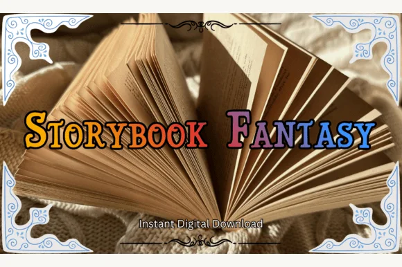
Swash-capped enchanted fairytale & medieval storybook serif
Storybook Fantasy is an ornate fairytale display serif featuring dramatic curled initial capitals alongside sturdy small-caps-style letters.
Ideas for this font
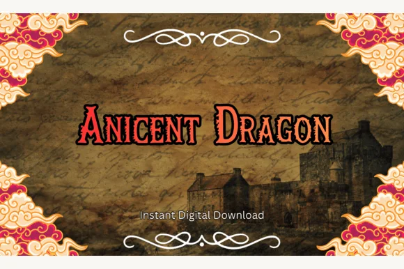
Spiky dragon-claw medieval fantasy serif (OTF & TTF)
Ancient Dragon is a fierce medieval fantasy serif tipping capitals and small-caps with hooked dragon-claw spurs (OTF & TTF).
Ideas for this font
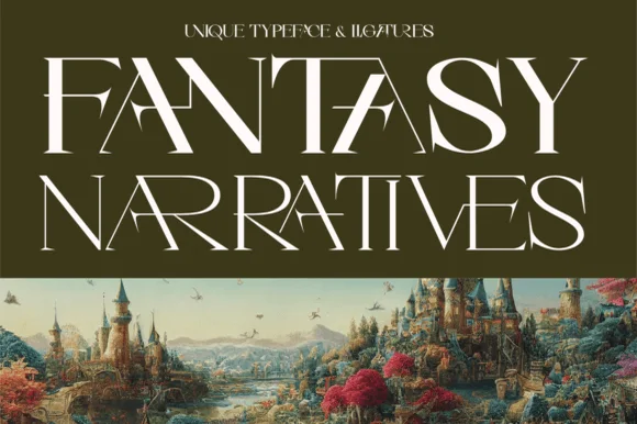
Sweeping ligature high-fantasy RPG & storybook serif
Fantasy Narratives is an enchanting high-contrast fantasy serif weaving dramatic diagonal 'FA', 'AN', 'NA', and 'AR' ligatures across kingdom titles!
Ideas for this font
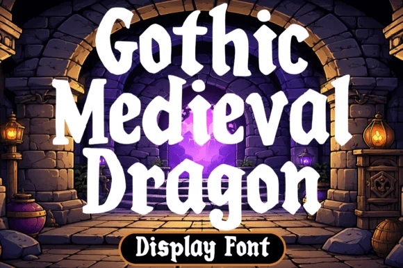
Chunky fantasy serif with rounded wedge serifs and heavy lowercase bowls
Gothic Medieval Dragon is a chunky fantasy serif in which the serifs wedge out round, the lowercase bowls stay heavy and the contrast stays low, so a game-night title reads as friendly storybook lettering rather than as black-metal type.
Ideas for this font
Allow optional Google Analytics to measure visits and catalogue actions. Your search words and notes are not included. Privacy & storage