Modern Grotesque Body

Ancient Dragon + Noar
Creates crisp high-hierarchy contrast beneath Ancient Dragon headlines across menus, websites and labels.
Inspect Noar specimenDisclosure: MakerFileHub may earn a commission from qualifying purchases via paid links on this page. How our links work.
Spiky dragon-claw medieval fantasy serif (OTF & TTF)
Ancient Dragon is a fierce medieval fantasy serif tipping capitals and small-caps with hooked dragon-claw spurs (OTF & TTF).
Paid link
Get this fontProject & layout blueprintsAt-a-glance maker compatibility
Sturdy stroke walls and open counters weed cleanly on adhesive vinyl, HTV apparel film, and cut cardstock.
Visual anatomy & craft review
Ancient Dragon is a medieval fantasy serif whose capitals and small caps end in hooked dragon-claw spurs, with tall ascenders and a heavy bracketed structure that reads as carved stone rather than calligraphy. The claws sit on the terminals, so they grow with the type size and disappear under a careless crop, and the weight stays solid enough for a two-colour print. It needs roughly 22 mm before the hooks read as talons instead of serifs, and it suits titles, labels and themed signage; long copy would turn the claws into noise.
Dragon-talon-serifs · Parchment-scroll · Mythic-bold
Two-font hierarchy recipes
Tested contrast partners — pairing Ancient Dragon with grounded secondary typography.
Ancient Dragon + Noar
Creates crisp high-hierarchy contrast beneath Ancient Dragon headlines across menus, websites and labels.
Inspect Noar specimen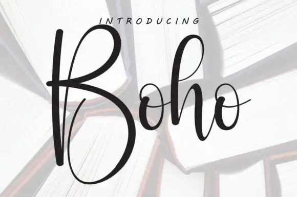
Ancient Dragon + Boho
Adds a warm human signature touch for 1-to-3-word callouts without competing against structured serif capitals.
Inspect Boho specimenPractical applications
Concrete hierarchy, scale and production guidance tailored to Ancient Dragon’s stroke geometry.
Clawed serifs set a fantasy theme in one word without a licensed illustration, and the heavy structure survives a topper cut from card. Tall ascenders give a short name vertical presence on an A6.
Hierarchy & layout recipe
Invite A6, name 16 mm, details 4.5 mm on 6 mm leading, 10 mm margins, 3 mm bleed. Topper 130 x 110 mm, name 45 mm, 8 mm stick slot. Quest card 105 x 148 mm, heading 14 mm, tasks 7/10 pt.
Pre-production check
Claw tips at 16 mm sit within about 1 mm and are the first thing a hand-cut topper tears. Die-cut the topper, and check one cut sample against the artwork before making a set.
A carved serif reads as a book-historical title rather than a game logo, which is what a fantasy novel cover needs on a shelf of competing jackets. Bracketed structure holds over painted illustration without an outline.
Hierarchy & layout recipe
Cover 152 x 229 mm, title 42 pt, author 16 pt, 18 mm margins, spine 9 pt. Spread 420 x 297 mm, chapter head 30 pt, body 10/15 pt. Title screen 1920 x 1080, title 200 px, safe margin 5 percent.
Pre-production check
A spine title at 9 pt closes the claws into a solid serif and the book looks plain on the shelf. Check the spine at 9 pt in a phone photo, and substitute a plainer cut for the spine if the hooks vanish.
Dragon-claw terminals read as carved stone detail, which suits a castle-themed haunt better than a dripping slasher face. Heavy fill stays legible in low venue light.
Hierarchy & layout recipe
Poster A2, title 220 mm, times 24/30 pt, 30 mm margins. Invite 120 x 180 mm, names 20 pt, details 8.5/12 pt, 15 mm margins. Book spine 40 mm wide, title 6 mm repeated.
Pre-production check
Guests read an invitation in a dim room, and a clawed 8.5 pt detail line is unreadable. Keep practical lines in a plain serif at 9 pt or above, and check one invite under evening lighting.
Technical & licence verification
Confirm included OTF/TTF/WOFF formats, full glyph tables and licence coverage on the live store page before batch production.
Closest visual alternatives
Matched across letterform anatomy, stroke behaviour and craft applications.
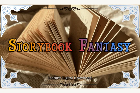
Swash-capped enchanted fairytale & medieval storybook serif
Storybook Fantasy is an ornate fairytale display serif featuring dramatic curled initial capitals alongside sturdy small-caps-style letters.
Ideas for this font
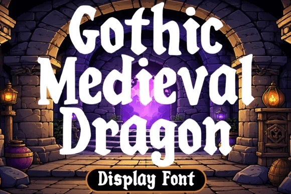
Chunky fantasy serif with rounded wedge serifs and heavy lowercase bowls
Gothic Medieval Dragon is a chunky fantasy serif in which the serifs wedge out round, the lowercase bowls stay heavy and the contrast stays low, so a game-night title reads as friendly storybook lettering rather than as black-metal type.
Ideas for this font
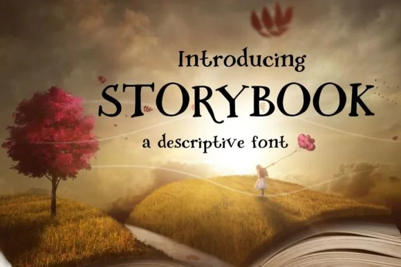
Descriptive serif with storybook curls
Storybook is a descriptive serif on a fantasy landscape: thick even strokes, curly terminals that flick upward on the S and the C, a single-storey a and a k with a looping leg, printed black on a page that appears to rise out of an open book.
Ideas for this font
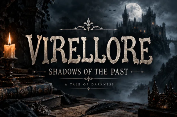
Rugged ornamental display serif
Virellore is an ornate display serif in weathered cream on a dark gothic scene: heavy bracketed serifs, split terminals, small thorns along the strokes, and rules with diamond finials between the lines, so the plate reads as a fantasy title card rather than as an editorial serif.
Ideas for this font
Same independent foundry
Allow optional Google Analytics to measure visits and catalogue actions. Your search words and notes are not included. Privacy & storage