Neutral Sans Workhorse

Star Mode + Homies
Lets Star Mode own the focal silhouette while handling secondary copy, sizing and subheads cleanly.
Inspect Homies specimenDisclosure: MakerFileHub may earn a commission from qualifying purchases via paid links on this page. How our links work.
Mid-century retro display
Star Mode is an uneven retro display in cream on a lilac space scene: tall slabs with exaggerated triangular feet, a bouncing baseline, a dark offset shadow and a bowl-like counter, set on two lines around a ringed planet and scattered stars.
Paid link
Get this fontProject & layout blueprintsAt-a-glance maker compatibility
Sturdy stroke walls and open counters weed cleanly on adhesive vinyl, HTV apparel film, and cut cardstock.
Visual anatomy & craft review
The two words are stacked and the drawing is a mid-century display cut: the slabs are tall, the feet flare into triangles, the counters are round, and the baseline bounces so the pair reads as hand-set rather than as typed. The dark offset shadow is part of the letterform construction, which means the same look reproduces in a single-colour print by shifting a copy, and the plate shows the pair overlapping a ringed planet, which is period styling rather than typographic evidence. Because the feet are wide, the face needs generous spacing and a large size, and the specimen sets two short words that fill the sheet. The palette is a muted lilac with cream and a dark navy, which keeps the retro space theme consistent.
Display, retro, playful, uneven
Two-font hierarchy recipes
Tested contrast partners — pairing Star Mode with grounded secondary typography.
Star Mode + Homies
Lets Star Mode own the focal silhouette while handling secondary copy, sizing and subheads cleanly.
Inspect Homies specimen
Star Mode + Askinо
Grounds bold display lettering with classic typographic authority on posters, badges and apparel.
Inspect Askinо specimenPractical applications
Concrete hierarchy, scale and production guidance tailored to Star Mode’s stroke geometry.
A mid-century display reads as a period sign, and the exaggerated feet hold at fascia size where a plain slab would look neutral.
Hierarchy & layout recipe
Paint a 1,300 by 400 mm fascia: the name at 120 mm cap height, the hours in a 24 mm sans, and a 6 mm shadow offset. Keep 28 mm margins and paint three colours on a dark board.
Pre-production check
Check the fascia at six metres, where the triangular feet can read as damage; keep them above 10 mm. Confirm the 24 mm hours read at three metres and that the shadow stays consistent.
A retro display gives a period subject its own voice, and the drawn shadow lets a cover read as printed matter rather than as a modern layout.
Hierarchy & layout recipe
Set the title at 85 mm cap height across 200 mm, the subtitle in a 12 pt sans, and the author at 9 pt. Print three colours on a coated stock and keep the stars away from the subtitle.
Pre-production check
Check the title at thumbnail size, where the shadow can merge with the letter; keep the offset above 1.5 mm. Confirm the 9 pt author survives lamination and that the title holds at newsstand size.
An uneven retro face sets a decade theme in one line, and the cream on a dark ground gives a small print run the look of a screen print.
Hierarchy & layout recipe
A3 poster: the occasion at 70 mm cap height, the date in a 20 mm sans, and the address at 9 mm. Keep 25 mm margins and print two colours on a coloured stock.
Pre-production check
Check the poster at four metres, where the bounce can look like bad setting; align the first and last letters. Confirm the 9 mm address reads at arm's length and that the stars clear the type.
Technical & licence verification
Confirm included OTF/TTF/WOFF formats, full glyph tables and licence coverage on the live store page before batch production.
Closest visual alternatives
Matched across letterform anatomy, stroke behaviour and craft applications.
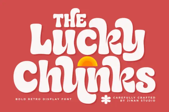
Bulging retro forms with curled joins
Lucky Chunks is a bold retro display face in cream on terracotta: very fat letters whose bowls bulge past the stems, curled joins between the letters of a word, and a half-sun arch drawn between the two lines.
Ideas for this font
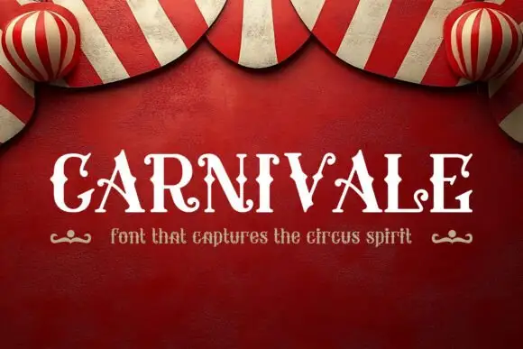
Contrast capitals with pointed side spurs and curled decorative terminals
Carnivale sets a pale uppercase word on a red circus field: narrow stems meet broad curved bowls and sharp triangular side points, the A crossbars curl outward, the V finishes in a small upper curl and the E closes on a rolled lower terminal, all on one straight baseline.
Ideas for this font
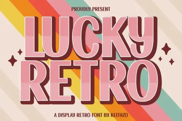
Retro display with extrusion
Lucky Retro is a retro display in pink with a maroon extrusion on a striped ground: wide caps with rounded corners, a thin inline highlight, a hard shadow that steps down and right, and four-point sparkles at the sides, so the plate reads as a seventies poster headline.
Ideas for this font

Inflated graffiti letters with hanging drips
Mila is an inflated graffiti display face in black on a dark wall: fat rounded letters with a glossy highlight, a neon green and pink outline, and paint drips hanging from the bottom of each stroke, with a crown splat and a spray can at the edges.
Ideas for this font
Same independent foundry
Allow optional Google Analytics to measure visits and catalogue actions. Your search words and notes are not included. Privacy & storage