Neutral Sans Workhorse

Carnivale + Cultivo
Lets Carnivale own the focal silhouette while handling secondary copy, sizing and subheads cleanly.
Inspect Cultivo specimenDisclosure: MakerFileHub may earn a commission from qualifying purchases via paid links on this page. How our links work.
Contrast capitals with pointed side spurs and curled decorative terminals
Carnivale sets a pale uppercase word on a red circus field: narrow stems meet broad curved bowls and sharp triangular side points, the A crossbars curl outward, the V finishes in a small upper curl and the E closes on a rolled lower terminal, all on one straight baseline.
Paid link
Get this fontProject & layout blueprintsAt-a-glance maker compatibility
Sturdy stroke walls and open counters weed cleanly on adhesive vinyl, HTV apparel film, and cut cardstock.
Visual anatomy & craft review
The stems stay narrow while the bowls broaden, the side spurs project as sharp triangles, and three letters carry a curl at the end of a stroke instead of a square cut. The pointed spur is the character: it gives an otherwise formal capital row a fairground edge, which is why the sample keeps every letter separated along one line. Because each curl and spur needs its own air, keep 26 pt as the floor and 8 mm of letter spacing at heading size. The striped canopy and hanging ornaments are presentation unless confirmed as extras, and the fine curls vanish beside a neighbouring vertical stroke.
Contrast · Pointed spurs · Curled ends
Two-font hierarchy recipes
Tested contrast partners — pairing Carnivale with grounded secondary typography.
Carnivale + Cultivo
Lets Carnivale own the focal silhouette while handling secondary copy, sizing and subheads cleanly.
Inspect Cultivo specimen
Carnivale + The Lumina Awesome
Grounds bold display lettering with classic typographic authority on posters, badges and apparel.
Inspect The Lumina Awesome specimenPractical applications
Concrete hierarchy, scale and production guidance tailored to Carnivale’s stroke geometry.
The pointed spurs give a fair poster its voice, and the separated capitals hold a two-word title at 60 pt on an A2 sheet in two colours. The separated row also keeps each spur from touching its neighbour.
Hierarchy & layout recipe
Print an A2 poster: set the title at 60 pt in capitals, keep 10 mm between the letters so the spurs stay distinct, and keep 26 mm of margin so no curl is trimmed by the edge. Keep the far ground plain behind the title.
Pre-production check
A pointed spur printed under 2 mm reads as a nick; check the film at full size and keep the title at 50 pt or above.
The contrasted caps set a season cover, and the curled terminals give a short play title its period tone at 56 pt on a coated page. The separated capitals also let a long play title breathe.
Hierarchy & layout recipe
Print an A4 cover: set the title at 56 pt in capitals, keep 22 mm of clear ground above the curls, and set the season line at 9 pt in a narrow caps along the foot of the page.
Pre-production check
A rolled terminal printed into the season line touches it; check the proof and keep 18 mm between the curl and any text.
The circus tone suits a confectionery label, and the broad bowls stay solid at 20 pt on a 55 mm panel in one ink. The circus tone also survives a small label at one colour.
Hierarchy & layout recipe
Print a 55 by 40 mm label: set the shop name at 20 pt, keep every spur at 1 mm minimum, and set the town in a 6 pt caps at the foot with 4 mm of clear ground. Keep the spurs on the flat panel.
Pre-production check
Spurs thinner than 0.8 mm fill on an uncoated label; check the plate proof and keep the name at 20 pt or above.
Technical & licence verification
Confirm included OTF/TTF/WOFF formats, full glyph tables and licence coverage on the live store page before batch production.
Closest visual alternatives
Matched across letterform anatomy, stroke behaviour and craft applications.
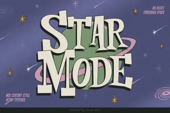
Mid-century retro display
Star Mode is an uneven retro display in cream on a lilac space scene: tall slabs with exaggerated triangular feet, a bouncing baseline, a dark offset shadow and a bowl-like counter, set on two lines around a ringed planet and scattered stars.
Ideas for this font
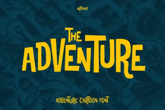
Uneven tall capitals with oversized V and T and a curved R leg
Adventure shows yellow capitals rising and falling across a dark teal field, where tall narrow bodies vary strongly in height, the V grows oversized, the T carries a broad top and the R leg curves below its neighbours.
Ideas for this font
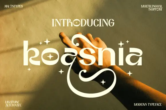
Rounded stylized lowercase with large upper curls and a deep lower sweep
Koasnia shows pale rounded lettering across a warm photograph of hands: wide bowls and fairly even substantial strokes contrast with a large curl above the middle letters and an open sweep that descends far below the line.
Ideas for this font

Inflated graffiti letters with hanging drips
Mila is an inflated graffiti display face in black on a dark wall: fat rounded letters with a glossy highlight, a neon green and pink outline, and paint drips hanging from the bottom of each stroke, with a crown splat and a spray can at the edges.
Ideas for this font
Same independent foundry
Allow optional Google Analytics to measure visits and catalogue actions. Your search words and notes are not included. Privacy & storage