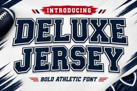
Modern Grotesque Body

Sport Station + Base Edge
Creates crisp high-hierarchy contrast beneath Sport Station headlines across menus, websites and labels.
Inspect Base Edge specimenDisclosure: MakerFileHub may earn a commission from qualifying purchases via paid links on this page. How our links work.
Layered varsity slab with badge
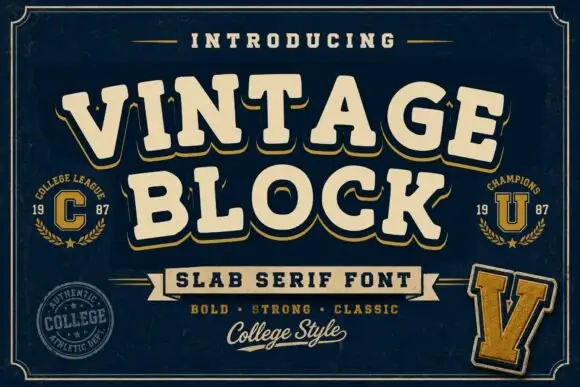
Sport Station is a layered varsity slab in cream on black: heavy square serifs, notched corners, an even double outline, and a set of supporting elements — a shield badge, tracked caps and a rule with a star, so the plate reads as a finished sports identity rather than a headline.
Paid link
Get this fontProject & layout blueprintsAt-a-glance maker compatibility
Sturdy stroke walls and open counters weed cleanly on adhesive vinyl, HTV apparel film, and cut cardstock.
Visual anatomy & craft review
The two words are stacked and the drawing is a college slab at display weight: the serifs are blocks, the tops are flat, and the corners are notched, which gives the letters their patch-like quality. Each line carries a double outline in a second tone, which lifts the lettering off a dark ground without a shadow, and the outline weight stays constant across both lines, which is what makes the pair read as one plate. Spacing is tight and the widths are even, so the block fills the middle of the frame. Beneath it, the specimen places a shield badge with a single letter, a tracked caption, and a rule with a star, all in the same two tones, so the sheet demonstrates a complete mark rather than an alphabet.
Varsity, bold, layered, elegant
Two-font hierarchy recipes
Tested contrast partners — pairing Sport Station with grounded secondary typography.
Sport Station + Base Edge
Creates crisp high-hierarchy contrast beneath Sport Station headlines across menus, websites and labels.
Inspect Base Edge specimen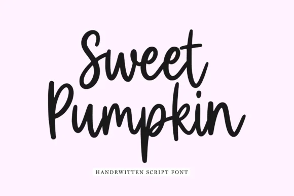
Sport Station + Sweet Pumpkin
Adds a warm human signature touch for 1-to-3-word callouts without competing against structured serif capitals.
Inspect Sweet Pumpkin specimenPractical applications
Concrete hierarchy, scale and production guidance tailored to Sport Station’s stroke geometry.
A layered slab plus a shield badge gives a small academy a complete mark from one purchase, and the two-tone build prints cleanly on shirts, signage and certificates.
Hierarchy & layout recipe
Build the mark at 60 mm on a certificate, 25 mm on a shirt and 200 mm on a hall banner. Keep the outline proportional at each size and always pair the word with the shield so the identity stays consistent.
Pre-production check
Check the 25 mm shirt mark, where the shield letter can fill; use a bold single letter at that size. Confirm the banner reads at fifteen metres and that the outline does not disappear on a light garment.
A varsity slab reads as a training brand rather than a boutique, and the notched corners give a fascia sign enough detail to look fabricated rather than printed.
Hierarchy & layout recipe
Fabricate a 1,200 by 400 mm sign: the name at 160 mm cap height, a 6 mm outline, and the badge at 200 mm. Keep the strokes at least 12 mm for the cut file and specify a matte face so the outline reads under downlights.
Pre-production check
Check the cut file at 160 mm, where a notch under 8 mm can snap during installation; widen it. Confirm the badge reads from thirty metres and that the outline is even after the sign is mounted.
A layered slab gives an annual the weight of a team identity, and the badge element lets the cover carry a mark in the corner without a second design.
Hierarchy & layout recipe
Set the title at 95 mm cap height, the subtitle in a 10 pt sans, and place the badge at 30 mm in the lower corner. Print two inks on a matte laminate and keep a single action photograph behind the title at low contrast.
Pre-production check
Check the title at 95 mm, where the outline can merge with the photograph; keep the image dark behind it. Confirm the badge reads at thumbnail size and that the subtitle survives the laminate.
Technical & licence verification
Confirm included OTF/TTF/WOFF formats, full glyph tables and licence coverage on the live store page before batch production.
Closest visual alternatives
Matched across letterform anatomy, stroke behaviour and craft applications.
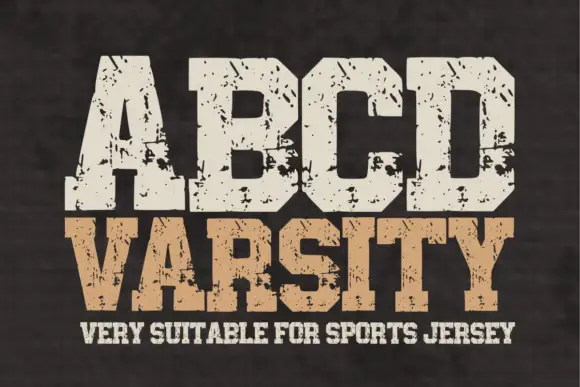
Wide athletic capitals with chamfered bowls and rough chips through the slabs
Abcd Varsity is a wide athletic slab in which the flat ends sit close, the bowls chamfer at the corners and irregular chips eat through the heavy slabs, so a two-word title reads as a weathered collegiate board.
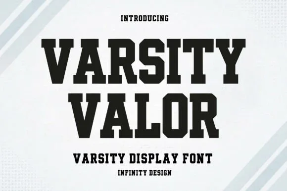
Solid varsity slab with flat serifs
Varsity Valor is a varsity display face in solid black on a pale ground: heavy capitals with thick flat serifs, flat apexes and a tight fit, with a small hatched pattern behind the words and tracked capital lines above and below.
Ideas for this font
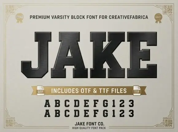
Very heavy collegiate slab capitals with tight spacing and flat slabs
Jake is a very heavy collegiate slab in capitals only, with flat rectangular slabs, tight spacing and almost no internal space left in the counters.
Ideas for this font
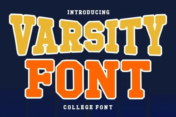
Layered college slab with arched line
Varsity Font is a layered college slab in gold and orange on navy: wide square serifs, flat-topped caps, a heavy white outline on both lines and a slight arch across the top, so the pair reads as an embroidered team patch rather than a plain headline.
Ideas for this font
Same independent foundry
Allow optional Google Analytics to measure visits and catalogue actions. Your search words and notes are not included. Privacy & storage