Modern Grotesque Body

Spooky Varsity + Helina
Creates crisp high-hierarchy contrast beneath Spooky Varsity headlines across menus, websites and labels.
Inspect Helina specimenDisclosure: MakerFileHub may earn a commission from qualifying purchases via paid links on this page. How our links work.
Dripping varsity slab
Spooky Varsity is a dripping varsity slab in black on white: heavy square serifs, flat-topped caps and long drips running from the baseline of every letter, with a tracked caption beneath in a smaller weight, so the pair reads as a haunted college jersey.
Paid link
Get this fontProject & layout blueprintsAt-a-glance maker compatibility
Sturdy stroke walls and open counters weed cleanly on adhesive vinyl, HTV apparel film, and cut cardstock.
Visual anatomy & craft review
The two words are stacked and the drawing is a college slab with a melt built in: the serifs are blocks, the curves are squared, and each letter ends in drips of different lengths, which gives the block its seasonal character without losing the athletic skeleton. Because the drips hang below the baseline, the words need vertical room, and the spacing stays tight so the pair reads as one mass. The counters remain open, which keeps the face legible at a distance despite the detail, and the specimen sets both words large on a white ground with a single tracked caption beneath. The palette is one ink, which is honest for a face that would be screen printed on a shirt.
Varsity, dripping, seasonal, bold
Two-font hierarchy recipes
Tested contrast partners — pairing Spooky Varsity with grounded secondary typography.
Spooky Varsity + Helina
Creates crisp high-hierarchy contrast beneath Spooky Varsity headlines across menus, websites and labels.
Inspect Helina specimen
Spooky Varsity + Coastal Honey
Adds a warm human signature touch for 1-to-3-word callouts without competing against structured serif capitals.
Inspect Coastal Honey specimenPractical applications
Concrete hierarchy, scale and production guidance tailored to Spooky Varsity’s stroke geometry.
A dripping varsity face combines a team look with the season, and the single ink prints as one screen on a light garment.
Hierarchy & layout recipe
Print a 260 mm chest graphic: the team name at 55 mm cap height, the year at 25 mm, and one ink. Keep the thinnest drip at 3 mm so the screen holds it and place the graphic 80 mm below the collar.
Pre-production check
Check the screen at actual mesh, where a drip under 2 mm fills; thicken it. Wash-test one shirt and confirm the year and the drips both survive five cycles.
A seasonal varsity face reads from the stands and looks like team merchandise, and the heavy letters survive on vinyl where a fine display would not.
Hierarchy & layout recipe
Print 1,000 by 500 mm: the event at 150 mm cap height, the times in a 30 mm sans, and a 6 mm border. Keep 30 mm margins and leave 40 mm below the drips so they never touch the details.
Pre-production check
Check the banner at six metres, where the drips can merge with the line beneath; keep the clear zone. Confirm the 30 mm times read at four metres and that the border clears the eyelets.
A dripping slab sets a seasonal tone with a sporty skeleton, which suits an older child better than a cute novelty face.
Hierarchy & layout recipe
A6 card: the name at 30 pt, the details in a 9 pt sans, and a 3 mm border. Keep 12 mm margins and print one ink on a white card so the drips stay open at card size.
Pre-production check
Check the 30 pt name, where a long drip can touch the line below; keep 6 mm of clear space. Confirm the 9 pt details keep a 4.5:1 contrast and that the border clears the drips.
Technical & licence verification
Confirm included OTF/TTF/WOFF formats, full glyph tables and licence coverage on the live store page before batch production.
Closest visual alternatives
Matched across letterform anatomy, stroke behaviour and craft applications.
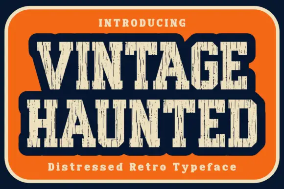
Distressed retro slab
Vintage Haunted is a distressed retro slab in cream on an orange panel with a navy ground: condensed caps with heavy vertical slabs, a rounded outer contour and long vertical gaps cut through the stems, with a tracked line above and a caption beneath.
Ideas for this font
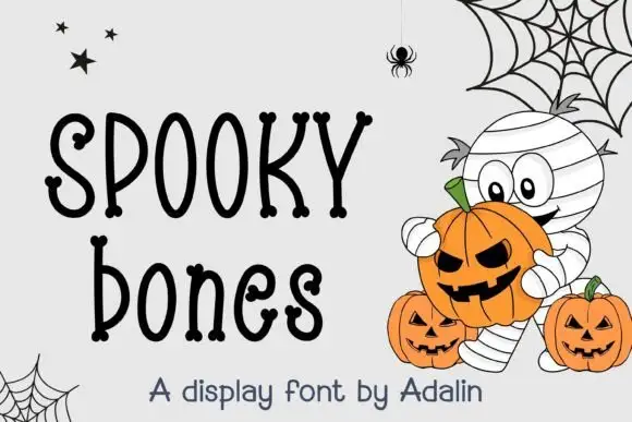
Quirky hand-drawn display with bead terminals
Spooky Bones is a quirky hand-drawn display in black on white: tall narrow letters with ball terminals, a wobbly baseline, mixed letter widths and small bead details on the stems, presented with a pumpkin-and-mummy illustration, so the plate reads as a children's Halloween card.
Ideas for this font
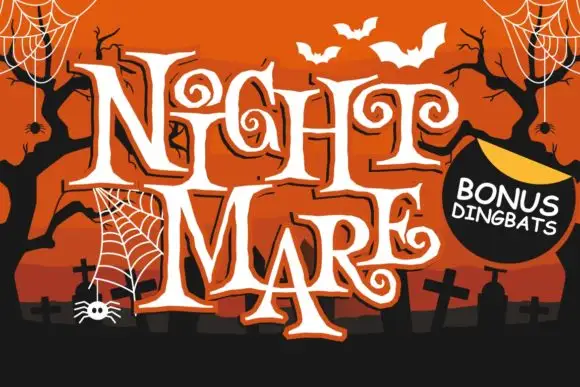
Angular spiral-terminal horror serif
Night Mare is an angular decorative serif in which the letters stay uneven, the feet come to points and the terminals coil inward in tight spirals, so a stacked title reads as gothic horror lettering rather than a clean historical blackletter.
Ideas for this font
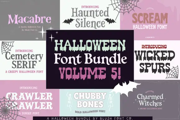
Halloween set mixing pointed serifs, dripping slabs and rounded outlined letters
Halloween Bundle Volume 5 is a seasonal set of eight cuts in which pointed serifs, dripping slabs, rounded outlined letters and shaky handwritten faces sit together, so one purchase covers a poster, a tag and a shirt in the same mood.
Ideas for this font
Same independent foundry
Allow optional Google Analytics to measure visits and catalogue actions. Your search words and notes are not included. Privacy & storage