Neutral Sans Workhorse

Funies Halloween + Nyxar
Lets Funies Halloween own the focal silhouette while handling secondary copy, sizing and subheads cleanly.
Inspect Nyxar specimenDisclosure: MakerFileHub may earn a commission from qualifying purchases via paid links on this page. How our links work.
Loose rounded lettering with varied heights and uneven crossbars
Funies Halloween is a loose rounded display alphabet in which the letters bounce above and below the baseline, the heights vary and the crossbars sit at different levels, so a word reads as something cut out and taped down.
Paid link
Get this fontProject & layout blueprintsAt-a-glance maker compatibility
Sturdy stroke walls and open counters weed cleanly on adhesive vinyl, HTV apparel film, and cut cardstock.
Visual anatomy & craft review
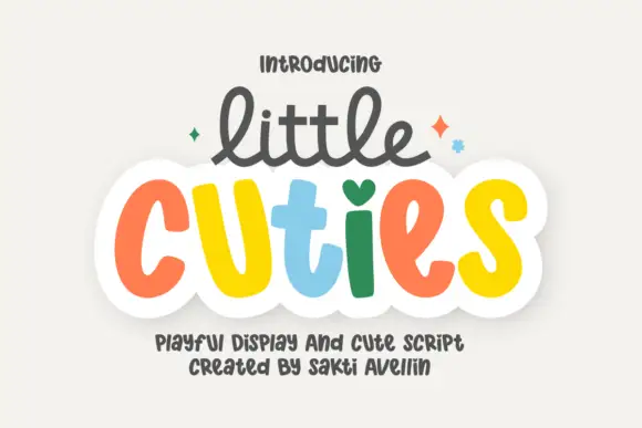
The F keeps a rounded arm and a short middle bar set high, the u holds a deep bowl, the n keeps a wide shoulder and the s reverses through two plump curves, all at a heavy even weight with fully rounded ends. The bounce is systematic: each letter is shifted a little off the baseline and the counters vary, which is what gives the face its cut-paper energy at 50 pt. Because the letters are separate and equally weighted, they can take a different colour each without losing the rhythm — the sample uses four colours across two words. The bounce makes the face a poor choice for anything that must align, so it belongs on headings and party pieces only. The white ground, the pastel fills, the sparkles and the two caption lines are presentation; the display face is the two words.
Loose · Rounded · Bouncy
Two-font hierarchy recipes
Tested contrast partners — pairing Funies Halloween with grounded secondary typography.
Funies Halloween + Nyxar
Lets Funies Halloween own the focal silhouette while handling secondary copy, sizing and subheads cleanly.
Inspect Nyxar specimen
Funies Halloween + Wolles Elegant Modern Serif
Grounds bold display lettering with classic typographic authority on posters, badges and apparel.
Inspect Wolles Elegant Modern Serif specimenPractical applications
Concrete hierarchy, scale and production guidance tailored to Funies Halloween’s stroke geometry.
The bouncing letters read as cut paper shapes, and the unjoined construction makes each one easy to die-cut for a garland at 30 mm.
Hierarchy & layout recipe
Print a die-cut garland: set each letter at 30 mm with the bounce intact, keep 5 mm between die cuts, and leave 4 mm of material around each rounded end so the cut does not nick the letter.
Pre-production check
A bounced letter placed on a straight string line looks crooked; check the strung garland and keep the bounce within 4 mm so the shapes still read as one word.
The loose weight reads on a box sticker at 15 pt and gives a seasonal bakery product a playful register without needing a mascot.
Hierarchy & layout recipe
Print a 55 mm round sticker: set the greeting at 15 pt within the die, keep 5 mm of margin so the bounced letters are not clipped by the circle, and check that no letter wanders outside the safe area.
Pre-production check
A bounced letter close to a round die gets clipped; check the artwork on the die line and shift the whole lockup up rather than flattening the bounce.
The heavy bouncing letters carry a printed backdrop at 60 mm, and the per-letter colour lets one print match any party palette.
Hierarchy & layout recipe
Print a 1.5 by 1 m paper backdrop: set the greeting at 60 mm, keep 10 mm between letters so the shapes stay separate, and leave 15 cm of blank paper at each end so the fixings fall on plain ground.
Pre-production check
Backdrop paper creases between fixings; add a centre support and check the hung print before the party rather than after.
Technical & licence verification
Confirm included OTF/TTF/WOFF formats, full glyph tables and licence coverage on the live store page before batch production.
Closest visual alternatives
Matched across letterform anatomy, stroke behaviour and craft applications.
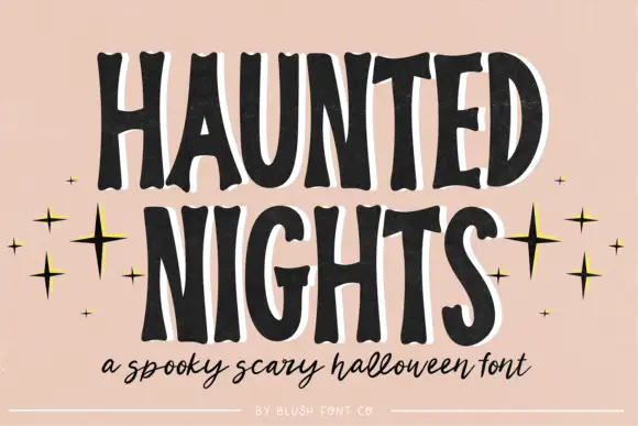
Tall irregular spooky capitals with wobbly contours
Haunted Nights is a tall irregular capital alphabet in which the stems wobble, the counters sag and the outline breaks unevenly, so a two-word greeting reads as lettering cut quickly for a porch sign.
Ideas for this font
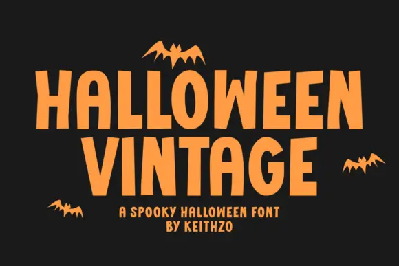
Plain Halloween capitals with irregular vertical rhythm and flat terminals
Halloween Vintage is a plain capital alphabet in which the letters are condensed, the vertical rhythm shifts slightly and the terminals stay flat, so a word reads as cut paper lettering rather than as a decorated seasonal face.
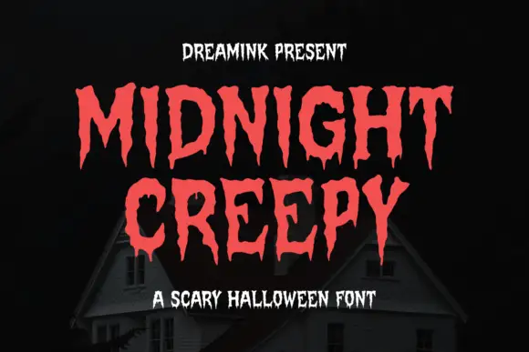
Display
Midnight Creepy is a horror display face in which every stroke melts: the caps are heavy and irregular, and the bottoms of the letters run down into long drips that end in rounded drops.
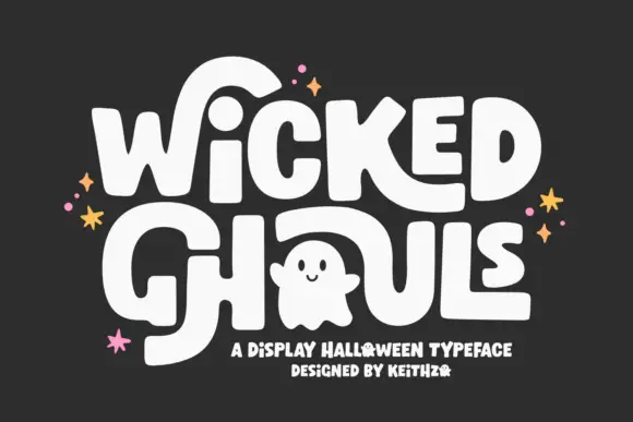
Round Halloween blocks with oversized sweeping strokes
Wicked Ghouls builds heavy softly rounded capitals and then lets one counter become a ghost, with oversized strokes sweeping away from the word.
Ideas for this font
Same independent foundry
Allow optional Google Analytics to measure visits and catalogue actions. Your search words and notes are not included. Privacy & storage