Neutral Sans Workhorse

Smiley Candy + Nyxar
Lets Smiley Candy own the focal silhouette while handling secondary copy, sizing and subheads cleanly.
Inspect Nyxar specimenDisclosure: MakerFileHub may earn a commission from qualifying purchases via paid links on this page. How our links work.
Emoji-face layered display
Smiley Candy is a decorative display in pastel colours with black outlines: rounded letters that carry simple faces — eyes, smiles and blushes — plus small arms and legs on some characters, arranged in two lines with a name-tag speech bubble above and a scalloped label beneath.
Paid link
Get this fontProject & layout blueprintsAt-a-glance maker compatibility
Cut solid base, outline, and shadow layers in separate vinyl colors and align on registration marks.
Visual anatomy & craft review
The two words are stacked and each letter is a character: the bowl of a letter becomes a face, the terminals become arms, and the feet sit on the baseline, which turns the word into a cast rather than a text line. The construction is deliberately layered — a filled shape, a black outline, a blush and a face — and the badge at the lower right says five layers, which is what a buyer needs to know for cutting and printing. Because the characters need room, the letters are spaced generously, and the specimen sets the block large on a cream ground with a small heart and stars. The type below the block is a rounded sans in black on a scalloped label, which is the only neutral voice on the plate.
Decorative, cute, layered, playful
Two-font hierarchy recipes
Tested contrast partners — pairing Smiley Candy with grounded secondary typography.
Smiley Candy + Nyxar
Lets Smiley Candy own the focal silhouette while handling secondary copy, sizing and subheads cleanly.
Inspect Nyxar specimen
Smiley Candy + Cronelo
Grounds bold display lettering with classic typographic authority on posters, badges and apparel.
Inspect Cronelo specimenPractical applications
Concrete hierarchy, scale and production guidance tailored to Smiley Candy’s stroke geometry.
Faced letters read as characters, which is exactly what a small child responds to, and the layered construction can be flattened to one colour for a home print.
Hierarchy & layout recipe
A6 card: the name at 30 pt, the details in a 9 pt rounded sans, and two stars. Keep 14 mm margins, keep the faces above 3 mm so they survive at card size, and print one ink on a white card.
Pre-production check
Check the 30 pt name, where the facial features can blur at 300 dpi; keep the eyes above 1 mm. Confirm the 9 pt details keep a 4.5:1 contrast and that the stars clear the trim.
A faced sticker is the favour itself, and the layered cut lets a maker build a set with consistent eyes and smiles across every letter.
Hierarchy & layout recipe
Die-cut 45 mm stickers: one letter per sticker at 30 mm, a 2 mm outline, and 2 mm clear to the die. Keep the face features at least 2 mm and print four colours on white vinyl.
Pre-production check
Check the 30 mm letters, where arms and legs can snap at the die edge; thicken them. Confirm the stickers peel cleanly and that the faces stay registered across the set.
A character label makes a small sweet brand memorable to children, and the flat version prints on a round label without a special process.
Hierarchy & layout recipe
Print a 50 mm round label: the brand at 12 pt, the flavour in a 6 pt rounded sans, and one small face. Keep 4 mm inside the die and print three colours on a white stock so the outline stays crisp.
Pre-production check
Check the 12 pt brand, where the face can close into a blob; enlarge the eyes. Confirm the 6 pt flavour reads on the shelf and that the label adheres to a wrapped bag.
Technical & licence verification
Confirm included OTF/TTF/WOFF formats, full glyph tables and licence coverage on the live store page before batch production.
Closest visual alternatives
Matched across letterform anatomy, stroke behaviour and craft applications.
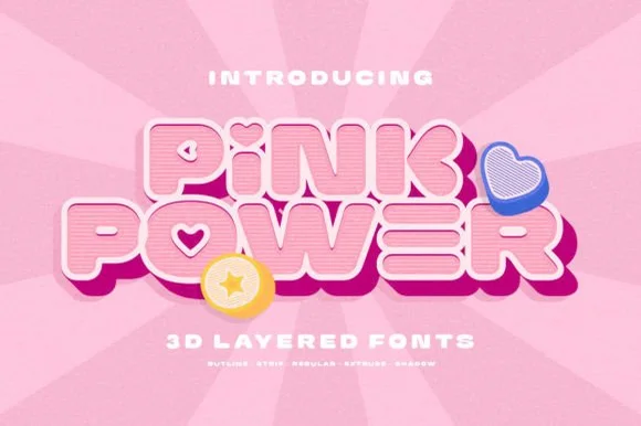
5-style 3D retro Y2K bubble sans + cute icons (Outline, Strip, Regular, Extrude, Shadow)
Pink Power is a 5-style layered 3D retro sans system (Regular, Outline, Strip, Extrude, Shadow) bundled with cute heart/star 3D icons.
Ideas for this font
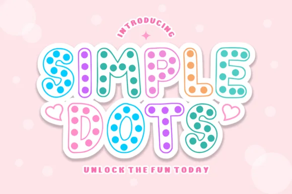
Hollow-outline polka-dot cartoon bubble display
Simple Dots fills crisp double-outlined cartoon bubble letters with cheerful polka-dot confetti for sweet stationery and party prints!
Ideas for this font
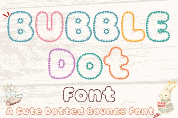
Beaded-pearl outline bouncy kids' bubble font (OTF & TTF)
Bubble Dot traces plump, bouncy cartoon bubble letters entirely out of tiny pearl-bead rings with cozy hollow centers (OTF & TTF)!
Ideas for this font
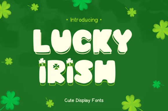
Chunky 3D display with offset shadow layer
Lucky Irish is a chunky display in cream with a solid green offset behind it: fat rounded caps, irregular letter heights, a clover tucked into the I, and a hard-edged shadow layer that steps down and right to give the word thickness.
Ideas for this font
Same independent foundry
Allow optional Google Analytics to measure visits and catalogue actions. Your search words and notes are not included. Privacy & storage