Neutral Sans Workhorse

Lucky Irish + Montreal
Lets Lucky Irish own the focal silhouette while handling secondary copy, sizing and subheads cleanly.
Inspect Montreal specimenDisclosure: MakerFileHub may earn a commission from qualifying purchases via paid links on this page. How our links work.
Chunky 3D display with offset shadow layer
Lucky Irish is a chunky display in cream with a solid green offset behind it: fat rounded caps, irregular letter heights, a clover tucked into the I, and a hard-edged shadow layer that steps down and right to give the word thickness.
Paid link
Get this fontProject & layout blueprintsAt-a-glance maker compatibility
Sturdy stroke walls and open counters weed cleanly on adhesive vinyl, HTV apparel film, and cut cardstock.
Visual anatomy & craft review
Both words are set large on a green ground and the drawing is deliberately uneven: the L and the U differ in height, the C leans into the K, and the I of the second word carries a small clover in place of a dot, which is the only decorative element in the letterforms. A cream fill sits over a solid green offset layer, so the depth reads as a single hard step rather than a gradient, and the offset is consistent across the word, which keeps the construction tidy despite the playful proportions. The counters are wide and round, which is what allows the face to stay legible at the small sizes a card or a sticker needs. The ground is a green field of clovers, and the caption at the foot is a rounded sans, so the whole specimen is built from the same two colours.
Chunky, cute, dimensional, festive
Two-font hierarchy recipes
Tested contrast partners — pairing Lucky Irish with grounded secondary typography.
Lucky Irish + Montreal
Lets Lucky Irish own the focal silhouette while handling secondary copy, sizing and subheads cleanly.
Inspect Montreal specimen
Lucky Irish + Auretha
Grounds bold display lettering with classic typographic authority on posters, badges and apparel.
Inspect Auretha specimenPractical applications
Concrete hierarchy, scale and production guidance tailored to Lucky Irish’s stroke geometry.
A chunky display with a hard offset shadow reads as a cheerful shop sign, and the single step of depth prints cleanly in two flat colours.
Hierarchy & layout recipe
A6 card: the word at 34 pt with a 1.5 mm offset, the offer in a 9 pt rounded sans beneath, and a clover motif at the top. Keep the whole card to green and cream and leave 12 mm margins so the offset never reaches the trim.
Pre-production check
Check the offset at 34 pt, where a 1 mm step can look like a misregistration; keep it at 1.5 mm and consistent. Confirm the 9 pt offer keeps a 4.5:1 contrast on the green and that the clover motif does not sit on the word.
A rounded chunky face with a single depth step makes a small sticker read at arm's length, and the wide counters survive being printed at 30 mm.
Hierarchy & layout recipe
Die-cut a 35 mm round sticker: the word at 14 pt with a 0.8 mm offset, and a 1.5 mm cream border to the die. Keep the offset colour distinct from the ground so the depth reads on any surface.
Pre-production check
Check the 14 pt word on the die-cut sticker, where the offset can merge with the cream fill; separate the tones. Confirm the die line clears the letters by 1.5 mm and that the sticker still reads on both light and dark surfaces.
A chunky festive face gives a limited-edition bottle a seasonal identity, and the two-colour construction keeps the label cheap to print on a short run.
Hierarchy & layout recipe
Print a 60 mm round label: the word at 16 pt with a 1 mm offset, the flavour in 7 pt caps, and the volume in 6 pt. Keep 4 mm of clear label inside the die so the offset layer does not run off the edge.
Pre-production check
Check the label on a dark glass bottle, where the ground disappears and the offset layer becomes the only edge; specify a cream base for the label. Confirm the 6 pt volume reads on the curve and that the offset stays even around the die.
Technical & licence verification
Confirm included OTF/TTF/WOFF formats, full glyph tables and licence coverage on the live store page before batch production.
Closest visual alternatives
Matched across letterform anatomy, stroke behaviour and craft applications.
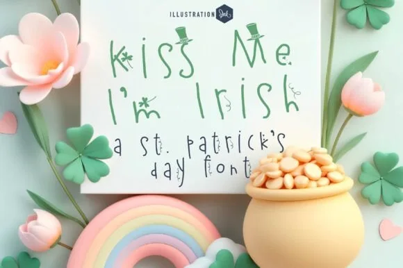
Whimsical fine-pen St. Patrick's print topped with shamrocks & top hats
Kiss Me I'm Irish is a light, playful hand-drawn St. Patrick's print font adorning slender stems with tiny shamrocks and tilted leprechaun top hats!
Ideas for this font
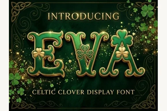
Shamrock-embellished St. Patrick's Celtic display serif
Eva Celtic is a festive St. Patrick's display serif decorating flared Celtic-style capitals with built-in three-leaf shamrock cutouts and sprigs.
Ideas for this font
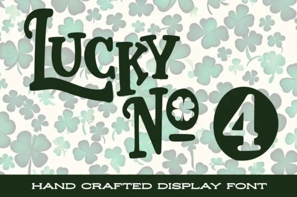
Handcrafted St. Patrick's display with shamrock counters
Lucky No. 4 is a lively, hand-crafted St. Patrick's display typeface featuring bouncy tall capitals, shamrock-filled counters, and badge numerals.
Ideas for this font
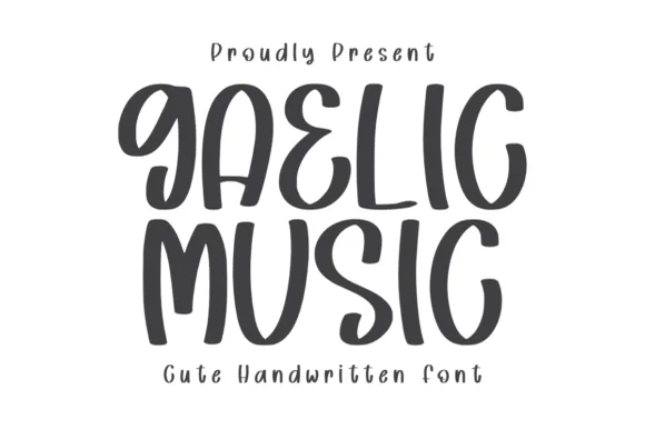
Quirky spiral-hooked folk & Celtic-poster print sans (NOT cursive!)
Gaelic Music is actually a bold, disconnected folk-poster print font (NOT connected cursive!) curling whimsical Celtic-inspired spiral hooks onto 'G', 'A', 'E', 'C', and 'S'!
Ideas for this font
Same independent foundry
Allow optional Google Analytics to measure visits and catalogue actions. Your search words and notes are not included. Privacy & storage