High-Contrast Display Serif

Single Line + Svara
Pairs sculptural editorial warmth with Single Line's clean modern geometry.
Inspect Svara specimenDisclosure: MakerFileHub may earn a commission from qualifying purchases via paid links on this page. How our links work.
Rounded monoline capitals
Single Line is a rounded monoline sans in black on a pale ruled sheet: upright capitals with narrow oval bowls, an even stroke, soft terminal ends and wide letter spacing, set as one line between a small tracked line above and a plain line beneath.
Paid link
Get this fontProject & layout blueprintsAt-a-glance maker compatibility
Set Cricut or Silhouette operation to Pen, Foil Quill, or Laser Score — not Basic Blade Cut.
Visual anatomy & craft review
The plate is almost empty and that suits the face: one line of capitals, wide spaced, on a faint ruled ground, with two small lines of copy. The drawing is a rounded monoline with narrow oval bowls, so the face reads as quiet and functional rather than as decorative, and the even stroke means it holds at small sizes where a contrast face would fail. That construction gives a low size floor and makes the face usable for a caption and a sign from one file. The ruled ground is staging, and the two small lines are product copy that name the style. Because the letters are rounded and even, the face suits a label, a sign and a short caption, and the wide spacing is best kept for headings rather than for running text.
Sans serif, monoline, rounded, quiet
Two-font hierarchy recipes
Tested contrast partners — pairing Single Line with grounded secondary typography.
Single Line + Svara
Pairs sculptural editorial warmth with Single Line's clean modern geometry.
Inspect Svara specimen
Single Line + Farmhouse
Introduces organic movement on pull-quotes, signatures and gift tags.
Inspect Farmhouse specimenPractical applications
Concrete hierarchy, scale and production guidance tailored to Single Line’s stroke geometry.
A quiet monoline reads as a working studio, and the even stroke holds on a small plate where a contrast face would not. The even stroke holds on brushed metal.
Hierarchy & layout recipe
Fabricate a 300 by 120 mm plate: the studio at 40 mm cap height, the floor at 14 mm, and a 2 mm rule. Keep 15 mm margins and specify a brushed finish with a matte etch.
Pre-production check
Check the plate at 40 mm, where a narrow oval can close in an etch; keep the counters above 2 mm. Confirm the 14 mm floor reads at two metres and that the rule aligns with the text block.
A monoline caption stays quiet under a photograph, and the even stroke keeps a long line readable at small size. It stays quiet beneath a photograph.
Hierarchy & layout recipe
Set the captions at 8.5 pt with 1.35 leading, the headings at 22 pt, and the numbers at 9 pt. Print one ink on an uncoated stock and keep 18 mm margins.
Pre-production check
Check the 8.5 pt captions in a proof, where a narrow oval can fill; keep the size at 8.5 pt or above. Confirm the numbers keep a 4.5:1 contrast and that the captions align to the grid.
A monoline list reads at a glance, and the even stroke survives a laminated sheet on a door. The list reads at a glance from the door.
Hierarchy & layout recipe
A4 sheet: the heading at 30 mm cap height, the names at 14 mm, and one ink on a light card. Keep 20 mm margins and laminate the sheet so it wipes clean.
Pre-production check
Check the sheet at actual size, where the lamination can fill a narrow counter; keep the counters above 1.5 mm. Confirm the names read at two metres and that the sheet hangs flat.
Technical & licence verification
Confirm included OTF/TTF/WOFF formats, full glyph tables and licence coverage on the live store page before batch production.
Closest visual alternatives
Matched across letterform anatomy, stroke behaviour and craft applications.
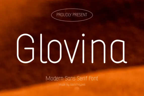
Slender rounded monoline mixed case with a double-storey a and long curved l foot
Glovina is a thin modern sans: light monoline strokes, wide spacing, a single-storey a and a dot on the i drawn as a small teardrop rather than a circle.
Ideas for this font
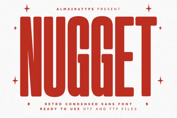
Very tall heavy capitals with rounded corners and narrow internal channels
Nugget shows red capitals filling most of a white cover, where thick near-even strokes leave thin vertical openings in the U and G, the N draws a sharply narrowing diagonal and every outer corner softens.
Ideas for this font
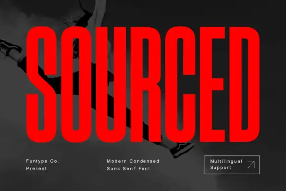
Very condensed heavy capitals with narrow rounded rectangular counters
Sourced shows vivid red capitals across a dark monochrome photograph, where tall heavy uprights and flat-ended arms leave thin rounded rectangular counters inside the O and D, the R carries a straight angled leg and the C opens only a small gap on its right side.
Ideas for this font
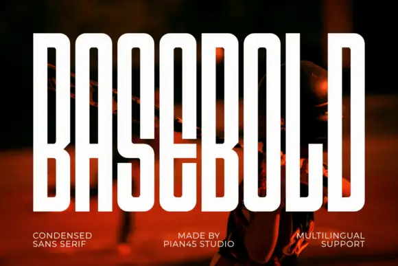
Extremely tall narrow capitals with long rectangular counters and small angular B joins
Basebold is an extremely tall condensed sans: letterforms squeezed to narrow columns, flat shoulders, and counters reduced to vertical slits that still stay open at headline sizes.
Ideas for this font
Same independent foundry
Allow optional Google Analytics to measure visits and catalogue actions. Your search words and notes are not included. Privacy & storage