Editorial Serif Anchor

Clean Notes + The Bilstein Editorial
Anchors Clean Notes's fluid strokes with crisp Roman proportions on wedding suites, headers and packaging.
Inspect The Bilstein Editorial specimenDisclosure: MakerFileHub may earn a commission from qualifying purchases via paid links on this page. How our links work.
Very thin upright unjoined note handwriting
Clean Notes shows tall thin unjoined letters with a broad C and narrow upright n forms, where smaller diary lines sit on photographed notebook rules and the page hole belongs to the photo rather than the type.
Paid link
Get this fontProject & layout blueprintsAt-a-glance maker compatibility
Weld or Unite overlapping script joins into one continuous vector path before sending to the blade.
Visual anatomy & craft review
The strokes stay very fine, the letters never connect, the bowls close narrow and the height runs tall relative to the width. That unjoined thin hand is the character: the page reads as a careful annotation rather than a signature, which is why the sample pairs it with ruled lines. Those rules and the punched hole are artwork, so set your own baseline, keep 20 pt as the floor and choose a smooth stock that will not break a hairline.
Thin · Upright · Unjoined
Two-font hierarchy recipes
Tested contrast partners — pairing Clean Notes with grounded secondary typography.
Clean Notes + The Bilstein Editorial
Anchors Clean Notes's fluid strokes with crisp Roman proportions on wedding suites, headers and packaging.
Inspect The Bilstein Editorial specimen
Clean Notes + One More
Keeps small-scale dates, URLs, nutrition facts and care instructions crisp and legible below script titles.
Inspect One More specimenPractical applications
Concrete hierarchy, scale and production guidance tailored to Clean Notes’s stroke geometry.
The thin unjoined hand keeps a note understated, and the tall letters stay clear at 22 pt on an A6 card, so nothing competes with the message.
Hierarchy & layout recipe
Print an A6 card: set the line at 22 pt across the upper third, keep 14 mm of clear ground beneath, and leave the lower half blank so the printed line only opens the note.
Pre-production check
A hairline printed at 14 pt breaks on textured card; check the proof and choose a smooth stock.
The annotation tone suits a photo caption, and the unjoined letters hold a short line at 18 pt beneath an image, where the thin strokes stay light against the picture.
Hierarchy & layout recipe
Print a 210 mm page: set the caption at 18 pt in one line beneath the photograph, keep 10 mm of clear ground above and below, and keep the text aligned to the image edge rather than the column.
Pre-production check
Thin handwriting set as body copy tires the eye; check the page and keep the face for captions only.
The neat annotation hand suits stationery, and the fine strokes hold a short name at 20 pt on a 50 mm panel, provided the label is printed on smooth stock.
Hierarchy & layout recipe
Print a 50 by 35 mm label: set the name at 20 pt on one line, keep 6 mm of clear ground beneath for the street at 6 pt, and keep 5 mm of border all round.
Pre-production check
A hairline on a small label disappears at arm's length; check the label in place and hold the name at 20 pt.
Technical & licence verification
Confirm included OTF/TTF/WOFF formats, full glyph tables and licence coverage on the live store page before batch production.
Closest visual alternatives
Matched across letterform anatomy, stroke behaviour and craft applications.

Tall narrow letters left unjoined
Simple Alphabet is a tall narrow display face in black on a pale photograph of loose lettering blocks: monoline letters with rounded ends, open counters and wide spacing, set unjoined so each letter stands on its own.
Ideas for this font

Bouncing tail script with long entry and exit swashes
Farmhouse is a bouncing tail script in which the letters sit at different heights, the strokes swell on the downstroke and long swashes enter and leave the word, so a name reads as hand lettering on a painted board.
Ideas for this font
Modern farmhouse script with open descenders and long exit tails
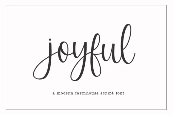
Joyful Script is a modern farmhouse script with light even strokes, wide open descenders and long exit tails, drawn so a single word sits evenly across a wide card.
Ideas for this font
Light looping connected hand with large open counters
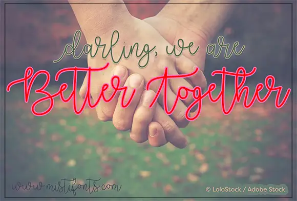
Better Together is light connected handwriting in a single even stroke, with large open loops on the ascenders and a wide, relaxed rhythm that makes a short phrase read as one flowing line.
Ideas for this font
Same independent foundry
Allow optional Google Analytics to measure visits and catalogue actions. Your search words and notes are not included. Privacy & storage