Modern Grotesque Body

Silver Stone + Furion
Creates crisp high-hierarchy contrast beneath Silver Stone headlines across menus, websites and labels.
Inspect Furion specimenDisclosure: MakerFileHub may earn a commission from qualifying purchases via paid links on this page. How our links work.
Narrow vintage capitals with curled terminals
Silver Stone is a narrow vintage serif in cream with a grey shadow on charcoal: capitals with curled S forms, a long returning L, small tucked serifs and a soft dimensional edge, set in a staggered three-line lockup with a small dated note at the right and two tracked notes at the shoulders.
Paid link
Get this fontProject & layout blueprintsAt-a-glance maker compatibility
Sturdy stroke walls and open counters weed cleanly on adhesive vinyl, HTV apparel film, and cut cardstock.
Visual anatomy & craft review
The lockup is staggered rather than flush, which is the right call for a face with this much terminal detail, because the words are set on three slightly offset lines and each word can be judged on its own silhouette. The drawing is a narrow vintage serif with curled spurs and a long returning L, and the pale-grey shadow is a light treatment applied to the artwork rather than a glyph weight, so a buyer should expect the plain file to be flat. That construction sets a moderate size floor, since the curls close when the letters shrink. The charcoal ground is staging, and the dated note and the two tracked shoulder notes are product furniture. It suits a shop sign, a label and a poster for a business that wants a period voice.
Serif, vintage, narrow, ornamental
Two-font hierarchy recipes
Tested contrast partners — pairing Silver Stone with grounded secondary typography.
Silver Stone + Furion
Creates crisp high-hierarchy contrast beneath Silver Stone headlines across menus, websites and labels.
Inspect Furion specimen
Silver Stone + Esmeralda
Adds a warm human signature touch for 1-to-3-word callouts without competing against structured serif capitals.
Inspect Esmeralda specimenPractical applications
Concrete hierarchy, scale and production guidance tailored to Silver Stone’s stroke geometry.
A narrow vintage serif reads as a painted sign, and the curled terminals give a plain shop name a period voice on a dark board.
Hierarchy & layout recipe
Paint a 1,000 by 380 mm board: the shop at 110 mm cap height, the hours in a 22 mm serif, and a 5 mm rule. Keep 25 mm margins and paint two colours on a primed board.
Pre-production check
Check the board at five metres, where a curl can look like a drip; keep the spurs deliberate. Confirm the 22 mm hours read at two metres and that the rule survives a wet season.
A vintage serif gives a bottle label a period register, and the narrow width fits a long estate name on a small die. A bottle label rewards a period serif.
Hierarchy & layout recipe
Print a 60 by 90 mm label: the distillery at 13 pt, the expression at 8 pt, and the volume at 7 pt. Keep 5 mm inside the die and keep the curls above 0.3 mm.
Pre-production check
Check the 13 pt name on a bottle, where a curl can fill; keep the strokes above 0.3 mm. Confirm the 7 pt volume reads on the shelf and that the label holds in a cellar.
A period serif frames a local history title, and the staggered lockup can be re-created on a cover without a photograph.
Hierarchy & layout recipe
Set the title at 70 mm cap height in a staggered lockup, the author in a 12 pt serif, and the imprint at 8 pt. Print two colours on a textured stock and keep 22 mm margins.
Pre-production check
Check the title at 70 mm, where a returning L can collide with the word beneath; set the stagger first. Confirm the 8 pt imprint survives lamination and that the title clears the trim.
Technical & licence verification
Confirm included OTF/TTF/WOFF formats, full glyph tables and licence coverage on the live store page before batch production.
Closest visual alternatives
Matched across letterform anatomy, stroke behaviour and craft applications.
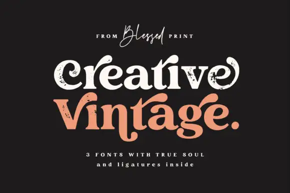
Distressed curled vintage serif
Creative Vintage is a high-contrast serif in which the terminals curl into swash shapes, the C turns inward, the t finishes in a broad low hook and scattered distressed marks break the fill, so a title reads as a worn printed label.
Ideas for this font
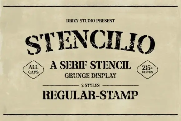
Distressed serif stencil
Stencilio is a distressed serif stencil in black on aged paper: heavy caps with interrupted bowls and rough feet, the letters set on a shallow arc, with a tracked line above, a small caps line and a two-diamond label beneath and a full second line in the stamp style.
Ideas for this font
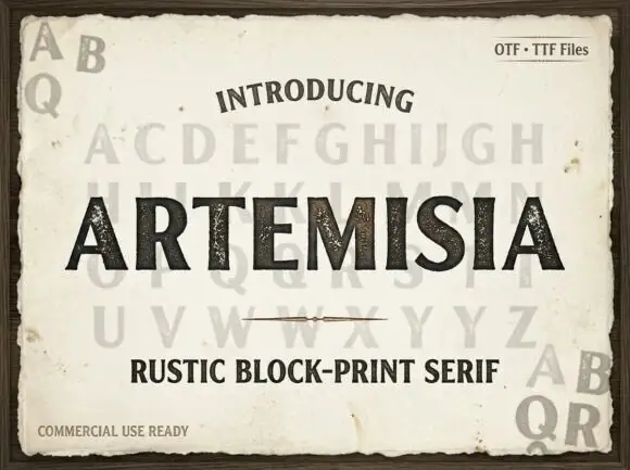
Heavy uppercase shapes with speckled interiors and small flared feet
Artemisia shows substantial black capitals on weathered cream paper: the upright strokes and broad diagonals carry scattered pale speckles, the R ends its leg sharply, the A opens a compact triangular counter and small flared feet close each stem.
Ideas for this font
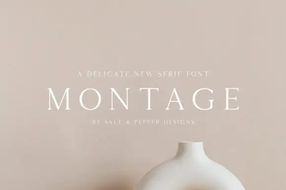
Delicate high-contrast serif
Montage is a delicate serif in white on a soft beige field: very fine hairlines, wide letterspacing, thin bracketed serifs and a high waist, set in caps on one line with a tracked line above and an attribution beneath, on a still life of a ceramic vessel.
Ideas for this font
Same independent foundry
Allow optional Google Analytics to measure visits and catalogue actions. Your search words and notes are not included. Privacy & storage