Editorial Serif Anchor

Signature Creation + Grandeur – Elegant Classic Serif
Anchors Signature Creation's fluid strokes with crisp Roman proportions on wedding suites, headers and packaging.
Inspect Grandeur – Elegant Classic Serif specimenDisclosure: MakerFileHub may earn a commission from qualifying purchases via paid links on this page. How our links work.
Retro sign-painting condensed display
Signature Creation is a retro sign-painting display in yellow on a teal badge: condensed brush capitals with thick stems, a slight forward slant, and a heavy offset shadow that steps down and right, so the words read as painted shop lettering.
Paid link
Get this fontProject & layout blueprintsAt-a-glance maker compatibility
Cut solid base, outline, and shadow layers in separate vinyl colors and align on registration marks.
Visual anatomy & craft review
The two words are stacked inside a rounded badge with a dotted border, and the drawing imitates a sign painter's brush: the stems are thick and slightly irregular, the terminals are cut at an angle, and the whole block leans, which gives it the speed of hand lettering. The offset shadow is solid and consistent, in a darker tone, and it is thick enough to look like a second painted layer rather than a drop shadow, which is the technique this style depends on. Spacing is tight, so the words read as a single block, and the counters stay open because the letters are condensed rather than wide. A paint-swipe underline closes the block, and the caption sits in a small angled plate at the foot, so the specimen reads as a hand-painted sign rather than a type sample.
Retro, condensed, sign-painted, bold
Two-font hierarchy recipes
Tested contrast partners — pairing Signature Creation with grounded secondary typography.
Signature Creation + Grandeur – Elegant Classic Serif
Anchors Signature Creation's fluid strokes with crisp Roman proportions on wedding suites, headers and packaging.
Inspect Grandeur – Elegant Classic Serif specimen
Signature Creation + Bareum
Keeps small-scale dates, URLs, nutrition facts and care instructions crisp and legible below script titles.
Inspect Bareum specimenPractical applications
Concrete hierarchy, scale and production guidance tailored to Signature Creation’s stroke geometry.
A sign-painting display gives a shopfront the look of hand lettering, and the offset shadow adds depth that a flat vinyl sign would not have.
Hierarchy & layout recipe
Paint a 900 by 400 mm board: the name at 140 mm cap height with a 5 mm offset, the services in a 25 mm sans, and a paint-swipe rule beneath. Keep the whole board to two colours plus the offset tone so it reads from the pavement.
Pre-production check
Check the offset at 5 mm on the board, where it must stay even on the slant; inspect the verticals. Confirm the 25 mm services read from three metres and that the paint-swipe rule does not cross the descenders.
A retro sign face reads as fairground lettering and stands out among printed banners, and the condensed width fits a long stall name across the top.
Hierarchy & layout recipe
Print an A3 poster: the stall name at 110 mm cap height with a 4 mm offset, the prices in a 16 mm sans, and a dotted border. Keep 25 mm margins and use three flat colours so the offset reads as a separate layer.
Pre-production check
Check the offset at A3, where a 4 mm step can look like a registration error; keep it consistent on every letter. Confirm the 16 mm prices read at two metres and that the border does not cut the shadow.
A sign-painting display gives a design annual a cover that looks made by hand, and the offset construction keeps the lettering from reading as a flat title on a busy cover.
Hierarchy & layout recipe
Set the title at 130 mm wide on a 240 mm cover, the year in a 12 pt sans, and a paint-swipe rule beneath. Print three inks on a mid stock so the offset layer reads as paint rather than as a printed shadow.
Pre-production check
Check the title at thumbnail size, where the offset can blur the letters together; keep the step under 5 mm at that scale. Confirm the 12 pt year is legible online and that the rule clears the shadow.
Technical & licence verification
Confirm included OTF/TTF/WOFF formats, full glyph tables and licence coverage on the live store page before batch production.
Closest visual alternatives
Matched across letterform anatomy, stroke behaviour and craft applications.
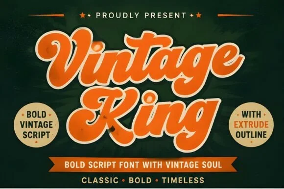
Layered 1950s–70s sign-painter script (Regular, Extrude & Outline)
Vintage King is a thick, creamy retro script family bundled with matched Extrude and Outline cuts plus stylistic swash alternates.
Ideas for this font
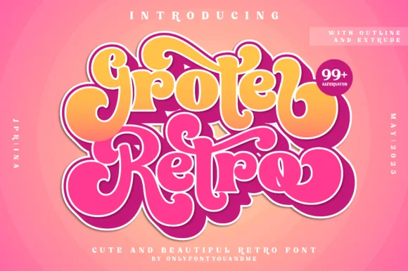
Layered 1970s bubble script family (Outline, Extrude & 99+ alternates)
Groter Retro is a plump, 1970s marshmallow script family bundled with matched Outline and Extrude font layers plus 99+ stylistic alternates.
Ideas for this font
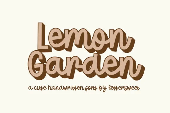
Cute handwritten display with offset depth
Lemon Garden is a cute handwritten display in tan with a brown offset: fat rounded mixed-case letters with a wavy baseline, wide bowls and short ascenders, and a hard shadow layer that steps down and to the right on every letter.
Ideas for this font

Slanted signature cursive with sweeping underline swash
William Jameson is a lively monoline signature script with broad looping capitals and a bold underline swash tail.
Ideas for this font
Same independent foundry
Allow optional Google Analytics to measure visits and catalogue actions. Your search words and notes are not included. Privacy & storage