Editorial Serif Anchor

Lemon Garden + Mewah
Anchors Lemon Garden's fluid strokes with crisp Roman proportions on wedding suites, headers and packaging.
Inspect Mewah specimenDisclosure: MakerFileHub may earn a commission from qualifying purchases via paid links on this page. How our links work.
Cute handwritten display with offset depth
Lemon Garden is a cute handwritten display in tan with a brown offset: fat rounded mixed-case letters with a wavy baseline, wide bowls and short ascenders, and a hard shadow layer that steps down and to the right on every letter.
Paid link
Get this fontProject & layout blueprintsAt-a-glance maker compatibility
Cut solid base, outline, and shadow layers in separate vinyl colors and align on registration marks.
Visual anatomy & craft review
The two words are stacked and the drawing is playful rather than constructed: the letters are rounded and uneven in width, the l leans forward, the G swells at the bowl, and the baseline ripples so the word looks written on a line rather than set on one. The depth is a single solid offset in a darker tone, consistent across the pair, which turns the lettering into a paper cut-out without any gradient. Counters are wide and round, so the face stays legible at label and card sizes, which is unusual for a display with this much bounce. The ground is a plain cream, and the caption beneath is set in a light connected script, so the whole page uses two tones and one colour family.
Cute, handwritten, layered, wavy
Two-font hierarchy recipes
Tested contrast partners — pairing Lemon Garden with grounded secondary typography.
Lemon Garden + Mewah
Anchors Lemon Garden's fluid strokes with crisp Roman proportions on wedding suites, headers and packaging.
Inspect Mewah specimen
Lemon Garden + Bargain Condensed
Keeps small-scale dates, URLs, nutrition facts and care instructions crisp and legible below script titles.
Inspect Bargain Condensed specimenPractical applications
Concrete hierarchy, scale and production guidance tailored to Lemon Garden’s stroke geometry.
A cute wavy display reads as friendly before the words are parsed, and the offset gives a home-printed card a finished look without extra artwork.
Hierarchy & layout recipe
A6 card: the name at 32 pt with a 1.2 mm offset, the details in a 9 pt rounded sans, and two small stars. Keep 12 mm margins so the wavy baseline never pushes a letter into the trim, and print in two tones on cream.
Pre-production check
Check the offset at 32 pt, where a 1 mm step looks like a misregistration on a home printer; keep it at 1.2 mm and even. Confirm the 9 pt details keep a 4.5:1 contrast and that the descending letters clear the card edge.
A wavy hand-lettered mark reads as soft and playful on a garment tag, and the offset layer can be dropped for woven labels where the detail would be lost.
Hierarchy & layout recipe
Print a 40 by 60 mm tag: the brand at 14 pt with a 0.6 mm offset, the size at 8 pt, and the care line in a 6 pt sans. Build a flat version without the offset for the woven label.
Pre-production check
Check the 14 pt tag at actual size, where the offset can crowd the letters; widen the tracking slightly. Confirm the 6 pt care line is legible on the inner label and that the flat version still reads as the same brand.
A wavy display suits a nursery print, and the two-tone construction stays calm on a wall where a bright palette would be too much.
Hierarchy & layout recipe
A3 print: the phrase at 110 mm cap height in two lines, the sub-line in a 12 pt rounded sans, and a 6 mm border of the same tone. Keep the whole print to two tones on a warm paper so the offset reads as depth.
Pre-production check
Check the print at A3, where the offset must stay consistent across both lines or the piece looks hand-cut; measure the step. Confirm the 12 pt sub-line reads at a metre and that the border clears the trim.
Technical & licence verification
Confirm included OTF/TTF/WOFF formats, full glyph tables and licence coverage on the live store page before batch production.
Closest visual alternatives
Matched across letterform anatomy, stroke behaviour and craft applications.
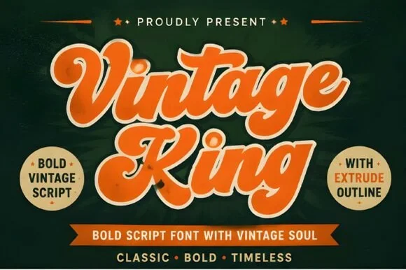
Layered 1950s–70s sign-painter script (Regular, Extrude & Outline)
Vintage King is a thick, creamy retro script family bundled with matched Extrude and Outline cuts plus stylistic swash alternates.
Ideas for this font
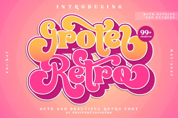
Layered 1970s bubble script family (Outline, Extrude & 99+ alternates)
Groter Retro is a plump, 1970s marshmallow script family bundled with matched Outline and Extrude font layers plus 99+ stylistic alternates.
Ideas for this font
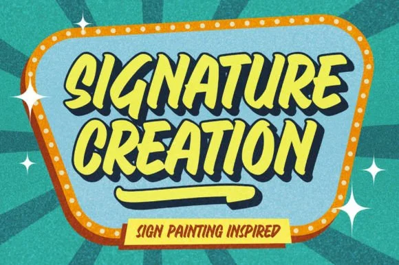
Retro sign-painting condensed display
Signature Creation is a retro sign-painting display in yellow on a teal badge: condensed brush capitals with thick stems, a slight forward slant, and a heavy offset shadow that steps down and right, so the words read as painted shop lettering.
Ideas for this font
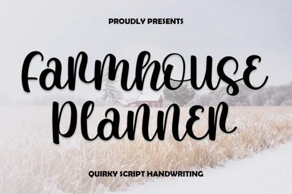
Quirky looped-curl bouncy farmhouse script
Farmhouse Planner is a playful, bouncy connected cursive script curling whimsical little eyelet loops onto 'F', 'r', 's', 'e', and 'n'!
Ideas for this font
Same independent foundry
Allow optional Google Analytics to measure visits and catalogue actions. Your search words and notes are not included. Privacy & storage