Editorial Serif Anchor

Machton + Evoire
Anchors Machton's fluid strokes with crisp Roman proportions on wedding suites, headers and packaging.
Inspect Evoire specimenDisclosure: MakerFileHub may earn a commission from qualifying purchases via paid links on this page. How our links work.
Varsity baseball script with tail
Machton is a varsity baseball script in red with a cream outline on green: heavy connected lowercase, an oversized capital with a long entry, and a thick underline tail that sweeps under the word to a point, so the plate reads as a team mark from the fifties.
Paid link
Get this fontProject & layout blueprintsAt-a-glance maker compatibility
Weld or Unite overlapping script joins into one continuous vector path before sending to the blade.
Visual anatomy & craft review
The word is set once, arcing slightly upward, and the drawing is the American sports script: the lowercase masses are heavy, the joins are thick, and the capital rises well above the x-height with a curl at the top. The tail is the structural element, leaving the last letter and running back under the whole word to a point, which gives the lockup a base and is what makes the mark work on a jersey. A cream outline separates the red from the green ground, and the two tracked credits at the corners are set in a light sans. The palette is two flat colours plus the ground, which is the honest way to present a mark that would be embroidered or screen printed.
Varsity, script, sporty, retro
Two-font hierarchy recipes
Tested contrast partners — pairing Machton with grounded secondary typography.
Machton + Evoire
Anchors Machton's fluid strokes with crisp Roman proportions on wedding suites, headers and packaging.
Inspect Evoire specimen
Machton + Inkora
Keeps small-scale dates, URLs, nutrition facts and care instructions crisp and legible below script titles.
Inspect Inkora specimenPractical applications
Concrete hierarchy, scale and production guidance tailored to Machton’s stroke geometry.
A baseball script is the authentic mark for a club, and the thick strokes and underline tail survive embroidery on a cap where a light script would disappear.
Hierarchy & layout recipe
Digitise a 90 mm cap badge: the name at 24 mm cap height, a 4 mm outline, and a 2 mm minimum stroke for the thread. Keep the tail inside the badge and enlarge the smallest gaps to 1.5 mm before digitising.
Pre-production check
Check the embroidery file, where a gap under 1.5 mm closes into a lump; redraw it. Confirm the tail meets the badge edge cleanly on a curved crown and that the name reads at five metres.
A team script makes a birthday shirt look like merchandise, and the single-colour version prints without registration problems on a light garment.
Hierarchy & layout recipe
Print a 250 mm chest graphic: the name at 55 mm cap height, the age in a 22 mm sans inside the tail, and one ink. Keep the thinnest tail at 3 mm so the screen holds it and place the graphic 80 mm below the collar.
Pre-production check
Check the screen at actual mesh, where a tail under 2 mm breaks; thicken it. Confirm the age reads inside the tail at three metres and that the print survives a wash without cracking at the joins.
A period script frames a sports history as a document of its era, and the underline tail gives a cover a built-in rule for the subtitle.
Hierarchy & layout recipe
Set the title at 100 mm wide on a 240 mm cover, the subtitle in a 9 pt sans beneath the tail, and the author in 8 pt caps. Print two colours on a matte stock so the cream outline holds against the ground.
Pre-production check
Check the title at thumbnail size, where the tail can read as a stray line; keep it attached to the last letter. Confirm the 9 pt subtitle sits clear of the tail and that the 8 pt author survives the laminate.
Technical & licence verification
Confirm included OTF/TTF/WOFF formats, full glyph tables and licence coverage on the live store page before batch production.
Closest visual alternatives
Matched across letterform anatomy, stroke behaviour and craft applications.
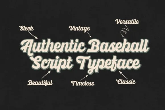
Heavy vintage stadium baseball & athletic jersey script
Ballpark Beauty is an authentic, heavy-stroke vintage baseball script (NOT a block display!) built for arched jersey chests, brewery cans, and retro merch!
Ideas for this font
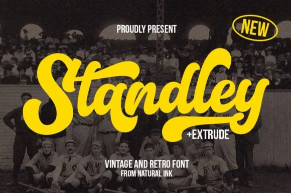
Layered vintage baseball & varsity brush script (+ Extrude)
Standley is a chunky vintage ballpark script bundled with a matched Extrude shadow font and extra swash glyphs.
Ideas for this font
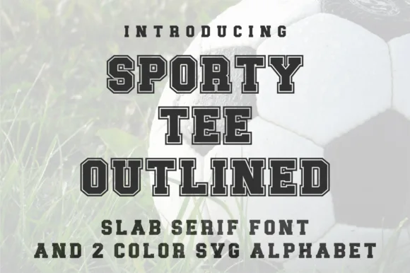
Varsity slab with outline and two-colour alphabet
Sporty Tee Outlined is a varsity slab in dark grey with a light outline: heavy square serifs, wide flat-topped caps, counters cut as rectangles, and an inline gap that separates the fill from the outline, sold with a two-colour SVG alphabet for the same job.
Ideas for this font
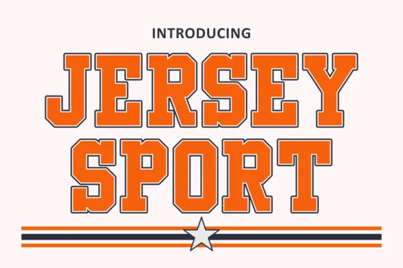
Outlined collegiate sports slab with a flat fill and a thin keyline
Jersey Sport is a collegiate slab alphabet drawn as an outline with a flat fill inside it, so a word reads as a printed athletic front where the keyline does the work and the fill carries the colour.
Ideas for this font
Same independent foundry
Allow optional Google Analytics to measure visits and catalogue actions. Your search words and notes are not included. Privacy & storage