Editorial Serif Anchor

Saltwater Verse + Resquel
Anchors Saltwater Verse's fluid strokes with crisp Roman proportions on wedding suites, headers and packaging.
Inspect Resquel specimenDisclosure: MakerFileHub may earn a commission from qualifying purchases via paid links on this page. How our links work.
Looped slanted travel script
Saltwater Verse is a slanted looped script in tan on cream: soft medium strokes, wide open loops, and a travelling slant that makes a short line read as writing done on a postcard.
Paid link
Get this fontProject & layout blueprintsAt-a-glance maker compatibility
Fine grain and micro-texture excel in 300 DPI print, sublimation, and screen print rather than small vinyl weeding.
Visual anatomy & craft review
The phrase is set over three lines, with the middle line longest and every line slightly offset, and the face is a relaxed script: the S opens with a wide loop, the h and the t rise into loose ascenders, the w and the e are round, the V of Verse throws a swash to the left and the final e runs out into a shallow tail. The stroke is medium with a light swell, the slant is consistent and the letters are loosely joined, so a line reads as written in one pass with a fine pen. The ground is a collage of faded beach photographs, shells, a compass, stamps and pressed leaves, all in warm neutrals, which sets the travel tone before a word is read. Saltwater Verse is a script for travel branding, postcards, menus and packaging, and it holds at moderate sizes because the stroke is not hairline.
A warm script for postcards and travel
Two-font hierarchy recipes
Tested contrast partners — pairing Saltwater Verse with grounded secondary typography.
Saltwater Verse + Resquel
Anchors Saltwater Verse's fluid strokes with crisp Roman proportions on wedding suites, headers and packaging.
Inspect Resquel specimen
Saltwater Verse + Taught
Keeps small-scale dates, URLs, nutrition facts and care instructions crisp and legible below script titles.
Inspect Taught specimenPractical applications
Concrete hierarchy, scale and production guidance tailored to Saltwater Verse’s stroke geometry.
A warm travel script sets the tone for a wedding that starts with a flight, and the loose loops read on a card that guests will keep in a bag.
Hierarchy & layout recipe
Print a 105 by 148 mm card: set the greeting at 28 pt over two lines, keep 14 mm of clear ground beneath before the details at 9.5 pt, and hold 13 mm of margin on all four sides.
Pre-production check
A slanted script centred on a card can look tilted; print one and check the optical balance before the batch.
A travel script makes a plain postcard feel sent from somewhere, and the medium stroke holds on an uncoated card that will be written on.
Hierarchy & layout recipe
Print a 105 by 148 mm postcard: set the shop name at 24 pt on one line, keep 14 mm of clear ground for the message block, and hold 12 mm of margin on all four sides with the address lines at 9 pt.
Pre-production check
Writing over a card stock can smudge a printed script; print one postcard and test a pen over the ink before the order.
A loose script suits a dinner served outside, and the travel tone keeps a printed menu from feeling formal at a seaside table.
Hierarchy & layout recipe
Print a 130 by 210 mm menu: set the heading at 30 pt on one line, set the courses at 10 pt in a plain serif beneath, and hold 16 mm of margin on all four sides of the card.
Pre-production check
A script heading over a serif list needs air; print one menu at the finished size and check the spacing before the run.
Technical & licence verification
Confirm included OTF/TTF/WOFF formats, full glyph tables and licence coverage on the live store page before batch production.
Closest visual alternatives
Matched across letterform anatomy, stroke behaviour and craft applications.

Ornate flourished calligraphy with oversized loops
Handmade Calligraphy is an ornate script whose flourishes leave the letters entirely, curling above and below the line so the two words read as a drawn flourish with letters inside it.
Ideas for this font

Bold slanted script with a curled capital and heavy connected stems
Esmeralda is a bold slanted script in which the capital curls back over itself and the body runs in connected heavy stems with a steady forward lean.
Ideas for this font
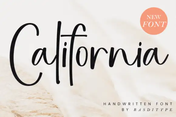
Tall narrow handwriting with an oversized capital C and open joins
California is a tall narrow handwritten face in which the capital C runs twice the height of the small letters, the joins stay open and the strokes lean forward, so a word reads as a place name written in one sweep.
Ideas for this font
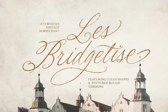
Fine slanted script with expansive capitals
Les Bridgetise is a very fine slanted script whose tall capitals open into long entry loops while the lower-case stays narrow and high-waisted.
Ideas for this font
Same independent foundry
Allow optional Google Analytics to measure visits and catalogue actions. Your search words and notes are not included. Privacy & storage