Editorial Serif Anchor

Sallintine + Worldstar
Anchors Sallintine's fluid strokes with crisp Roman proportions on wedding suites, headers and packaging.
Inspect Worldstar specimenDisclosure: MakerFileHub may earn a commission from qualifying purchases via paid links on this page. How our links work.
High-contrast calligraphic script with long swashes
Sallintine is a high-contrast calligraphic script in warm copper on cream, with flourishes that leave the word entirely: a swash from the S sweeps across half the canvas and loops back beneath, and a second flourish lifts off the final e into the upper right.
Paid link
Get this fontProject & layout blueprintsAt-a-glance maker compatibility
Weld or Unite overlapping script joins into one continuous vector path before sending to the blade.
Visual anatomy & craft review
The word sits at the centre of a wide canvas and the drawing is a formal calligraphy rather than a signature: heavy downstrokes, hairlines that taper to nothing, and a steep forward angle that stays consistent through every letter. What makes the face is the flourish logic, because the entry stroke from the capital S travels well past the word and returns as a thin loop, while the exit from the last letter rises into a curl that clears the ascenders, so the type behaves like an ornament as much as a word. The smaller script line beneath it is the same hand at a reduced size, with shorter flourishes, and the corner labels are tiny spaced capitals that name the style and the designer. Printed in one warm ink on a cream ground, the hairlines read as pen pressure rather than as a colour, which is why the sample keeps everything else off the page.
Calligraphic, flowing, elegant, flourished
Two-font hierarchy recipes
Tested contrast partners — pairing Sallintine with grounded secondary typography.
Sallintine + Worldstar
Anchors Sallintine's fluid strokes with crisp Roman proportions on wedding suites, headers and packaging.
Inspect Worldstar specimen
Sallintine + Bareum
Keeps small-scale dates, URLs, nutrition facts and care instructions crisp and legible below script titles.
Inspect Bareum specimenPractical applications
Concrete hierarchy, scale and production guidance tailored to Sallintine’s stroke geometry.
Long swashes give a wedding invitation the gesture of a calligrapher's hand, and they can be sized to fill a wide card without a second ornament.
Hierarchy & layout recipe
A5 landscape: the names at 34 pt with the entry swash allowed to run 30 mm into the left margin, the date in a 9 pt roman caps beneath, and nothing else on the page. Print one ink at 60 percent on cream so the hairlines read as pressure.
Pre-production check
Check the swash against the trim at full size: it must clear the edge by at least 6 mm, and the hairline must not fall below 0.2 pt on uncoated stock. Confirm the smaller script line beneath keeps a 4.5:1 contrast when printed at 60 percent tint.
A calligraphic script with long flourishes gives a beauty brand a drawn mark that scales from a carton to a favicon, provided the swashes are trimmed for small sizes.
Hierarchy & layout recipe
Set the name at 40 pt in copper, then build a reduced version for small use by cutting the outer flourishes and keeping only the word at 24 pt. Keep the hairlines at a minimum of 0.3 pt for print and 1.5 px for screen at every size.
Pre-production check
Check the reduced mark at 32 px in the browser, where the exiting curl can read as a stray line, and confirm the trimmed version still matches the packaging. Compare the copper against the carton's cream board to make sure the two do not sit at the same value.
A flourished script gives a short phrase the feel of a written dedication, and the long entry stroke can fill a wide crop that a plain script would leave empty.
Hierarchy & layout recipe
A6 landscape: the phrase at 30 pt, the flourish allowed to run to the right edge minus 8 mm, the offer line in an 8 pt sans at the foot. Print one ink on a cream card and keep the reverse side empty so the flourish reads as the whole design.
Pre-production check
Check the flourish's thin end at print size, where a 0.15 pt tail will drop out entirely; thicken the final 10 mm of the swash. Confirm the 8 pt line stays outside the flourish's path and that both sides of the card register when printed duplex.
Technical & licence verification
Confirm included OTF/TTF/WOFF formats, full glyph tables and licence coverage on the live store page before batch production.
Closest visual alternatives
Matched across letterform anatomy, stroke behaviour and craft applications.
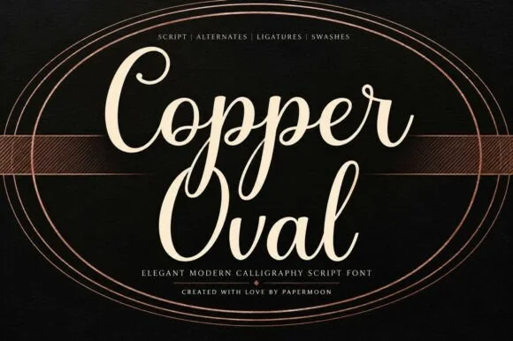
Smooth medium-bold modern copperplate calligraphy script
Copper Oval is a graceful, medium-bold calligraphy script (not a slab serif) blending classic copperplate oval loops with sturdy hand-lettered warmth.
Ideas for this font
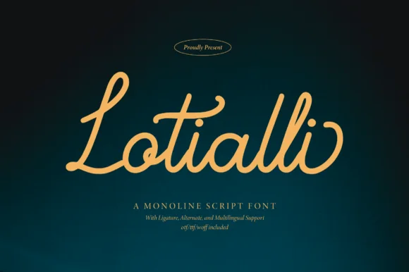
Monoline script with ligatures
Lotialli is a monoline script in warm gold on a deep teal gradient: even stroke weight, a tall looped L, a rounded bowl on the o, and connected letters that keep a steady rhythm across the word without ornament.
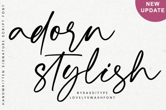
Slanted modern calligraphy script with lowercase end swashes
Adorn Stylish is a fluid, slanted modern handwritten script featuring tall narrow loops and sweeping beginning/ending lowercase swashes.
Ideas for this font
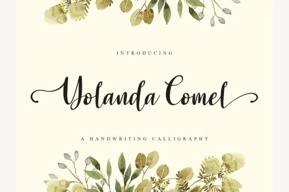
Calligraphic handwriting script with swash capitals
Yolanda Comel is a calligraphic script in near-black on cream: a modulated stroke with a steep angle, tall looping capitals, a long swash entry on the Y and a matching exit on the final l, so the pair reads as an invitation written with a pointed pen and then set in print.
Ideas for this font
Same independent foundry
Allow optional Google Analytics to measure visits and catalogue actions. Your search words and notes are not included. Privacy & storage