Editorial Serif Anchor

Lotialli + Brenco
Anchors Lotialli's fluid strokes with crisp Roman proportions on wedding suites, headers and packaging.
Inspect Brenco specimenDisclosure: MakerFileHub may earn a commission from qualifying purchases via paid links on this page. How our links work.
Monoline script with ligatures
Lotialli is a monoline script in warm gold on a deep teal gradient: even stroke weight, a tall looped L, a rounded bowl on the o, and connected letters that keep a steady rhythm across the word without ornament.
Paid link
Get this fontProject & layout blueprintsAt-a-glance maker compatibility
Set Cricut or Silhouette operation to Pen, Foil Quill, or Laser Score — not Basic Blade Cut.
Visual anatomy & craft review
The name is set large at the centre of the page and the drawing is uniform in weight from start to finish, so the face reads as a broad-nib script simplified to a single line rather than as a calligraphy with pressure. The capital L rises into a narrow loop and its entry comes in from below, the t carries a small crossbar that lifts the rhythm, and the double l at the end is drawn with two distinct loops so it does not read as a single wide letter. Because the stroke is even, the joins between letters are visible and short, which keeps the word legible at the small sizes a script is usually set at. The caption block below names the face as monoline and lists the accompanying ligatures, alternates and language support in a narrow serif, which is the practical information a buyer needs before downloading.
Monoline, golden, flowing, versatile
Two-font hierarchy recipes
Tested contrast partners — pairing Lotialli with grounded secondary typography.
Lotialli + Brenco
Anchors Lotialli's fluid strokes with crisp Roman proportions on wedding suites, headers and packaging.
Inspect Brenco specimen
Lotialli + Taught
Keeps small-scale dates, URLs, nutrition facts and care instructions crisp and legible below script titles.
Inspect Taught specimenPractical applications
Concrete hierarchy, scale and production guidance tailored to Lotialli’s stroke geometry.
A monoline script reads as a signature on a bag without the fragile hairlines of a calligraphy, so it survives the small print of a coffee label and a stamped bag.
Hierarchy & layout recipe
Print a 80 by 110 mm bag label: the name at 22 pt in gold on a deep ground, the roast in a 7 pt sans caps beneath, and the origin in 6.5 pt. Keep 6 mm of clear space above the loop of the capital so the descender of the L never touches the edge.
Pre-production check
Check the gold on the deep ground for a 4.5:1 contrast, and confirm the monoline stroke still reads when the label is printed at 70 percent tint. Verify the 6.5 pt origin line stays legible on the bag's matte stock.
A monoline script holds its weight on small cards where a contrasted calligraphy would break, so a wedding suite can use one script from the menu to the place setting.
Hierarchy & layout recipe
Set the names at 18 pt on a 90 by 50 mm place card, the course headings at 14 pt, and the dish descriptions in a 9 pt sans beneath. Keep 8 mm between the script and the sans so the descenders never meet the smaller text.
Pre-production check
Check the 18 pt names at actual size, where the loops of the L can close; open the tracking slightly for the card version. Confirm the 9 pt descriptions keep a 4.5:1 contrast and that the script clears the card's trim on both sides.
One line of monoline script breaks a page of roman text without introducing a second typographic voice, which is the usual job of a pull-quote in a feature.
Hierarchy & layout recipe
Set the quote at 34 pt in gold on a cream page, centred across a 120 mm measure, with a 0.5 pt rule above and below at 12 mm. Keep the quote to one or two lines so the even stroke stays rhythmic rather than mechanical.
Pre-production check
Check the two-line version for baseline drift, where a monoline script can look wobbly when set on a tight leading. Confirm the quote clears the body column by 15 mm and that the gold holds contrast on the uncoated page at 34 pt.
Technical & licence verification
Confirm included OTF/TTF/WOFF formats, full glyph tables and licence coverage on the live store page before batch production.
Closest visual alternatives
Matched across letterform anatomy, stroke behaviour and craft applications.
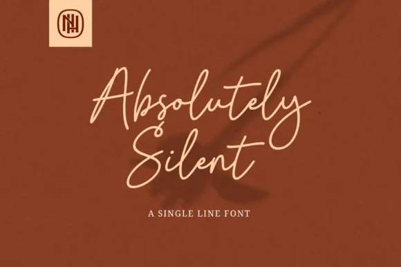
Airy tall-looped monoline fountain-pen script
Absolutely Silent is a graceful, slender monoline cursive script with tall narrow ascender loops and sweeping crossed 't' bars.
Ideas for this font
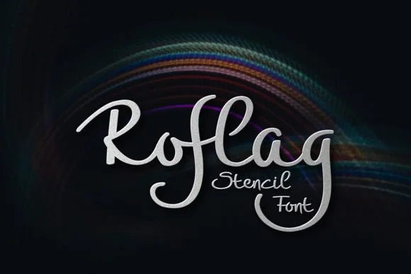
Brush script with stencil bridges
Roflag Stencil is a brush script in silver on a dark ground: a moderate stroke with visible modulation, tall looping ascenders, curled terminals and small bridges cut through several strokes, set as one word with a second line in the same hand and a subtle light trail behind.
Ideas for this font
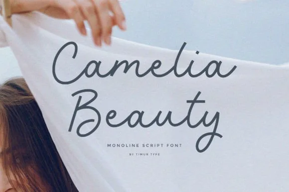
Clean upright medium-weight monoline cursive script
Camelia Beauty is a calm, tidy monoline handwritten script with open C/B capitals and smooth, legible upright lowercase.
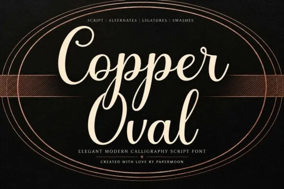
Smooth medium-bold modern copperplate calligraphy script
Copper Oval is a graceful, medium-bold calligraphy script (not a slab serif) blending classic copperplate oval loops with sturdy hand-lettered warmth.
Ideas for this font
Same independent foundry
Allow optional Google Analytics to measure visits and catalogue actions. Your search words and notes are not included. Privacy & storage