High-Contrast Display Serif

Rustic Graytone + The Avenue Editorial
Pairs sculptural editorial warmth with Rustic Graytone's clean modern geometry.
Inspect The Avenue Editorial specimenDisclosure: MakerFileHub may earn a commission from qualifying purchases via paid links on this page. How our links work.
Chunky slab with retro script duo
Rustic Graytone is a duo in navy and red on cream: a chunky bracketed slab in caps for the first line and a fat retro script with a long tail for the second, with a red seal at the left and two small caption blocks at the foot, so the plate reads as a vintage packaging mark.
Paid link
Get this fontProject & layout blueprintsAt-a-glance maker compatibility
Weld or Unite overlapping script joins into one continuous vector path before sending to the blade.
Visual anatomy & craft review
The pairing is the design: the slab is upright, heavy and evenly spaced, while the script is slanted, connected and ends in a sweeping tail that runs under the whole lockup, which gives the mark its base. The two share a warm weight but not a skeleton, so the contrast reads as deliberate rather than mismatched. The seal at the left adds a third element without a third typeface, and the two caption blocks at the foot are set in small caps, which is how a period label explains itself. The palette is two inks on cream, and the plate keeps to one lockup, so the sheet reads as a finished mark rather than a specimen grid.
Duo, retro, chunky, layered
Two-font hierarchy recipes
Tested contrast partners — pairing Rustic Graytone with grounded secondary typography.
Rustic Graytone + The Avenue Editorial
Pairs sculptural editorial warmth with Rustic Graytone's clean modern geometry.
Inspect The Avenue Editorial specimen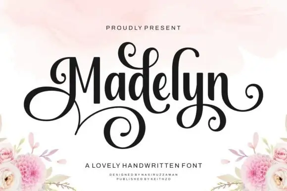
Rustic Graytone + Madelyn
Introduces organic movement on pull-quotes, signatures and gift tags.
Inspect Madelyn specimenPractical applications
Concrete hierarchy, scale and production guidance tailored to Rustic Graytone’s stroke geometry.
A slab and a script in one purchase give a roaster a mark and a descriptor that match, and the tail gives the label a graphic element without an illustration.
Hierarchy & layout recipe
Print a 75 by 110 mm label: the brand in the slab at 18 pt, the origin in the script at 12 pt, and the weight in a 6 pt sans. Keep 5 mm inside the die so the tail is never cut and print two inks on a kraft stock.
Pre-production check
Check the 12 pt script on kraft, where the thick joins can fill; keep the size above 10 pt. Confirm the tail clears the die and that the 6 pt weight reads on the shelf.
A slab and a script read as a painted barn sign, and the pairing gives a board two voices without a second designer decision.
Hierarchy & layout recipe
A1 board: the greeting in the slab at 90 mm, the names in the script at 60 mm, and the date in a 24 mm slab. Keep 40 mm margins so the tail has room, and paint two colours on a light board.
Pre-production check
Check the board at four metres, where the script joins can merge; keep the script larger than 50 mm. Confirm the 24 mm date reads from the door and that the tail does not run off the board.
A retro duo gives a market poster a printed period look, and the two voices let the headline and the date sit at different scales without a third face.
Hierarchy & layout recipe
A2 portrait: the market name in the slab at 110 mm, the dates in the script at 40 mm, and the venue in a 14 mm sans. Keep 30 mm margins and print two flat colours on a cream ground.
Pre-production check
Check the poster at five metres, where the slab counters can close; keep the counters above 6 mm. Confirm the 14 mm venue reads at two metres and that the script does not crowd the slab above.
Technical & licence verification
Confirm included OTF/TTF/WOFF formats, full glyph tables and licence coverage on the live store page before batch production.
Closest visual alternatives
Matched across letterform anatomy, stroke behaviour and craft applications.
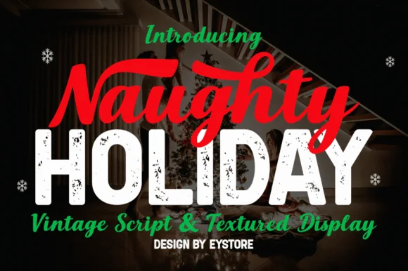
Brush script paired with textured display
Naughty Holiday is a festive pair: a hand-painted red brush script with a fat entry swash, set above a distressed white display in heavy caps, with a thin italic script and a tracked credit line beneath, so the sheet shows two faces working as a headline and a counterweight.
Ideas for this font
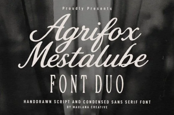
Bold retro brush script + tall skinny condensed sans duo
Agrifox Mestalube is a high-contrast heritage font duo pairing a juicy slanted brush script with a tall, airy monoline condensed sans.
Ideas for this font
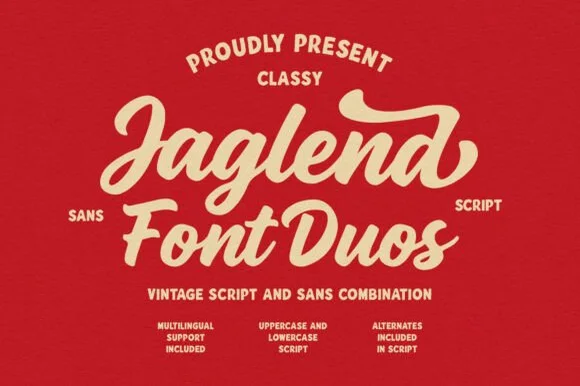
Retro sign-painter brush script & rugged condensed sans duo
Jaglend Font Duo pairs a thick, creamy vintage sign-painter brush script with a sturdy, hand-drawn condensed uppercase sans companion.
Ideas for this font
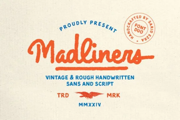
Rough-edged vintage monoline script & stamp sans duo
Madliners is a warm vintage monoline font duo combining a thick, rough-edged connected script (with underline tail) and a matching stamp sans.
Ideas for this font
Same independent foundry
Allow optional Google Analytics to measure visits and catalogue actions. Your search words and notes are not included. Privacy & storage