Editorial Serif Anchor

Roline Mono + Brenco
Anchors Roline Mono's fluid strokes with crisp Roman proportions on wedding suites, headers and packaging.
Inspect Brenco specimenDisclosure: MakerFileHub may earn a commission from qualifying purchases via paid links on this page. How our links work.
Retro monoline script with looped crossbars
Roline Mono is a retro monoline script in yellow on navy: even stroke weight, tall looped ascenders, crossbars that flick up into curls, and a bouncing baseline that gives the two words a 1970s lettering rhythm.
Paid link
Get this fontProject & layout blueprintsAt-a-glance maker compatibility
Set Cricut or Silhouette operation to Pen, Foil Quill, or Laser Score — not Basic Blade Cut.
Visual anatomy & craft review
The two words are stacked and each keeps a single stroke weight, so the drawing reads as a pen script written with a monoline nib rather than a brush. The R opens with a loop that rises above the cap line, the l and the n carry tall curved ascenders, and the crossbar of the t extends into a small upward curl, which is the detail that places the face in the 1970s rather than in a modern script. The baseline bounces under each word, and the letters connect with visible loops, so the word looks handwritten but stays rhythmic. The ground is a navy textured panel, and the yellow type has enough contrast to read at small sizes, which is why the same face works for captions and for the display line in this specimen. The caption at the foot is spaced capitals in a plain sans, giving the yellow script a quiet frame.
Retro, monoline, looping, seventies
Two-font hierarchy recipes
Tested contrast partners — pairing Roline Mono with grounded secondary typography.
Roline Mono + Brenco
Anchors Roline Mono's fluid strokes with crisp Roman proportions on wedding suites, headers and packaging.
Inspect Brenco specimen
Roline Mono + Sailors
Keeps small-scale dates, URLs, nutrition facts and care instructions crisp and legible below script titles.
Inspect Sailors specimenPractical applications
Concrete hierarchy, scale and production guidance tailored to Roline Mono’s stroke geometry.
A looping monoline script reads as a 1970s grocer's sign, which gives a heritage blend a story without an illustration, and the even stroke prints cleanly on a small bag.
Hierarchy & layout recipe
Print a 100 by 150 mm bag: the blend name at 26 pt, the roast in a 7 pt sans caps, and the weight in 6.5 pt. Keep 8 mm clear below the loops so the descender of the y never meets the fold, and print yellow on navy or navy on kraft.
Pre-production check
Check the loops at 26 pt on the kraft bag, where a light ink reverses and the thin stroke can break; proof both colourways. Confirm the 6.5 pt weight reads on the crease and that no loop sits over the bag's gusset.
A retro script line breaks a page of text with a period feel, and the monoline weight keeps it readable at the small size a pull quote is usually set at.
Hierarchy & layout recipe
Set the quote at 32 pt across a 110 mm measure, the attribution in an 8 pt sans caps beneath at 8 mm, and a 0.5 pt rule above at 12 mm. Keep the script to two lines and let the bounce do the work rather than adding colour.
Pre-production check
Check the two-line version, where the bouncing baseline can look like careless leading; set each line on its own baseline. Confirm the 8 pt attribution keeps a 4.5:1 contrast and that the rule clears the tallest ascender by 8 mm.
A retro monoline script signals a crate-digging night better than a modern sans, and the yellow on navy combination reads under dim club lighting.
Hierarchy & layout recipe
A3 portrait: the name at 90 mm cap height, the date in a 14 mm sans, and the venue at 10 mm. Keep the script in the upper two thirds on a flat navy field and leave the bottom third for the line-up.
Pre-production check
Check the script at three metres, where the thin stroke under club lighting loses contrast; thicken the script for the poster version. Confirm the 10 mm venue reads at arm's length and that the loops do not collide with the date line.
Technical & licence verification
Confirm included OTF/TTF/WOFF formats, full glyph tables and licence coverage on the live store page before batch production.
Closest visual alternatives
Matched across letterform anatomy, stroke behaviour and craft applications.
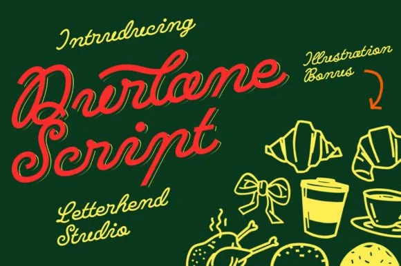
Fat retro script with an inline highlight and a heavy slant
Durlane is a fat retro script in which the strokes swell, a thin inline runs along the middle of every stem and the joins stay heavy, so a name reads as a hand-painted bakery sign from the 1980s.
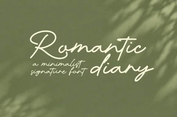
Minimalist signature script with slender loops and a light stroke
Romantic Diary is a minimalist signature script in which the capitals rise into slender loops, the body stays narrow and the stroke keeps one light weight, so a name reads as a quick signing gesture rather than as calligraphy.
Ideas for this font
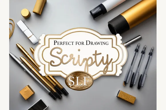
Hand-drawn script in ornate frame
Scripty is a hand-drawn script in a gold gradient inside an ornate cream frame: connected lowercase with tall loops, a fine stroke and a flourish on the final letter, presented as a badge over a photograph of gold pens and tools, so the plate reads as a calligraphy kit rather than a type specimen.
Ideas for this font
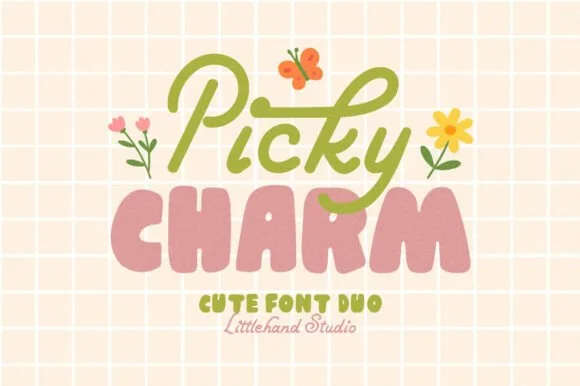
Cute duo pairing a monoline script with puffy lowercase shapes
Picky Charm is a two-cut family in which a monoline script writes the first word and puffy lowercase shapes stack the second, so a two-line design gets a written voice and a soft block from one purchase.
Ideas for this font
Same independent foundry
Allow optional Google Analytics to measure visits and catalogue actions. Your search words and notes are not included. Privacy & storage