High-Contrast Display Serif

Roadside + Vanielst Elegant Serif Display Stylistic
Pairs sculptural editorial warmth with Roadside's clean modern geometry.
Inspect Vanielst Elegant Serif Display Stylistic specimenDisclosure: MakerFileHub may earn a commission from qualifying purchases via paid links on this page. How our links work.
Vintage capitals paired with a script
Roadside is a vintage duo in navy on cream: tall irregular capitals with soft slab ends in a heavy line, paired with a broad slanted connected script beneath, with small vertical notes at both sides, two oval labels and a plain line at the foot naming the pairing.
Paid link
Get this fontProject & layout blueprintsAt-a-glance maker compatibility
Weld or Unite overlapping script joins into one continuous vector path before sending to the blade.
Visual anatomy & craft review
The plate does the thing a duo must do: it sets the two voices together at their intended sizes, so the buyer can see that the capitals carry the name and the script carries the second word. The drawing on top is a tall irregular capital with soft slab ends, and the script beneath is broad and connected with a heavy stroke, which is a pairing that reads as a hand-painted sign rather than as a wedding suite. That construction sets a moderate size floor, because the script's joins close when it shrinks, and the plate sets both lines large enough to judge the relationship. The oval labels are product copy naming the register. It suits a shop sign, a label and a poster for a business that wants a vintage voice.
Duo, vintage, pairing, display
Two-font hierarchy recipes
Tested contrast partners — pairing Roadside with grounded secondary typography.
Roadside + Vanielst Elegant Serif Display Stylistic
Pairs sculptural editorial warmth with Roadside's clean modern geometry.
Inspect Vanielst Elegant Serif Display Stylistic specimen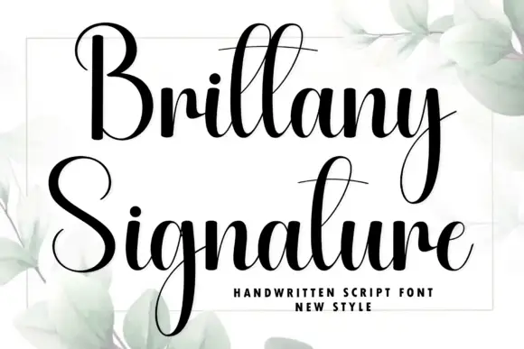
Roadside + Brittany Signature
Introduces organic movement on pull-quotes, signatures and gift tags.
Inspect Brittany Signature specimenPractical applications
Concrete hierarchy, scale and production guidance tailored to Roadside’s stroke geometry.
A capitals-and-script duo gives a diner a sign with two voices, which is how painted signage actually worked. Two voices are how painted signs worked.
Hierarchy & layout recipe
Paint a 1,100 by 420 mm board: the name in the capitals at 110 mm cap height, the line in the script at 55 mm, and a 5 mm rule. Keep 26 mm margins and paint two colours on a primed board.
Pre-production check
Check the board at five metres, where a script join can fill; keep the joins above 4 mm. Confirm the 55 mm script reads at three metres and that the rule survives a wet season.
A duo label sets a brand and a flavour in two voices, which keeps a small bottle from looking plain. A bottle label needs a small second voice.
Hierarchy & layout recipe
Print a 60 by 90 mm label: the brand in the capitals at 14 pt, the flavour in the script at 12 pt, and the volume at 7 pt. Keep 5 mm inside the die and keep the script above 1 mm.
Pre-production check
Check the 12 pt script on a curved bottle, where a join can close; keep it above 12 pt. Confirm the 7 pt volume reads on the shelf and that the label holds in a cooler.
A capitals-and-script pair sets a retro invitation, and the two voices keep the card from needing an illustration. The pair keeps a retro card from needing art.
Hierarchy & layout recipe
A6 card: the greeting in the capitals at 24 pt, the details in the script at 11 pt, and the date at 8.5 pt. Keep 15 mm margins and print two colours on a cream card.
Pre-production check
Check the 11 pt script at home-print resolution, where a join can break; keep it above 12 pt. Confirm the 8.5 pt date keeps a 4.5:1 contrast and that the card folds flat.
Technical & licence verification
Confirm included OTF/TTF/WOFF formats, full glyph tables and licence coverage on the live store page before batch production.
Closest visual alternatives
Matched across letterform anatomy, stroke behaviour and craft applications.
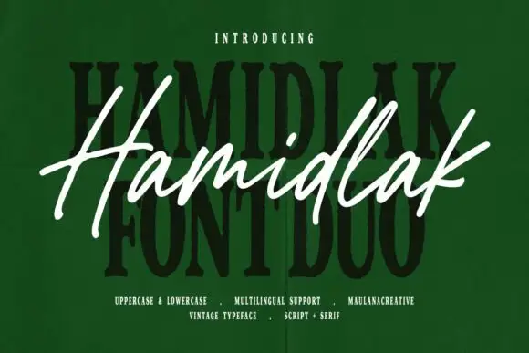
Brush signature script layered over a heavy vintage serif
Hamidlak layers a loose brush signature over a heavy vintage serif, so the same word appears twice in the sample — once as a signature and once as a stamped plate.
Ideas for this font
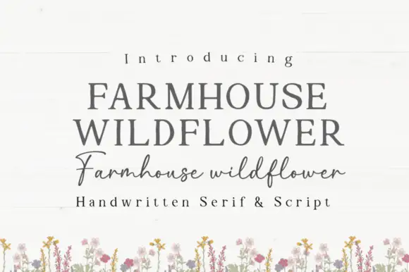
Soft upright serif caps with uneven edges paired with a loose connected script
Farmhouse Wildflower is a two-cut pair in which soft upright serif capitals carry slightly uneven edges and a lighter connected script runs low rounded joins with long strokes leaving the first and last letters.
Ideas for this font
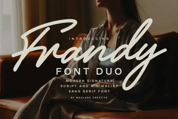
Modern signature script paired with a minimal sans in wide capitals
Frandy pairs a modern signature script with a minimal sans in wide-tracked capitals, so one lockup carries a personal mark and a quiet structural label beneath it.
Ideas for this font
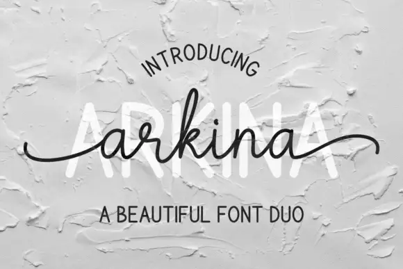
Tall sans capitals with a low looping script duo
Arkina Duo layers a very low looping connected script over tall narrow capitals that read as engraved lettering pressed into plaster, with entry strokes starting well left of the first letter.
Ideas for this font
Same independent foundry
Allow optional Google Analytics to measure visits and catalogue actions. Your search words and notes are not included. Privacy & storage