Modern Grotesque Body

Retro Groovy + Clyne Sans
Creates crisp high-hierarchy contrast beneath Retro Groovy headlines across menus, websites and labels.
Inspect Clyne Sans specimenDisclosure: MakerFileHub may earn a commission from qualifying purchases via paid links on this page. How our links work.
Heavy quirky serif with irregular counters
Retro Groovy is a heavy display serif in black on cream: fat letters with uneven serifs and rounded counters, shown over a seventies sunburst with wavy stripes and daisies, and repeated on four rounded badges of slogans.
Paid link
Get this fontProject & layout blueprintsAt-a-glance maker compatibility
Sturdy stroke walls and open counters weed cleanly on adhesive vinyl, HTV apparel film, and cut cardstock.
Visual anatomy & craft review
Two words are stacked and fill the frame, and the face is a heavy display with a handmade irregularity: the stems are fat, the serifs are small and uneven from letter to letter, the bowls of the o and the g are nearly circular, the R carries a curved leg and the y drops a long soft tail. The letters are fitted closely, so each word reads as a dense block, and the weight has very little contrast, which keeps the block solid at a distance. The sample uses the same face twice more, on rounded badges set in the corners with short slogans, which shows that the face works at a much smaller size as well as across two big lines. The ground is a warm cream scattered with a sunburst, two waving stripes in orange and olive, and flat daisies, all drawn in the same period palette. Retro Groovy is a display face for posters, packaging, apparel and party goods with a seventies mood, and it needs short words and a warm, busy-but-flat ground.
Groovy, heavy, irregular
Two-font hierarchy recipes
Tested contrast partners — pairing Retro Groovy with grounded secondary typography.
Retro Groovy + Clyne Sans
Creates crisp high-hierarchy contrast beneath Retro Groovy headlines across menus, websites and labels.
Inspect Clyne Sans specimen
Retro Groovy + Coastal Honey
Adds a warm human signature touch for 1-to-3-word callouts without competing against structured serif capitals.
Inspect Coastal Honey specimenPractical applications
Concrete hierarchy, scale and production guidance tailored to Retro Groovy’s stroke geometry.
A heavy quirky face sets the decade at a glance, and the same face at badge size keeps the decor consistent across a room.
Hierarchy & layout recipe
Print a 600 by 400 mm board: set the greeting at 110 pt over two lines, keep 26 mm of clear ground beneath before the time at 20 pt, and hold 24 mm of margin on all four sides.
Pre-production check
A dense block on a bright board can look muddy at a distance; view one printed board from the door before the run.
A groovy face gives a can a period identity, and the irregular serifs keep the word from looking like a modern grocery brand.
Hierarchy & layout recipe
Print a 60 by 100 mm can label: set the brand at 18 pt over two lines, keep 6 mm of clear ground beneath before the flavour at 5.5 pt, and hold 5 mm of margin on all four sides.
Pre-production check
A wrap label bends the block at the seam; print one on the real can and check the letters near the join.
A period face repeated on small badges gives a cart a coherent identity without a logo, and the short slogans suit a round die.
Hierarchy & layout recipe
Print a 148 by 100 mm sheet of 35 mm stickers: set each slogan at 12 pt over two lines, keep 4 mm of clear ground to the die line, and repeat the badges across the sheet.
Pre-production check
A dense face at twelve points can close its counters; print one sheet and check each badge before the batch.
Technical & licence verification
Confirm included OTF/TTF/WOFF formats, full glyph tables and licence coverage on the live store page before batch production.
Closest visual alternatives
Matched across letterform anatomy, stroke behaviour and craft applications.
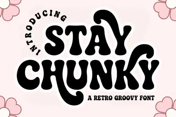
Retro groovy chunky display
Stay Chunky is a retro groovy display in black on pale pink: very heavy rounded caps with curled tails that drop below the baseline, an R with a swash leg, a Y and an A with hooked stems, and a curved note above, with flowers at the corners.
Ideas for this font
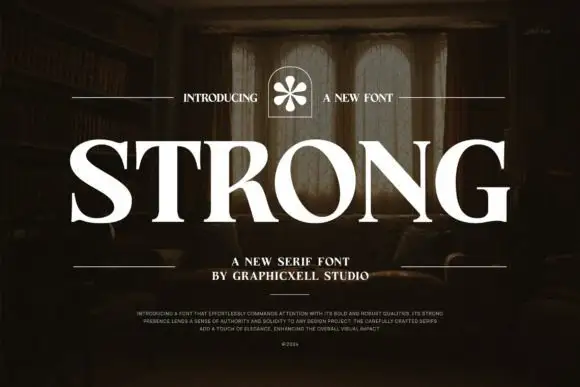
Heavy broad capitals with sharp fine serifs
Strong shows white serif capitals with substantial curved stems and fine pointed serifs over a shadowed room, where the O is broad and round, the R carries a thick low diagonal leg and the G finishes in a firm horizontal bar with a small flower badge above the row.
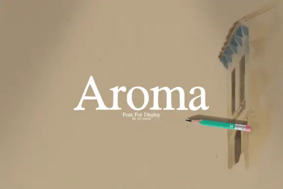
Open mixed case serif with a triangular capital and short flared feet
Aroma is an open mixed-case serif in which the capital A closes as a triangle with a low bar, the feet flare briefly and the letters keep generous space, so a single word reads as a quiet display face.
Ideas for this font
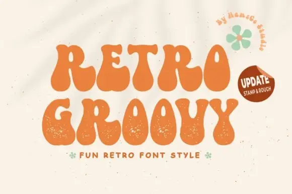
Groovy fat display with grainy edges
Retro Groovy is a groovy display face in orange on cream: fat blobby letters with wavy contours and a grainy surface, set as two stacked lines with a small tracked line beneath and a green flower beside them.
Same independent foundry
Allow optional Google Analytics to measure visits and catalogue actions. Your search words and notes are not included. Privacy & storage



