Modern Grotesque Body

Aroma + Bargain Condensed
Creates crisp high-hierarchy contrast beneath Aroma headlines across menus, websites and labels.
Inspect Bargain Condensed specimenDisclosure: MakerFileHub may earn a commission from qualifying purchases via paid links on this page. How our links work.
Open mixed case serif with a triangular capital and short flared feet
Aroma is an open mixed-case serif in which the capital A closes as a triangle with a low bar, the feet flare briefly and the letters keep generous space, so a single word reads as a quiet display face.
Paid link
Get this fontProject & layout blueprintsAt-a-glance maker compatibility
Sturdy stroke walls and open counters weed cleanly on adhesive vinyl, HTV apparel film, and cut cardstock.
Visual anatomy & craft review
The A is the defining letter: a pointed apex, a low crossbar and two straight strokes that meet at the top rather than curling, which sets a geometric tone the rest of the alphabet follows. The lowercase keeps an open skeleton with a moderate contrast and short, slightly flared serifs, so the word reads clearly at 40 pt and above without any of the density of a text roman. Spacing is generous, which lets a short brand name fill a wide plate at a modest size. Counters stay open and the ascenders are moderate, so the face sits comfortably between a display and a text role. The flat wall behind, the white ink, the pencil and the corner of the notebook are presentation; the typeface is the word shown.
Open · Classed · Flared
Two-font hierarchy recipes
Tested contrast partners — pairing Aroma with grounded secondary typography.
Aroma + Bargain Condensed
Creates crisp high-hierarchy contrast beneath Aroma headlines across menus, websites and labels.
Inspect Bargain Condensed specimen
Aroma + Thick Black
Adds a warm human signature touch for 1-to-3-word callouts without competing against structured serif capitals.
Inspect Thick Black specimenPractical applications
Concrete hierarchy, scale and production guidance tailored to Aroma’s stroke geometry.
The open serif reads as an engraved name on a door plate, and the generous spacing lets a short studio name fill the plate at a modest size.
Hierarchy & layout recipe
Set the studio name at 22 pt on a 120 by 40 mm plate, keep the address in a 6 pt caps serif, and leave 12 mm of clearance so the flared feet are not cut by the plate edge.
Pre-production check
Engraving a short serif foot needs a minimum depth; confirm the producer's limit and thicken the feet rather than the stems.
The quiet display serif gives a title page its restraint, and the open counters keep the title legible at 40 pt on an uncoated page.
Hierarchy & layout recipe
Set the title at 40 pt on an A5 title page, set the author in a small caps serif at 10 pt, and leave 20 mm between the title line and the imprint at the foot.
Pre-production check
Uncoated stock softens flared feet; print the title page on the actual paper and check that the serifs still read as serifs.
The open serif gives an invitation a contemporary restraint, and the generous spacing lets two surnames sit on one line without condensing.
Hierarchy & layout recipe
Set both names at 20 pt on a 120 by 180 mm card, set the details in a small caps serif at 8 pt, and hold 16 mm between the names line and the details block.
Pre-production check
A generous fit can push a long surname past the margin; check the proof at final size and break the names onto two lines rather than condensing them.
Technical & licence verification
Confirm included OTF/TTF/WOFF formats, full glyph tables and licence coverage on the live store page before batch production.
Closest visual alternatives
Matched across letterform anatomy, stroke behaviour and craft applications.
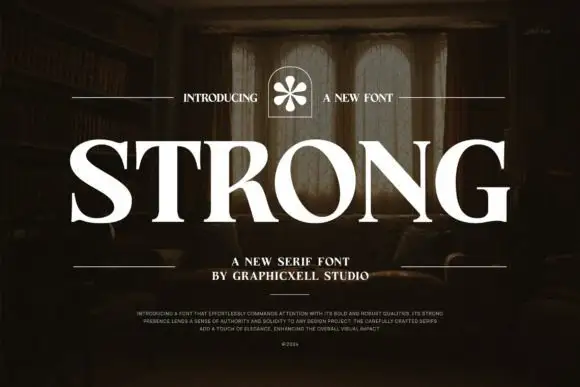
Heavy broad capitals with sharp fine serifs
Strong shows white serif capitals with substantial curved stems and fine pointed serifs over a shadowed room, where the O is broad and round, the R carries a thick low diagonal leg and the G finishes in a firm horizontal bar with a small flower badge above the row.
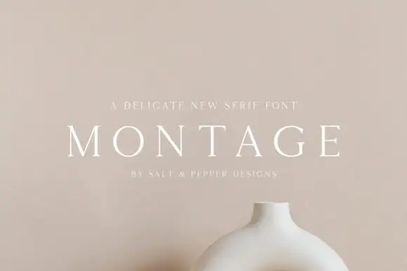
Delicate high-contrast serif
Montage is a delicate serif in white on a soft beige field: very fine hairlines, wide letterspacing, thin bracketed serifs and a high waist, set in caps on one line with a tracked line above and an attribution beneath, on a still life of a ceramic vessel.
Ideas for this font

Fine serif title with large upper and lower loops
Amilea shows pale yellow high-contrast letters with fine tapered serifs and broad rounded lowercase over a dark portrait, where a thin loop curves below the capital A and a tall upper flourish crosses the central ascender before sweeping right.

Tall light capitals with long overlapping crossbars
Beach Dates is a tall light capital face in which the C and D open broad curves, the serifs taper finely and the H crossbar reaches left into the C while the T bar stretches across the row below, so two stacked words lock into one form.
Ideas for this font
Allow optional Google Analytics to measure visits and catalogue actions. Your search words and notes are not included. Privacy & storage