Neutral Sans Workhorse

Scrabble Game + Miniplate
Lets Scrabble Game own the focal silhouette while handling secondary copy, sizing and subheads cleanly.
Inspect Miniplate specimenDisclosure: MakerFileHub may earn a commission from qualifying purchases via paid links on this page. How our links work.
Game-tile display
Scrabble Game is a novelty display on cream: plain capitals set inside rounded square tiles with small numerals in the lower corner, arranged on a grid as a crossword, with blank and coloured tiles filling the gaps and a small format line at the lower right.
Paid link
Get this fontProject & layout blueprintsAt-a-glance maker compatibility
Sturdy stroke walls and open counters weed cleanly on adhesive vinyl, HTV apparel film, and cut cardstock.
Visual anatomy & craft review
The plate is a layout rather than a specimen, and the crossword arrangement is the demonstration: each letter sits in its own tile with a score value, the tiles lock together on a grid and the blanks and coloured squares complete the board. That construction sets a large size floor, because the numerals and the rounded corners close first, and it also tells the buyer that the face is a tile system rather than a font to set a line of text with. The small line at the lower right is product copy that names the case coverage. It suits a card, a sign and a shirt for a game-themed event, and the tile construction means the layout should be built on the grid rather than kerned by eye.
Decorative, tiles, game, novelty
Two-font hierarchy recipes
Tested contrast partners — pairing Scrabble Game with grounded secondary typography.
Scrabble Game + Miniplate
Lets Scrabble Game own the focal silhouette while handling secondary copy, sizing and subheads cleanly.
Inspect Miniplate specimen
Scrabble Game + Auretha
Grounds bold display lettering with classic typographic authority on posters, badges and apparel.
Inspect Auretha specimenPractical applications
Concrete hierarchy, scale and production guidance tailored to Scrabble Game’s stroke geometry.
A tile display names the evening in the lettering, and the score numerals give a small card a playful detail. The numerals sell the game.
Hierarchy & layout recipe
A6 card: the greeting as four tiles at 14 mm each, the details in a 9.5 pt sans, and the date at 8.5 pt. Keep 15 mm margins and print two colours on a cream card.
Pre-production check
Check the 14 mm tiles at home-print resolution, where the numerals can close; keep them above 1 mm. Confirm the details read at arm's length and that the card folds flat.
A tile display prints as club kit, and the grid construction reads on a light shirt where a script would look soft. The grid reads on a shirt.
Hierarchy & layout recipe
Print a 250 mm chest graphic: the club as a row of six tiles at 26 mm each, the year at 20 mm, and two inks on a light shirt. Keep the numerals at 3 mm and place the graphic 80 mm below the collar.
Pre-production check
Check the screen at actual mesh, where a 3 mm numeral can fill; enlarge it to 4 mm. Wash-test one shirt and confirm the tiles stay square after five cycles.
A tile sign names a table, and the grid reads at arm's length across a room of players. The tiles read across a table. It reads across a tournament room.
Hierarchy & layout recipe
A4 sign: the table number as two tiles at 40 mm each, the rules in a 10 pt sans, and two colours on a white card. Keep 20 mm margins and laminate for a table stand.
Pre-production check
Check the 40 mm tiles, where the numerals can fill behind the laminate; keep them above 2 mm. Confirm the rules read at arm's length and that the sign stands level.
Technical & licence verification
Confirm included OTF/TTF/WOFF formats, full glyph tables and licence coverage on the live store page before batch production.
Closest visual alternatives
Matched across letterform anatomy, stroke behaviour and craft applications.
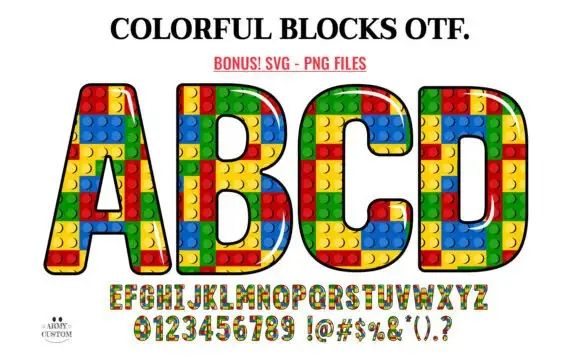
Outlined block capitals filled with colourful studded rectangles
Colorful Blocks builds every letter from a grid of plastic bricks, fills them in primary red, yellow, green and blue, and adds a glossy highlight and a heavy black contour around the whole shape.
Ideas for this font
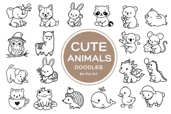
Rounded black outline animal dingbats with simple expressions and props
Cute Animals Doodles is a typable collection of about two dozen animals — elephant, corgi, bunny, raccoon, bear, owl, alpaca, koala, mouse, hedgehog, whale, duck, sheep, a small dragon — each drawn in one even black line.
Ideas for this font
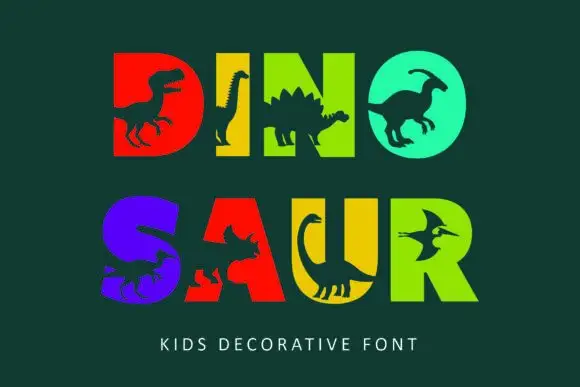
Heavy block capitals cut through by distinct dinosaur silhouettes
Dinosaur sets heavy square capitals in solid colours and cuts a dinosaur silhouette out of each letter, so a word reads as a row of coloured blocks with prehistoric animals standing in the counters.
Ideas for this font
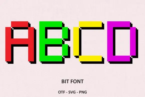
Bright rectangular pixel-style capitals with hard black offset shadows
Bit Font draws heavy capitals on a coarse pixel grid, gives each letter a solid colour, and steps a black shadow one block to the right so every word looks extruded by two rows of pixels.
Ideas for this font
Same independent foundry
Allow optional Google Analytics to measure visits and catalogue actions. Your search words and notes are not included. Privacy & storage