High-Contrast Display Serif

Ransom Wave + Bulgary
Pairs sculptural editorial warmth with Ransom Wave's clean modern geometry.
Inspect Bulgary specimenDisclosure: MakerFileHub may earn a commission from qualifying purchases via paid links on this page. How our links work.
Hand-drawn display sans
Ransom Wave is a hand-drawn display sans in cream on a muted travel poster: wide caps with slightly irregular strokes, cut terminals and an open R, set over a screen-printed ship, with a block of small caps copy at the left and a two-line signature at the foot.
Paid link
Get this fontProject & layout blueprintsAt-a-glance maker compatibility
Sturdy stroke walls and open counters weed cleanly on adhesive vinyl, HTV apparel film, and cut cardstock.
Visual anatomy & craft review
The two words are stacked and the drawing is a display sans with a drawn quality: the strokes flare slightly at the ends, the corners are cut rather than rounded, and the widths vary by letter, which keeps the face from looking mechanical. The weight is moderate and the counters are wide, so the words read at poster size without crowding the illustration behind. The small caps block at the left is set with generous leading and a ragged right, which is how a period poster carried its copy, and the signature at the foot names the studio in the same voice. The palette is two inks on a tinted ground, and the screen-printed texture belongs to the illustration rather than the type.
Hand-drawn, display, editorial, quiet
Two-font hierarchy recipes
Tested contrast partners — pairing Ransom Wave with grounded secondary typography.
Ransom Wave + Bulgary
Pairs sculptural editorial warmth with Ransom Wave's clean modern geometry.
Inspect Bulgary specimen
Ransom Wave + Easy Handwriting
Introduces organic movement on pull-quotes, signatures and gift tags.
Inspect Easy Handwriting specimenPractical applications
Concrete hierarchy, scale and production guidance tailored to Ransom Wave’s stroke geometry.
A drawn display sans reads as a printed poster, and the wide letters let a two-word title hold a cover while leaving room for an illustration behind.
Hierarchy & layout recipe
Set the title at 90 mm cap height across 220 mm, the subtitle in a 12 pt sans, and the author at 9 pt caps. Print two inks on a tinted stock and keep the illustration in the lower two thirds.
Pre-production check
Check the title at thumbnail size, where the drawn edges can soften; keep the contrast high. Confirm the 9 pt author survives lamination and that the title clears the trim by 12 mm.
A hand-drawn sans reads as a painted sign without the formality of a serif, and the wide letters hold at a distance on a large panel.
Hierarchy & layout recipe
A2 portrait: the yard at 120 mm cap height, the services in a 16 mm sans, and the address at 12 mm. Keep 30 mm margins, print two inks on a tinted ground, and keep the copy block to the left third.
Pre-production check
Check the poster at five metres, where the irregular strokes can read as wobble; keep the variation in the flare only. Confirm the 12 mm address reads at three metres and that the copy block aligns to the title.
A drawn sans survives weather and distance better than a script, and the wide letters can carry a long stall name across a board.
Hierarchy & layout recipe
Paint a 1,200 by 400 mm board: the market at 130 mm cap height, the days in a 30 mm sans, and a 6 mm rule. Keep 30 mm margins and paint two colours on a primed board.
Pre-production check
Check the board at ten metres, where a moderate stroke can thin out; increase the weight if the board is backlit. Confirm the 30 mm days read at four metres and that the rule clears the frame.
Technical & licence verification
Confirm included OTF/TTF/WOFF formats, full glyph tables and licence coverage on the live store page before batch production.
Closest visual alternatives
Matched across letterform anatomy, stroke behaviour and craft applications.
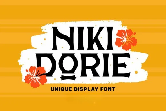
Hand-carved tropical wedge-serif display
Niki Dorie is a crisp tropical display serif combining geometric wedge serifs with playful hand-carved coastal bounce.
Ideas for this font
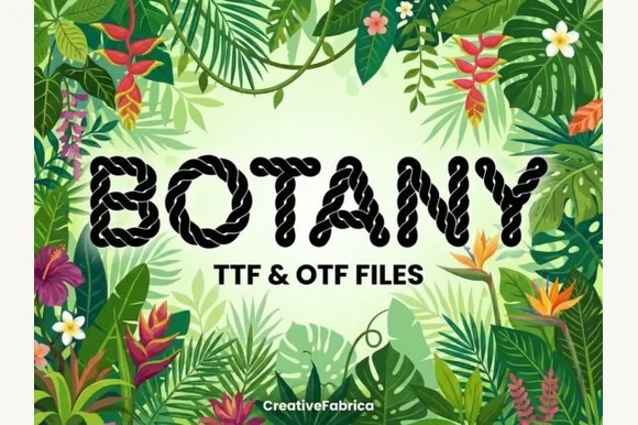
Twisted nautical-rope & macramé cord alphabet (TTF & OTF)
Botany is a crisp decorative display font twisting realistic multi-strand nautical rope into bold, clean uppercase letters (TTF & OTF).
Ideas for this font
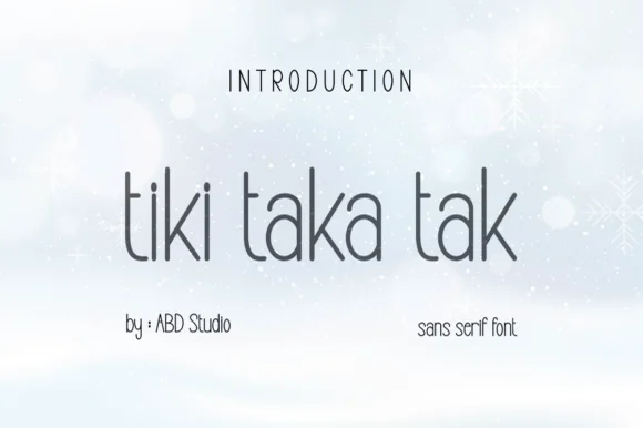
Tall slender minimalist geometric hairline sans serif
Tiki Taka Tak is actually a sleek, minimalist tall geometric sans serif (zero tropical tiki motifs!) built for clean modern branding.
Ideas for this font
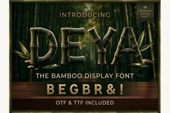
3D-ringed natural bamboo-culm alphabet + symbols (OTF & TTF)
Deya is a serene tropical decorative font forming clean geometric capitals and symbols ('&', '!') out of ringed bamboo stalks (OTF & TTF).
Ideas for this font
Same independent foundry
Allow optional Google Analytics to measure visits and catalogue actions. Your search words and notes are not included. Privacy & storage