Editorial Serif Anchor

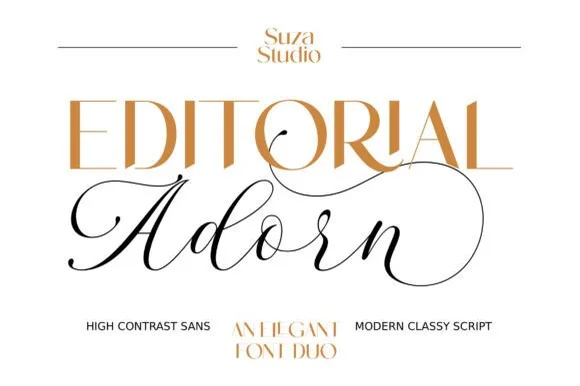
Barsela Calligraphy + Medvilea Editorial
Anchors Barsela Calligraphy's fluid strokes with crisp Roman proportions on wedding suites, headers and packaging.
Inspect Medvilea Editorial specimenDisclosure: MakerFileHub may earn a commission from qualifying purchases via paid links on this page. How our links work.
Flourished classical copperplate calligraphy script
Barsela Calligraphy is a sweeping classical calligraphy script (not a slab serif) draped in grand oval capital loops and figure-eight flourishes.
Paid link
Get this fontProject & layout blueprintsAt-a-glance maker compatibility
Weld or Unite overlapping script joins into one continuous vector path before sending to the blade.
Visual anatomy & craft review
Barsela Calligraphy is a classical copperplate script with grand oval capital loops, sweeping overhead crossbar loops and symmetrical figure-eight flourishes that extend far beyond the word. The contrast is high and the slant is formal, so the face needs roughly 30 mm before the hairlines hold, and the flourishes require the layout to reserve space on all four sides. It is a formal stationery face, best in one metallic or dark ink on a smooth coated stock, and it should not be set below about 14 pt in print.
Classical · Flourished · Formal
Two-font hierarchy recipes
Tested contrast partners — pairing Barsela Calligraphy with grounded secondary typography.
Barsela Calligraphy + Medvilea Editorial
Anchors Barsela Calligraphy's fluid strokes with crisp Roman proportions on wedding suites, headers and packaging.
Inspect Medvilea Editorial specimen
Barsela Calligraphy + Homies
Keeps small-scale dates, URLs, nutrition facts and care instructions crisp and legible below script titles.
Inspect Homies specimenPractical applications
Concrete hierarchy, scale and production guidance tailored to Barsela Calligraphy’s stroke geometry.
Copperplate flourishes signal a formal ceremony, which is what a hotel or cathedral wedding wants. The oval capitals give names scale without a monogram.
Hierarchy & layout recipe
Invitation 148 x 210 mm, names 30 mm with 12 mm flourish allowance, details 9/14 pt, 18 mm margins. Service card A5, headings 15 pt, hymns 8.5/12 pt. Place card 90 x 50 mm, name 9 mm.
Pre-production check
Hairlines under 0.15 mm fill on uncoated card and the flourish becomes a smear. Print on coated card, and check one 1:1 proof before the run rather than a scaled PDF.
A flourishes-heavy script reads as a written declaration, which is what an anniversary card should be. Symmetrical loops give a short message a formal frame.
Hierarchy & layout recipe
Card 120 x 170 mm, greeting 22 mm with 8 mm allowance, message 8/12 pt, 14 mm margins. Tag 45 x 80 mm, word 9 mm, hole 5 mm clear. Print 210 x 297 mm, greeting 50 mm, 30 mm margins.
Pre-production check
A 45 mm tag cannot hold a flourish and the loops collide with the punch. Use the plain style on tags and keep the flourishes for cards and prints.
Formal calligraphy gives an award an engraved register, which is the point of a certificate. A poetry cover uses the same family at a larger size without a second face.
Hierarchy & layout recipe
Certificate A4 landscape, recipient 22 mm, body 10/15 pt, 20 mm margins. Collection 129 x 198 mm, title 36 pt, spine 8 pt. Bookplate 90 x 60 mm, owner 9 pt, rule 1 pt.
Pre-production check
Certificates are printed on parchment-look stock that breaks hairlines into speckle. Print one proof on the actual stock, and drop to a plain style if the flourishes break up.
Technical & licence verification
Confirm included OTF/TTF/WOFF formats, full glyph tables and licence coverage on the live store page before batch production.
Closest visual alternatives
Matched across letterform anatomy, stroke behaviour and craft applications.
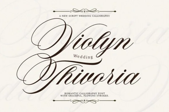
Grand copperplate wedding calligraphy with multi-looped capitals
Violyn Wedding Thivoria is a formal slanted calligraphy script distinguished by sweeping multi-looped capitals and smooth shaded lowercase.
Ideas for this font
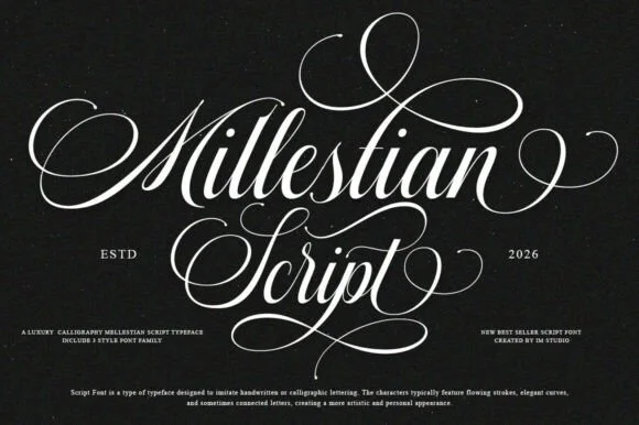
2-style PUA luxury Copperplate ornamental calligraphy family
Mallestian Script ('Millestian Script') is a PUA-encoded 2-style luxury Copperplate calligraphy family crowned with regal looping flourishes!
Ideas for this font
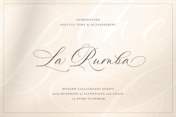
Fine-pointed copperplate wedding calligraphy with hundreds of alternates
La Rumba is a delicate, slanted copperplate calligraphy script featuring sweeping hairline entry loops, shaded downstrokes, and hundreds of alternates.
Ideas for this font
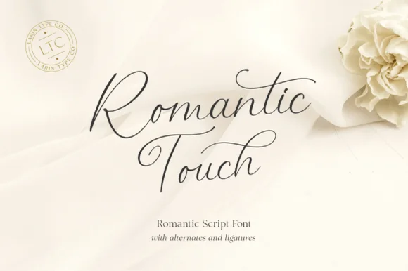
Ultra-fine airy fountain-pen calligraphy script
Romantic Touch is a feather-light, fluid handwritten script featuring wide looped capitals, flying t-crossbars, and delicate nib movement.
Ideas for this font
Same independent foundry
Allow optional Google Analytics to measure visits and catalogue actions. Your search words and notes are not included. Privacy & storage