Mountain Whitney + Vanielst Elegant Serif Display Stylistic
Anchors Mountain Whitney's fluid strokes with crisp Roman proportions on wedding suites, headers and packaging.
Inspect Vanielst Elegant Serif Display Stylistic specimenDisclosure: MakerFileHub may earn a commission from qualifying purchases via paid links on this page. How our links work.

Formal calligraphic branding script
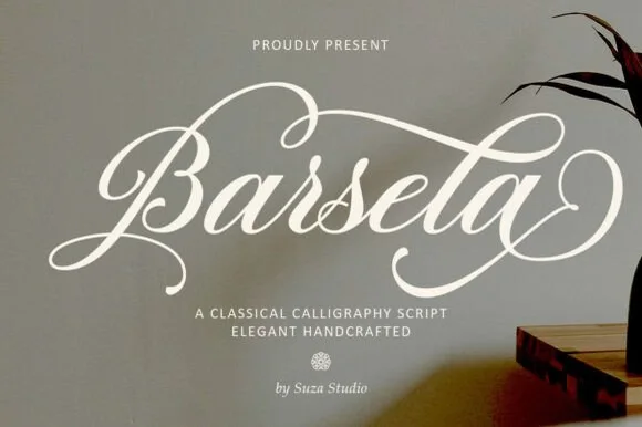
Mountain Whitney is a formal calligraphic script in white on a dark botanical ground: high-contrast strokes with a steep angle, ornate capitals with long swash entries, and tails that curl back into the word, so the pair reads as a brand mark drawn by a calligrapher rather than as an informal signature.
Paid link
Get this fontProject & layout blueprintsAt-a-glance maker compatibility
Weld or Unite overlapping script joins into one continuous vector path before sending to the blade.
Visual anatomy & craft review
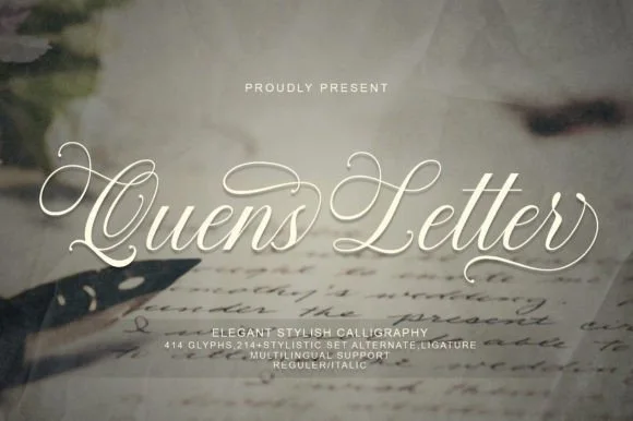
The two lines are stacked and slightly offset, and the drawing is a formal script: the downstrokes are heavy, the upstrokes are hairlines, and the joins are drawn with deliberate, visible connections, which keeps a decorative face readable. The capitals carry most of the ornament, with a W that opens into a wide curl and an M built from overlapping strokes, and the exits return inward rather than trailing away, which is what gives the lockup its closed, badge-like shape. Spacing is tight but the hairlines keep the letters apart at large sizes. The ground is a dark photograph of dried foliage, and the two tracked captions above and below sit in a light roman with wide letterspacing, so the page reads as a branding presentation.
Calligraphic, formal, swashed, elegant
Two-font hierarchy recipes
Tested contrast partners — pairing Mountain Whitney with grounded secondary typography.

Mountain Whitney + Vanielst Elegant Serif Display Stylistic
Anchors Mountain Whitney's fluid strokes with crisp Roman proportions on wedding suites, headers and packaging.
Inspect Vanielst Elegant Serif Display Stylistic specimen
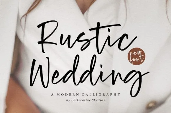
Mountain Whitney + Sailors
Keeps small-scale dates, URLs, nutrition facts and care instructions crisp and legible below script titles.
Inspect Sailors specimenPractical applications
Concrete hierarchy, scale and production guidance tailored to Mountain Whitney’s stroke geometry.
A formal calligraphy mark reads as a service rather than a product, and the closed swash shape holds on a shopfront where an informal signature would look unfinished at scale.
Hierarchy & layout recipe
Set the mark at 40 mm wide on a facade panel, 25 mm on a card and 14 mm on a ribbon, with a 7 pt roman descriptor at 300 units tracking. Keep the mark one colour and reserve clear space equal to the capital height.
Pre-production check
Check the 14 pt ribbon, where the hairlines can break; use a simplified cut below 18 pt. Confirm the facade mark reads at twenty metres and that the descriptor stays legible on a narrow ribbon.
A formal script sets a black-tie tone, and the closed swash shape gives the invitation a mark that can be repeated on the menu and the programme without redrawing.
Hierarchy & layout recipe
A5 invitation: the names at 26 pt, the request in a 10 pt roman at 14 pt leading, and the date in 9 pt caps. Keep 22 mm margins, leave 12 mm around the swashes, and letterpress one ink on a heavy cotton card.
Pre-production check
Check the 26 pt names on cotton, where a hairline upstroke can sink; proof the plate on the actual stock. Confirm the 10 pt request reads at arm's length and that the swashes clear the trim on both sides.
A calligraphic title gives a monograph a personal, commissioned tone, and the closed swash shape lets the title sit over a photograph without needing a panel behind it.
Hierarchy & layout recipe
Set the title at 70 mm wide on a 240 mm cover, the subtitle in a 10 pt roman, and the publisher at 7 pt. Keep the title on the darker side of the image and let the photograph run full bleed.
Pre-production check
Check the title at thumbnail size, where the hairlines can vanish into a dark image; raise the contrast. Confirm the 10 pt subtitle reads in a shop and that the title clears the trim by 15 mm.
Technical & licence verification
Confirm included OTF/TTF/WOFF formats, full glyph tables and licence coverage on the live store page before batch production.
Same independent foundry
Allow optional Google Analytics to measure visits and catalogue actions. Your search words and notes are not included. Privacy & storage