Modern Grotesque Body

Molimer + Miniplate
Creates crisp high-hierarchy contrast beneath Molimer headlines across menus, websites and labels.
Inspect Miniplate specimenDisclosure: MakerFileHub may earn a commission from qualifying purchases via paid links on this page. How our links work.
Elegant serif with oblique styles
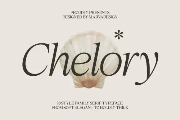
Molimer is an elegant serif in cream over a meadow photograph: moderate contrast, bracketed serifs, a large x-height and an oval O, offered in eighteen styles including an oblique, so the word reads as an editorial heading that could carry a whole issue.
Paid link
Get this fontProject & layout blueprintsAt-a-glance maker compatibility
Crisp hairline serifs shine on stationery, foil stamping, and packaging; add slight offset for small decals.
Visual anatomy & craft review
The word is set once, wide, and the drawing is a workhorse serif rather than a display face: the contrast is moderate so hairlines survive on uncoated paper, the serifs are short and bracketed, and the lowercase keeps a large x-height, which makes the pair readable in a paragraph as well as in a heading. The italic shown in the plate is a true oblique with the same skeleton, which is what lets one family cover titles, pull quotes and captions. Spacing is even and slightly generous, so the word does not feel tight at large sizes. The ground is a soft photograph of a woman holding yellow flowers, and the two small captions above and below are set in the same serif at small sizes, which quietly proves the family works below display scale.
Elegant, editorial, classic, versatile
Two-font hierarchy recipes
Tested contrast partners — pairing Molimer with grounded secondary typography.
Molimer + Miniplate
Creates crisp high-hierarchy contrast beneath Molimer headlines across menus, websites and labels.
Inspect Miniplate specimen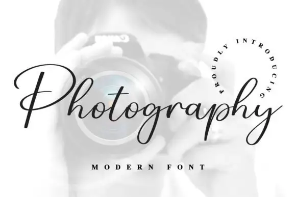
Molimer + Photography Font
Adds a warm human signature touch for 1-to-3-word callouts without competing against structured serif capitals.
Inspect Photography Font specimenPractical applications
Concrete hierarchy, scale and production guidance tailored to Molimer’s stroke geometry.
An editorial serif with eighteen styles lets one issue use a single family for the heading, the standfirst and the captions, which is what keeps a long feature looking considered.
Hierarchy & layout recipe
Set the heading at 60 pt, the standfirst at 12 pt with 16 pt leading, and the captions at 8 pt in the same family. Keep a 20 mm margin and align the standfirst to the heading's left edge rather than the page's.
Pre-production check
Check the 12 pt standfirst on newsprint, where a moderate contrast can grey out; keep the ink solid and the leading open. Confirm the 8 pt captions read at arm's length and that the italic holds its shape at that size.
A workhorse serif reads as formal without a script, which suits a couple who want restraint, and the family covers the invitation, the menu and the order of service consistently.
Hierarchy & layout recipe
A5 invitation: the names at 26 pt, the request in a 10 pt roman at 14 pt leading, and the date at 9 pt caps. Keep 22 mm margins and letterpress one ink on a heavy cream card so the bracketed serifs read as printed.
Pre-production check
Check the 26 pt names on cotton stock, where short serifs can fill; proof the plate. Confirm the 10 pt request reads under low light and that the italics in the order of service hold at 9 pt.
A serif family with an oblique gives a publisher a mark and a system from one licence, and the moderate contrast survives the small sizes a colophon needs.
Hierarchy & layout recipe
Set the mark at 20 pt on a title page, 12 pt on a spine and 8 pt in a colophon. Keep the mark in the roman and use the oblique only for subtitles so the identity stays consistent across a list.
Pre-production check
Check the 8 pt colophon, where a bracketed serif can fill on uncoated stock; keep the size at or above 7 pt. Confirm the spine mark reads on a shelf and that the oblique subtitle does not look like a different brand.
Technical & licence verification
Confirm included OTF/TTF/WOFF formats, full glyph tables and licence coverage on the live store page before batch production.
Closest visual alternatives
Matched across letterform anatomy, stroke behaviour and craft applications.
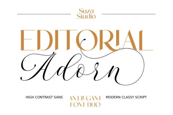
High-contrast fashion sans + fine calligraphic script editorial duo
Editorial Adorn is a refined luxury font duo pairing a radiant high-contrast fashion sans with an airy, sweeping Copperplate script!
Ideas for this font

High-contrast italic editorial serif
The Simple Editorial is a high-contrast italic serif in near-black on white: very fine hairlines, sharp serifs, a strong forward slant and a tall waist, shown in a full specimen with weight and width labels in a small caps grid around the display line.
Ideas for this font

High-contrast luxury serif with a swash descender and ball terminals
Bulgary is a high-contrast luxury serif in which the thick stems swell against hairlines, the terminals finish as small balls and the y drops a wide swash, so a single word carries the weight of a film title.
Ideas for this font

Large contrasting mixed case with a very tall capital and a wide open e
Evoire is a high-contrast editorial serif in which one capital rises far above the lowercase, the bowls stay broad and round, the i dot is a large circle and the final e opens wide to the right, so a name reads as a fashion masthead.
Ideas for this font
Same independent foundry
Allow optional Google Analytics to measure visits and catalogue actions. Your search words and notes are not included. Privacy & storage