Editorial Serif Anchor

Preppy Writing + Auretha
Anchors Preppy Writing's fluid strokes with crisp Roman proportions on wedding suites, headers and packaging.
Inspect Auretha specimenDisclosure: MakerFileHub may earn a commission from qualifying purchases via paid links on this page. How our links work.
Tall skinny hand-lettered capitals
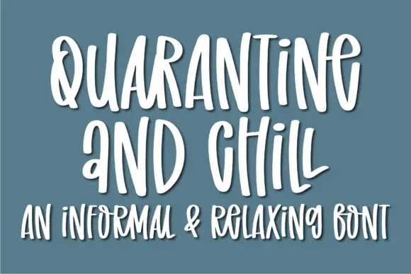
Preppy Writing is a tall skinny hand-lettering in charcoal on cream: narrow capitals with uneven stems, a small e and i, and a soft white outline that lifts the block off the ground.
Paid link
Get this fontProject & layout blueprintsAt-a-glance maker compatibility
Weld or Unite overlapping script joins into one continuous vector path before sending to the blade.
Visual anatomy & craft review
Both words are set in tall narrow letters, and the face is a hand rather than a typeface: the P is a narrow stem with a small bowl, the r is a short arm, the e is a small square loop and the i is a bare stem with a dot, while the stems themselves thicken and thin unevenly across a word, which is what makes a preppy hand look written with a marker. The letters are packed tight, the baseline bobs slightly and the white outline sits behind the whole block, so the group reads as a sticker on the page. Two tracked capital lines at the foot state the intended uses, teens, shirts and journals, and a small round stamp sits at the right. The face is a display handwriting for apparel, stickers, phone-wallpaper graphics and notebooks, and it holds at moderate sizes because the stems are thick.
A skinny preppy hand with a white outline
Two-font hierarchy recipes
Tested contrast partners — pairing Preppy Writing with grounded secondary typography.
Preppy Writing + Auretha
Anchors Preppy Writing's fluid strokes with crisp Roman proportions on wedding suites, headers and packaging.
Inspect Auretha specimen
Preppy Writing + Prime Nordic
Keeps small-scale dates, URLs, nutrition facts and care instructions crisp and legible below script titles.
Inspect Prime Nordic specimenPractical applications
Concrete hierarchy, scale and production guidance tailored to Preppy Writing’s stroke geometry.
A skinny hand reads as a design a teenager would actually wear, and the thick stems survive a screen print or a heat transfer on cotton.
Hierarchy & layout recipe
Print a 250 by 300 mm shirt graphic: set the line at 60 pt over two lines, keep 10 mm of clear bridge between letters, and leave 6 mm around the outline for the cutting path or screen.
Pre-production check
A hand with uneven stems can look broken when printed large; print one sample on the actual shirt and check the joins before the batch.
A preppy hand on a board signals a party rather than a ceremony, and the narrow capitals fit a long greeting on a narrow board.
Hierarchy & layout recipe
Print a 400 by 250 mm board: set the greeting at 80 pt over two lines, keep 20 mm of clear ground beneath before the names at 22 pt, and hold 18 mm of border on all four sides.
Pre-production check
The white outline vanishes on a pale board; print one at the final size and check the contrast before the set.
A hand with a white keyline is a sticker design on its own, and the tight spacing keeps a phrase inside a small die without shrinking the letters.
Hierarchy & layout recipe
Print a 100 by 150 mm sheet of 40 mm stickers: set the word at 22 pt inside each die, keep 7 mm of clear ground to the die line, and repeat the same block across the sheet.
Pre-production check
The keyline can cross the die on a tight cut; print one sheet and cut it before running the rest.
Technical & licence verification
Confirm included OTF/TTF/WOFF formats, full glyph tables and licence coverage on the live store page before batch production.
Closest visual alternatives
Matched across letterform anatomy, stroke behaviour and craft applications.
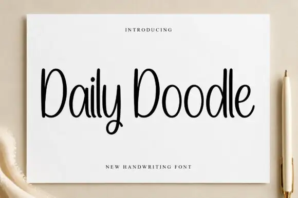
Narrow upright handwriting with tall ascenders and a soft even stroke
Daily Doodle is narrow upright handwriting in which the ascenders run tall, the stroke stays soft and even, and the letters stand apart at a gentle rhythm.
Ideas for this font
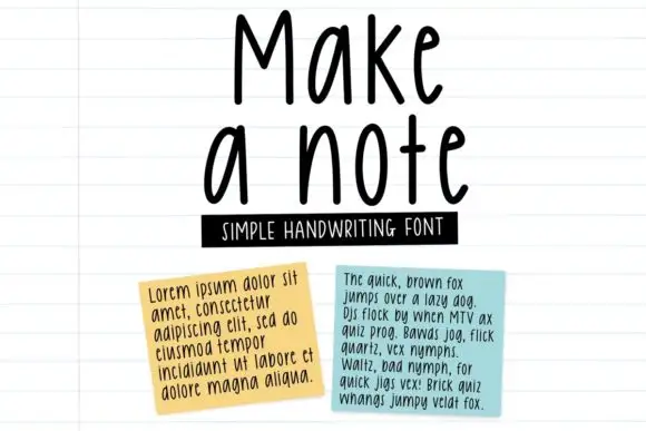
Tall neat monoline handwriting
Make a Note is a tall neat monoline handwriting in black on lined paper: high narrow letters, a small x-height, rounded terminals and an even spacing that keeps a paragraph legible at text size.
Ideas for this font
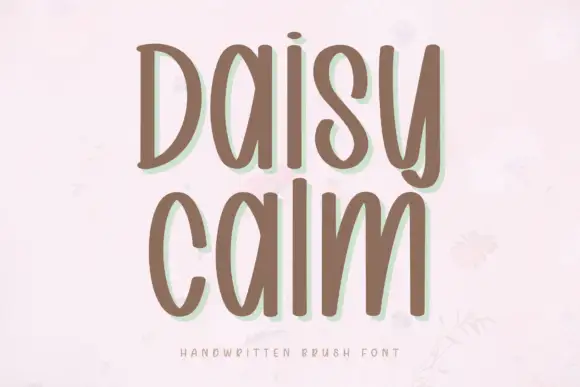
Soft brush capitals with a gentle bounce
Daisy Calm is a soft brush alphabet drawn with thick rounded strokes and a gentle bounce, set here in two lines of capitals that keep an even, unhurried rhythm.
Ideas for this font
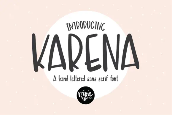
Tall narrow irregular hand-lettered sans with uneven stroke ends
Karena is a hand-lettered sans in which the letters run tall and narrow, the strokes vary in width and the ends sit flat and slightly uneven, so a word reads as something brushed onto a sign.
Ideas for this font
Same independent foundry
Allow optional Google Analytics to measure visits and catalogue actions. Your search words and notes are not included. Privacy & storage