Editorial Serif Anchor

Karena + Glofi
Anchors Karena's fluid strokes with crisp Roman proportions on wedding suites, headers and packaging.
Inspect Glofi specimenDisclosure: MakerFileHub may earn a commission from qualifying purchases via paid links on this page. How our links work.
Tall narrow irregular hand-lettered sans with uneven stroke ends
Karena is a hand-lettered sans in which the letters run tall and narrow, the strokes vary in width and the ends sit flat and slightly uneven, so a word reads as something brushed onto a sign.
Paid link
Get this fontProject & layout blueprintsAt-a-glance maker compatibility
Fine grain and micro-texture excel in 300 DPI print, sublimation, and screen print rather than small vinyl weeding.
Visual anatomy & craft review
The K keeps one stem and a splayed arm, the A carries a curved crossbar and a hooked leg, the R holds a narrow bowl and the E keeps three arms, all at a medium weight with flat ends and paths that wobble by a degree. That wobble is what keeps the face from reading as a condensed sans at 40 pt, and the narrow width lets a long word fill a tall panel on its own. The strokes vary slightly in thickness, so the face holds a brush quality without a dry edge. Below 18 pt the variation reads as uneven printing rather than as hand lettering. The cream ground, the dark ink, the pale circle behind and the round badge are presentation; the lettering is the word plus the small script caption.
Narrow · Irregular · Hand-lettered
Two-font hierarchy recipes
Tested contrast partners — pairing Karena with grounded secondary typography.
Karena + Glofi
Anchors Karena's fluid strokes with crisp Roman proportions on wedding suites, headers and packaging.
Inspect Glofi specimen
Karena + Nyxar
Keeps small-scale dates, URLs, nutrition facts and care instructions crisp and legible below script titles.
Inspect Nyxar specimenPractical applications
Concrete hierarchy, scale and production guidance tailored to Karena’s stroke geometry.
The narrow hand reads at 12 cm on a panel and looks brushed rather than set, which is what a small shop wants above its door.
Hierarchy & layout recipe
Print a 600 by 300 mm panel: set the shop name at 12 cm across the centre, set the category in a 4 cm sans beneath, and keep 8 cm of border so the uneven stroke ends are not cut by the frame or the fixings.
Pre-production check
Envoy weathering fades an uneven hand faster than a uniform one; check the panel after a season and keep the strokes wide enough to survive a repaint.
The hand-lettered capitals read on a slim label at 12 pt, and the narrow width lets a long product name sit on one line beside the scent.
Hierarchy & layout recipe
Print a 35 by 80 mm label: set the product at 12 pt, set the scent in a 5 pt caps sans beneath, and keep 4 mm of margin so the tall letters clear the die on both sides of the slim label.
Pre-production check
Slim labels leave no room for a second column; check the artwork and set the scent on a second label rather than condensing the hand.
The irregular capitals give a feature header a brushed character, and the narrow proportions let a long title span a single column at 34 pt.
Hierarchy & layout recipe
Print an A4 spread: set the header at 34 pt across a 100 mm measure, set the standfirst in a 10 pt serif at 14 pt leading, and hold 12 mm below the header so the uneven ends do not crowd the text.
Pre-production check
A brushed edge printed over a tinted panel can look like a registration fault; check the proof and keep the header on plain paper.
Technical & licence verification
Confirm included OTF/TTF/WOFF formats, full glyph tables and licence coverage on the live store page before batch production.
Closest visual alternatives
Matched across letterform anatomy, stroke behaviour and craft applications.
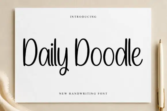
Narrow upright handwriting with tall ascenders and a soft even stroke
Daily Doodle is narrow upright handwriting in which the ascenders run tall, the stroke stays soft and even, and the letters stand apart at a gentle rhythm.
Ideas for this font
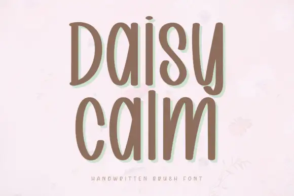
Soft brush capitals with a gentle bounce
Daisy Calm is a soft brush alphabet drawn with thick rounded strokes and a gentle bounce, set here in two lines of capitals that keep an even, unhurried rhythm.
Ideas for this font
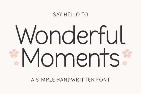
Thin rounded handwritten sans
Wonderful Moments is a thin rounded handwritten sans set in mixed caps: wide open letterforms, a light even stroke with rounded terminals and a small bounce that keeps the line from feeling ruled.
Ideas for this font
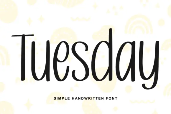
Simple unjoined handwriting with a light bounce
Tuesday is a simple handwritten face in black on white: a monoline, unjoined hand with tall ascenders, circular bowls and a slight bounce along the line, shown over pale yellow doodles of rainbows, stars and squiggles.
Ideas for this font
Same independent foundry
Allow optional Google Analytics to measure visits and catalogue actions. Your search words and notes are not included. Privacy & storage