Neutral Sans Workhorse

Preppy Senior + Kohilo
Lets Preppy Senior own the focal silhouette while handling secondary copy, sizing and subheads cleanly.
Inspect Kohilo specimenDisclosure: MakerFileHub may earn a commission from qualifying purchases via paid links on this page. How our links work.
Pastel patchwork graduation display
Preppy Senior is a pastel patchwork display on pale pink: hollow capitals drawn as an outline filled with patches of stripes and dots, decorated with graduation caps, bows, balloons, flowers and a ribbon banner, with a pink label at the head and a format line at the foot.
Paid link
Get this fontProject & layout blueprintsAt-a-glance maker compatibility
Sturdy stroke walls and open counters weed cleanly on adhesive vinyl, HTV apparel film, and cut cardstock.
Visual anatomy & craft review
This is a colour font sold with decoration files, and the plate is honest about it: the letters are outlined containers filled with patch patterns, and the accents are separate objects placed over and around them, which is why the sheet lists the formats and the number of decoration files at the foot. The drawing is soft and rounded, and the patch fill repeats across the word, so the block reads as a scrapbook rather than as lettering. Because the fill is busy, the face works at large sizes and on a craft cut, and the plate sets it large enough that each patch is visible. The pastel palette limits the contrast, so the outline does the work of separating the letters from the ground, which is the practical point a buyer needs to understand before cutting.
Decorative, pastel, novelty, layered
Two-font hierarchy recipes
Tested contrast partners — pairing Preppy Senior with grounded secondary typography.
Preppy Senior + Kohilo
Lets Preppy Senior own the focal silhouette while handling secondary copy, sizing and subheads cleanly.
Inspect Kohilo specimen
Preppy Senior + Alerigue
Grounds bold display lettering with classic typographic authority on posters, badges and apparel.
Inspect Alerigue specimenPractical applications
Concrete hierarchy, scale and production guidance tailored to Preppy Senior’s stroke geometry.
A patchwork colour font gives a graduation shirt the handmade look that a class committee wants, and the outline keeps the letters separate at 60 mm.
Hierarchy & layout recipe
Print a 240 mm chest graphic: the class year at 70 mm cap height, the name at 30 mm, and three colours on a light shirt. Keep the smallest patch at 4 mm and place the graphic 80 mm below the collar.
Pre-production check
Check the screen at actual mesh, where a 4 mm patch can fill; simplify the fill. Wash-test one shirt and confirm the outline stays closed after five cycles.
A pastel display marks a ceremony without a formal serif, and the decorative objects supply the graduation cues a banner needs.
Hierarchy & layout recipe
Print 1,200 by 450 mm: the greeting at 120 mm cap height, the year in a 40 mm block, and three colours on a light vinyl. Keep 30 mm margins and keep the accents above 15 mm.
Pre-production check
Check the banner at eight metres, where the patch fills can merge; keep the patches above 6 mm. Confirm the 40 mm year reads at four metres and that the accents clear the eyelets.
A soft display suits a thank-you card, and the decorative objects let a parent personalise a card without a separate illustration.
Hierarchy & layout recipe
A6 card: the greeting at 26 pt, the message at 9 pt, and two drawn accents. Keep 14 mm margins, print three colours on a white card and hold a quiet zone for the accents.
Pre-production check
Check the 26 pt greeting at home-print resolution, where a patch can fill; keep the patches above 0.8 mm. Confirm the 9 pt message keeps a 4.5:1 contrast and that the accents clear the trim.
Technical & licence verification
Confirm included OTF/TTF/WOFF formats, full glyph tables and licence coverage on the live store page before batch production.
Closest visual alternatives
Matched across letterform anatomy, stroke behaviour and craft applications.
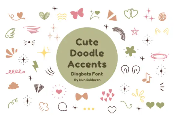
Pastel hearts, sparkles, bows and loose hand-drawn accent shapes
Cute Doodle Accents is a typable set of small decorative marks — four-point sparks, hearts in outline and solid, bows, ribbons, rainbows, teardrops, small flowers, notes and loops — in a muted pink, sage and mustard palette.
Ideas for this font
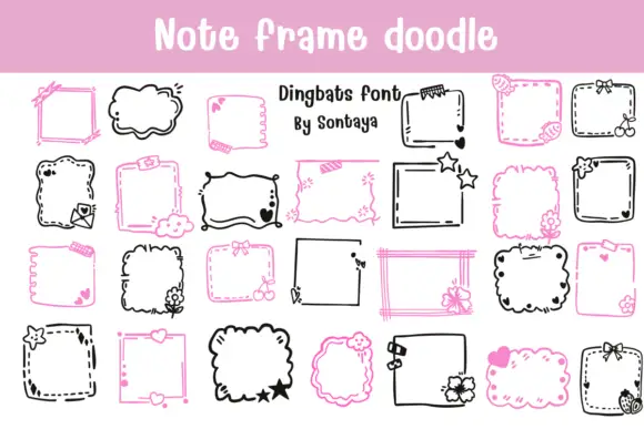
Note-frame dingbat set
Note Frame Doodle is a dingbat sheet on a pink band and white ground: many hand-drawn note frames in black and pink, some straight and ruled, some cloud-like with scalloped edges, decorated with small flowers, bows, stars and hearts, with a lined title at the top and a credit in the middle.
Ideas for this font
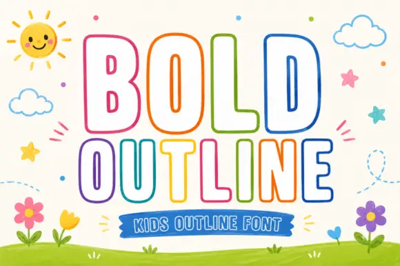
Rounded outline capitals
Bold Outline shows tall rounded capitals traced by a thin coloured contour on a pale field, where the B keeps small narrow counters while the L and D leave broad white interiors, and the letter widths change across the two rows so the second word runs wider than the first.
Ideas for this font
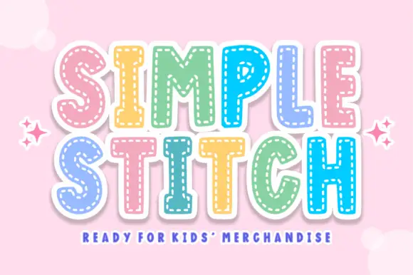
Stitched youth colour display
Simple Stitch is a colour display on pale pink: broad rounded capitals in pastel pink, yellow, green, blue and lilac, each with a dashed stitch line following the inner contour, white outline and soft shadow, set in two lines with sparkles at the sides and a plain caption along the foot.
Ideas for this font
Same independent foundry
Allow optional Google Analytics to measure visits and catalogue actions. Your search words and notes are not included. Privacy & storage