Neutral Sans Workhorse

Girly Halloween + Mansory
Lets Girly Halloween own the focal silhouette while handling secondary copy, sizing and subheads cleanly.
Inspect Mansory specimenDisclosure: MakerFileHub may earn a commission from qualifying purchases via paid links on this page. How our links work.
Rounded patchwork letters with pink motifs and small Halloween figures
Girly Halloween sets fat colour capitals in two treatments — cream with tiny black ghosts, and black with white dots — and dresses every letter with a bow, a flower, a pumpkin or a friendly ghost.
Paid link
Get this fontProject & layout blueprintsAt-a-glance maker compatibility
Sturdy stroke walls and open counters weed cleanly on adhesive vinyl, HTV apparel film, and cut cardstock.
Visual anatomy & craft review
GIRLY over HALLOWEEN fills the card on a pink ground scattered with black bats, flowers and ghosts, and each letter is a fat rounded shape with a stitched contour: the G is cream with a pink bow at the shoulder, the I is black and dotted with a witch hat, the R carries a pair of heart glasses, the Y is spotted with a bow. Two ghost characters float at the top corners, a pumpkin with a face sits in the counter of the A, and a broom leans against the final N. A caption at the top names the set, one at the foot lists the formats and twenty decoration files. The palette is pink, cream and black, which is the whole idea: a Halloween set for people who do not want orange and gore.
Rounded patchwork letters with pink motifs and small Halloween figures
Two-font hierarchy recipes
Tested contrast partners — pairing Girly Halloween with grounded secondary typography.
Girly Halloween + Mansory
Lets Girly Halloween own the focal silhouette while handling secondary copy, sizing and subheads cleanly.
Inspect Mansory specimen
Girly Halloween + Grandeur – Elegant Classic Serif
Grounds bold display lettering with classic typographic authority on posters, badges and apparel.
Inspect Grandeur – Elegant Classic Serif specimenPractical applications
Concrete hierarchy, scale and production guidance tailored to Girly Halloween’s stroke geometry.
The pastel palette and the bows give a Halloween card an audience that the usual orange and black design leaves out, and the characters make it friendly for younger guests.
Hierarchy & layout recipe
Print a 120 by 170 mm card: set the greeting at 38 pt across two rows, keep 18 mm of clear ground between the rows for the bows, and hold 13 mm from the tallest figure to the card edge.
Pre-production check
Small bows and flowers close up below 22 pt; print one card at the finished size and check the R before the batch.
A birthday that falls in October can borrow the season without becoming a Halloween card, which is what the bows and the soft palette allow.
Hierarchy & layout recipe
Print a 105 by 148 mm invitation: set the name at 34 pt across two rows, keep 16 mm of clear ground beneath before the details at 8.5 pt, and hold 12 mm from the contour to the card edge.
Pre-production check
Figures sit high on the letters and eat the leading; print one invitation and check the second row before the set.
The set gives a bakery a seasonal line that looks like its usual work rather than a costume, and one word on a plain box does the whole front.
Hierarchy & layout recipe
Print a 60 by 45 mm box label: set the bakery name at 14 pt on one row, keep 6 mm of clear ground above for the bows, and hold 4 mm from the contour to the die line.
Pre-production check
Bow details disappear on a small label; print one label on the real board and check the G before the order.
Technical & licence verification
Confirm included OTF/TTF/WOFF formats, full glyph tables and licence coverage on the live store page before batch production.
Closest visual alternatives
Matched across letterform anatomy, stroke behaviour and craft applications.
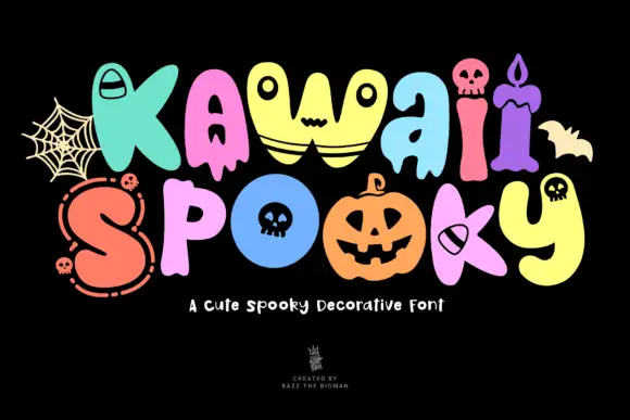
Soft irregular mixed case with varied Halloween faces, skulls, candle and stitched details
Kawaii Spooky shows two bright mixed-case rows on black, where rounded swollen letters carry different seasonal details, from ghost-like faces and small skulls to a candle shape and stitched marks, with the colour changing from letter to letter across the word.
Ideas for this font
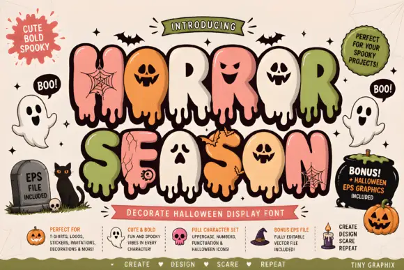
Bubble horror letters with faces and webs
Horror Season mixes puffy capitals with melting lower edges and face-shaped counters, where webs, cracks and small creature details appear inside selected letter bodies and the title is multicoloured with a heavy outline.
Ideas for this font
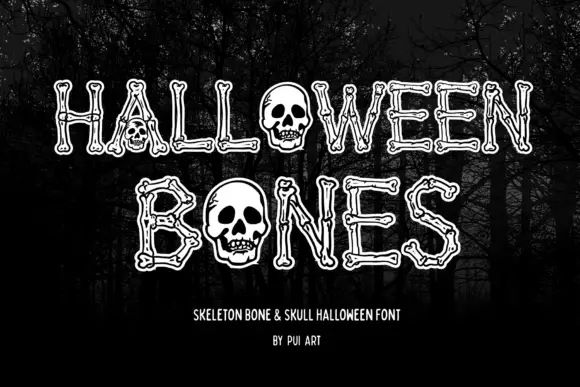
Narrow outlined capitals constructed from bone shapes with skulls replacing O forms
Halloween Bones sets pale outlined capitals against a dark forest, where long bone-like strokes end in small rounded joints and carry thin inner contours, and large skulls replace the O forms while the trees supply the scene behind the word.
Ideas for this font
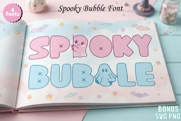
Pastel bubble display with cross counters
Spooky Bubble is a pastel colour display on a photograph of a book: fat rounded capitals in pink and pale blue with cross-shaped counters, a small ghost standing in for one letter and another ghost drawn inside a bowl, set in two lines with bats, candy and stars scattered around and a badge in the corner that names four fonts.
Ideas for this font
Same independent foundry
Allow optional Google Analytics to measure visits and catalogue actions. Your search words and notes are not included. Privacy & storage