Neutral Sans Workhorse

Cute Doodle Accents + Cultivo
Lets Cute Doodle Accents own the focal silhouette while handling secondary copy, sizing and subheads cleanly.
Inspect Cultivo specimenDisclosure: MakerFileHub may earn a commission from qualifying purchases via paid links on this page. How our links work.
Pastel hearts, sparkles, bows and loose hand-drawn accent shapes
Cute Doodle Accents is a typable set of small decorative marks — four-point sparks, hearts in outline and solid, bows, ribbons, rainbows, teardrops, small flowers, notes and loops — in a muted pink, sage and mustard palette.
Paid link
Get this fontProject & layout blueprintsAt-a-glance maker compatibility
Sturdy stroke walls and open counters weed cleanly on adhesive vinyl, HTV apparel film, and cut cardstock.
Visual anatomy & craft review
The card scatters about forty small marks around an olive circle that carries the set name, and each mark is drawn with a clean even line or as a simple filled shape: a sparkle with a dot, a striped heart, a small rainbow of three bands, a bow with two loops, a pair of cherries on a stem, a music note, a squiggle, a check mark, a pair of brackets. The scale is consistent across the set, which is what makes it useful for accents rather than for illustration — a mark can sit on a headline or between two words without dominating. The palette is deliberately soft, so the marks add punctuation to a page rather than colour, and because they are glyphs a whole border can be built by typing.
Pastel hearts, sparkles, bows and loose hand-drawn accent shapes
Two-font hierarchy recipes
Tested contrast partners — pairing Cute Doodle Accents with grounded secondary typography.
Cute Doodle Accents + Cultivo
Lets Cute Doodle Accents own the focal silhouette while handling secondary copy, sizing and subheads cleanly.
Inspect Cultivo specimen
Cute Doodle Accents + Evoire
Grounds bold display lettering with classic typographic authority on posters, badges and apparel.
Inspect Evoire specimenPractical applications
Concrete hierarchy, scale and production guidance tailored to Cute Doodle Accents’s stroke geometry.
A few marks on a plain box do the work of a printed pattern, and the soft palette suits a product that is bought as a gift rather than as a staple.
Hierarchy & layout recipe
Print a 70 by 50 mm box label: set the name at 14 pt in the centre with two sparks at 8 mm beside it, keep 5 mm of clear ground around the type, and hold 4 mm from the nearest mark to the die line.
Pre-production check
Small marks vanish on kraft; print one label on the real material and check a spark before the order.
The marks build a confetti field from type alone, which keeps a home-printed invitation cheap and lets the density be tuned to the layout.
Hierarchy & layout recipe
Print a 105 by 148 mm invitation: set the name at 30 pt with twelve marks scattered over the lower third, keep 8 mm of clear ground around the name, and hold 10 mm of margin at the edges.
Pre-production check
A dense field competes with the details; print one invitation and check the address block still reads first.
Two or three marks tie a menu, a place card and a program together without a monogram, which is what a modest wedding actually needs.
Hierarchy & layout recipe
Print a 105 by 210 mm menu: place a bow at 14 mm above the first course at 10 pt, repeat the same mark on the place cards at 8 mm, and hold 8 mm of clear ground between the mark and the type on every piece.
Pre-production check
Consistency across pieces is easy to lose; print the menu and one place card together and compare the marks before the run.
Technical & licence verification
Confirm included OTF/TTF/WOFF formats, full glyph tables and licence coverage on the live store page before batch production.
Closest visual alternatives
Matched across letterform anatomy, stroke behaviour and craft applications.
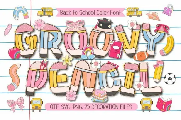
Rounded pencil-built capitals with pastel shafts and dark graphite ends
Groovy Pencil turns swelling capitals into coloured pencils, where pink eraser-like tops and narrow yellow collars sit above pastel blue, yellow, peach and pink shafts, and small bows, flowers and school objects overlap some letters over ruled notebook lines.
Ideas for this font
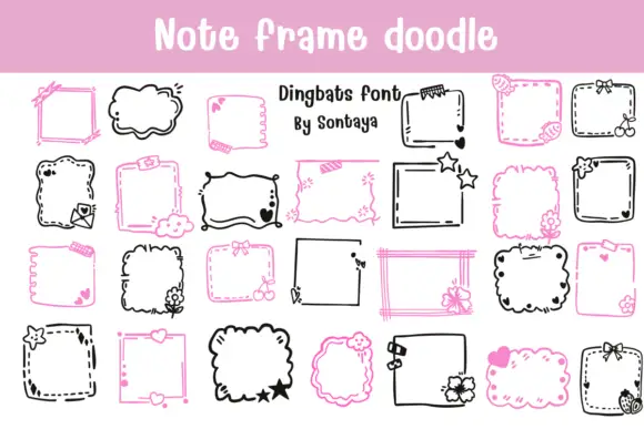
Note-frame dingbat set
Note Frame Doodle is a dingbat sheet on a pink band and white ground: many hand-drawn note frames in black and pink, some straight and ruled, some cloud-like with scalloped edges, decorated with small flowers, bows, stars and hearts, with a lined title at the top and a credit in the middle.
Ideas for this font
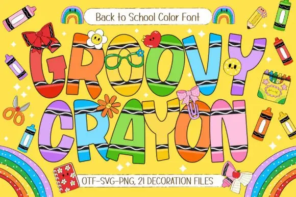
Tall rainbow capitals with black wavy bands and rounded ends
Groovy Crayon draws fat rounded letters in candy colours with a crayon-scribble fill, a heavy contour and a bow or a sticker on nearly every letter, then scatters crayons, rainbows and school objects around them.
Ideas for this font
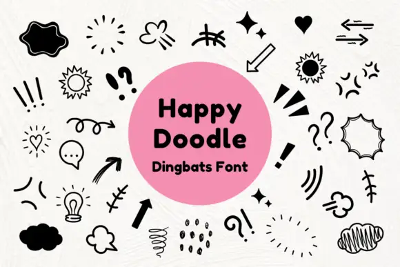
Black comic-style emphasis marks, arrows and outlined speech shapes
Happy Doodle is a dingbat set of marker-style marks: arrows, sparkles, suns, clouds, speech bubbles, exclamation marks, hatching and small stars, all drawn in one even black line.
Ideas for this font
Same independent foundry
Allow optional Google Analytics to measure visits and catalogue actions. Your search words and notes are not included. Privacy & storage