High-Contrast Display Serif

Shift + Alerigue
Pairs sculptural editorial warmth with Shift's clean modern geometry.
Inspect Alerigue specimenDisclosure: MakerFileHub may earn a commission from qualifying purchases via paid links on this page. How our links work.
Bold high-x-height grotesque
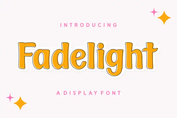
Shift Sans is a bold grotesque in cream on green: very tall x-height, short ascenders, flat terminals and slightly narrow counters, with two stacked lines filling the plate and a tracked caption above and below, so the pair reads as a contemporary poster headline.
Paid link
Get this fontProject & layout blueprintsAt-a-glance maker compatibility
Sturdy stroke walls and open counters weed cleanly on adhesive vinyl, HTV apparel film, and cut cardstock.
Visual anatomy & craft review
The two words are set at the same width and the drawing is a neo-grotesque with the x-height pushed up: the lowercase letters are almost as tall as the caps, the ascenders barely rise above them, and the terminals are cut flat, which gives the face an even, modern texture. The stroke is bold but not extreme, so the counters stay open and the word reads at small sizes as well as at poster scale, which is unusual for a display grotesque. Spacing is even and slightly tight, and the two lines are stacked with a small gap, so the block reads as a unit. The plate keeps to two colours, cream on a muted green, with a tracked introduction above and a format line beneath in the same family, so nothing competes with the word.
Bold, grotesque, friendly, modern
Two-font hierarchy recipes
Tested contrast partners — pairing Shift with grounded secondary typography.
Shift + Alerigue
Pairs sculptural editorial warmth with Shift's clean modern geometry.
Inspect Alerigue specimen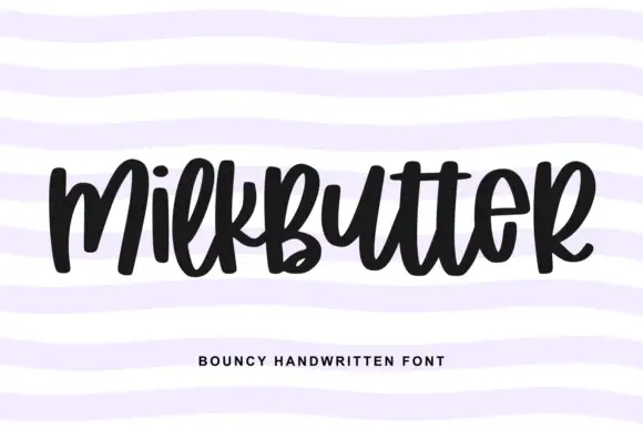
Shift + Milkbutter
Introduces organic movement on pull-quotes, signatures and gift tags.
Inspect Milkbutter specimenPractical applications
Concrete hierarchy, scale and production guidance tailored to Shift’s stroke geometry.
A bold grotesque with a tall x-height reads as modern and neutral, and the even weight holds at masthead size while staying legible in the small running heads the same issue needs.
Hierarchy & layout recipe
Set the masthead at 90 mm cap height, the running head at 9 pt with 100 units tracking, and the folio at 8 pt. Keep the masthead in one colour and reserve 15 mm above the trim for the cover lines.
Pre-production check
Check the 9 pt running head on newsprint, where a bold grotesque can look heavy; use the regular weight for that size. Confirm the masthead reads at newsstand distance and that the folio sits on a consistent baseline.
A tall x-height grotesque reads as competent and contemporary without decoration, and the flat terminals survive the small sizes a firm needs on forms and vehicle livery.
Hierarchy & layout recipe
Set the mark at 40 mm on a van panel, 20 pt on a card and 10 pt on a form header. Keep one colour and build a lighter weight for addresses so the mark stays the heaviest element on the page.
Pre-production check
Check the 10 pt form header, where tight counters can fill on a laser printer; keep the size above 8 pt. Confirm the van mark reads at fifteen metres and that the lighter weight does not look like a different family.
A friendly bold grotesque reads from across a hall without looking institutional, and the even weight prints cleanly on the PVC banners schools order in short runs.
Hierarchy & layout recipe
Print 1,200 by 600 mm: the event at 200 mm cap height, the times in a 40 mm regular, and a 8 mm rule. Keep 40 mm margins and print two colours so the heavy letters do not turn into a single flat block.
Pre-production check
Check the banner at eight metres, where tight counters can merge; open the tracking. Confirm the 40 mm times read at five metres and that the rule clears the eyelets by 30 mm.
Technical & licence verification
Confirm included OTF/TTF/WOFF formats, full glyph tables and licence coverage on the live store page before batch production.
Closest visual alternatives
Matched across letterform anatomy, stroke behaviour and craft applications.
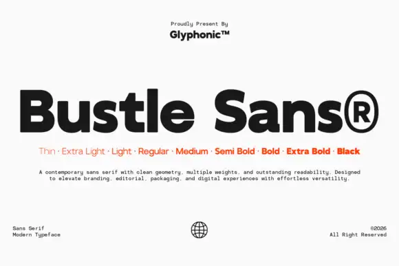
Dense rounded mixed case with open e bowls and a compact high t shoulder
Bustle shows black mixed-case lettering on white in a heavy treatment, where broad nearly even strokes surround compact bowls, the e opens horizontally, the u stays rounded and the t carries a compact shoulder high above the baseline.
Ideas for this font
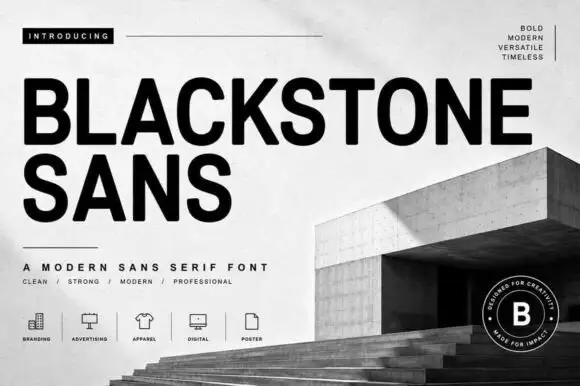
Substantial plain capitals with round O and blunt diagonal K and R legs
Blackstone Sans shows black uppercase words over a pale architectural cover, where substantial nearly even strokes form rounded B and O bowls, flat arms and blunt diagonal legs on the K and R, and the two title lines keep a straightforward block rhythm without swashes or outlines.
Ideas for this font
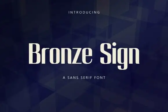
Narrow upright sans letters with softened rectangular bowls
Bronze Sign is a condensed sans display face: tall narrow caps and lowercase with a closed aperture, tight spacing and a flat, even stroke that reads like a sign painter's block letter.
Ideas for this font

Open rounded mixed case with a tall t and broad circular bowls
Cultivo shows a large black title-case name across the lower part of a pale beige cover, where light to moderate nearly even strokes form an open C, a broad u and near-circular bowls, the t finishes with a rounded lower turn and the v opens a clean diagonal.
Ideas for this font
Same independent foundry
Allow optional Google Analytics to measure visits and catalogue actions. Your search words and notes are not included. Privacy & storage