Neutral Sans Workhorse

Mama Designs + Furion
Lets Mama Designs own the focal silhouette while handling secondary copy, sizing and subheads cleanly.
Inspect Furion specimenDisclosure: MakerFileHub may earn a commission from qualifying purchases via paid links on this page. How our links work.
Sketch-stroke handwritten display
Mama Designs is a handwritten display in white on a painted dark backdrop: fat rounded letters drawn as open outlines with thin sketch lines running inside each stroke, so the word reads as a marker sketch rather than as filled type.
Paid link
Get this fontProject & layout blueprintsAt-a-glance maker compatibility
Sturdy stroke walls and open counters weed cleanly on adhesive vinyl, HTV apparel film, and cut cardstock.
Visual anatomy & craft review
The two words are stacked and the drawing is an outline with an inner texture: each letter is a thick white contour, and inside it three or four thin white lines follow the stroke direction, which gives the fill a hatched, sketched quality without using a fill at all. The letterforms are chunky and rounded, the A is broken into a triangle, the e is a small circle, and the letters lean slightly, so the pair reads as quick signage rather than as a constructed display. Because the shapes are open, the dark ground shows through the letters, which is what gives the word its contrast, and the inner lines stay visible only above roughly 30 pt. The ground is a dark, painted portrait with visible brush marks, and the two captions sit inside small white ribbons at the top and bottom.
Sketchy, outlined, hand-drawn, bold
Two-font hierarchy recipes
Tested contrast partners — pairing Mama Designs with grounded secondary typography.
Mama Designs + Furion
Lets Mama Designs own the focal silhouette while handling secondary copy, sizing and subheads cleanly.
Inspect Furion specimen
Mama Designs + Bulgary
Grounds bold display lettering with classic typographic authority on posters, badges and apparel.
Inspect Bulgary specimenPractical applications
Concrete hierarchy, scale and production guidance tailored to Mama Designs’s stroke geometry.
A sketch-outlined display gives a craft bar a hand-drawn wrapper, and because the letters are open the dark chocolate colour shows through, which is cheaper than printing a solid fill.
Hierarchy & layout recipe
Print a 90 by 60 mm wrapper: the brand at 18 pt, the flavour in a 7 pt sans, and the inner sketch lines thickened to 0.4 mm for the print. Keep 5 mm clear inside the die and print one ink on a dark stock.
Pre-production check
Check the 18 pt brand on the wrapper, where the inner lines can fill and read as a solid; thicken the gaps rather than the lines. Confirm the 7 pt flavour reads at arm's length and that the open letters still parse against the dark ground.
A sketch display signals a making workshop, and the open letters photocopy with more character than a solid bold face at the same size.
Hierarchy & layout recipe
A4 print: the title at 60 mm, the details in a 12 mm sans, and the inner sketch lines kept at 0.5 mm. Keep the design to one colour plus paper so a school copier reproduces the texture without filling it in.
Pre-production check
Check the A4 on a copier, where a thin inner line disappears; test one copy and thicken if needed. Confirm the 12 mm details read from two metres and that the open counters still read as letters.
A sketch display gives a craft annual a cover that looks hand-made, and the open strokes keep a large headline from becoming a heavy block on a busy cover.
Hierarchy & layout recipe
Set the title at 120 mm wide on a 240 mm cover, the subtitle in a 9 pt sans, and a 3 mm border. Print white on a dark, textured ground and keep the inner lines consistent across every letter.
Pre-production check
Check the title at thumbnail size, where the inner lines disappear and the letters read as outlines only; confirm the word still parses. Verify the 9 pt subtitle is legible online and that the border does not crowd the lettering.
Technical & licence verification
Confirm included OTF/TTF/WOFF formats, full glyph tables and licence coverage on the live store page before batch production.
Closest visual alternatives
Matched across letterform anatomy, stroke behaviour and craft applications.
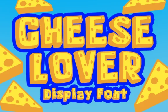
Chunky cartoon Swiss-cheese-hole novelty display!
Cheese Lover Outline sculpts chunky cartoon block capitals packed with playful Swiss-cheese holes and bubbly outlined wedges!
Ideas for this font
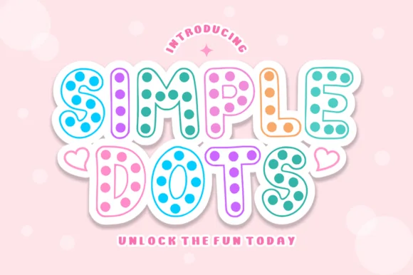
Hollow-outline polka-dot cartoon bubble display
Simple Dots fills crisp double-outlined cartoon bubble letters with cheerful polka-dot confetti for sweet stationery and party prints!
Ideas for this font
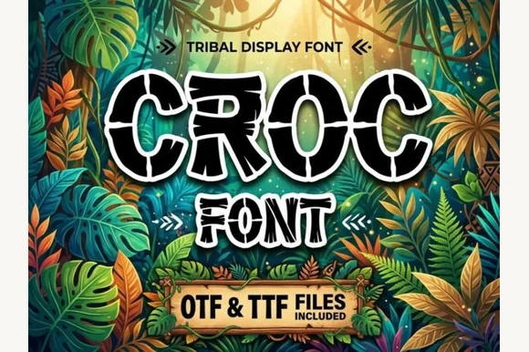
Cracked crocodile-scale & prehistoric jungle block font (OTF & TTF)
Croc is a bold jungle decorative font etching reptile/crocodile scale cracks across chunky cartoon-outlined capitals (OTF & TTF).
Ideas for this font
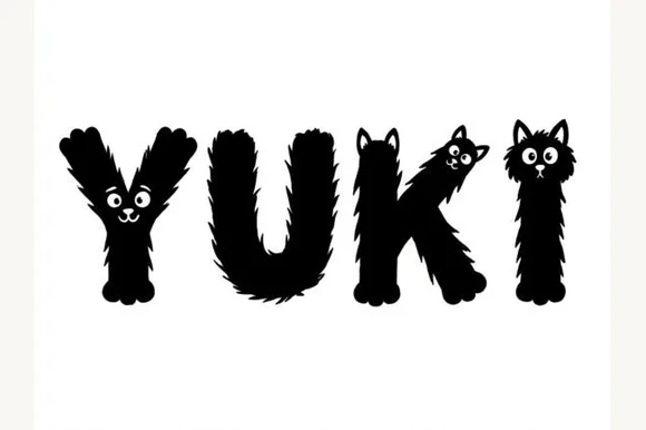
Fluffy black-cat & furry-paw illustrated animal alphabet
Yuki is an adorable illustrated pet novelty font sculpting fuzzy black-furred letters complete with peeking cat faces, ears, and furry paws.
Ideas for this font
Same independent foundry
Allow optional Google Analytics to measure visits and catalogue actions. Your search words and notes are not included. Privacy & storage