Neutral Sans Workhorse

Opulent Editorial + Cenura
Lets Opulent Editorial own the focal silhouette while handling secondary copy, sizing and subheads cleanly.
Inspect Cenura specimenDisclosure: MakerFileHub may earn a commission from qualifying purchases via paid links on this page. How our links work.
Ornate serif with swashed capitals
Opulent Editorial is an ornate serif in black on white: high contrast, wide capitals with swashed entries on the O and the E, a T whose arms curl, and a companion italic used for the caption, so a single line carries three levels of ornament.
Paid link
Get this fontProject & layout blueprintsAt-a-glance maker compatibility
Sturdy stroke walls and open counters weed cleanly on adhesive vinyl, HTV apparel film, and cut cardstock.
Visual anatomy & craft review
The specimen sets a tracked line above in teal, a small lead-in line, the display name at large size, and two caption lines in the italic beneath. The display itself is a serif with an ornamental layer: the O opens with a curled entry stroke, the E carries a swash on its lower arm, and the l and the t end in small hooked terminals, while the stems keep a proper thick-thin contrast. The capitals are wide and generously spaced, which lets each ornament read separately, and the italic caption is a genuine italic with a calligraphic lean rather than a slant. The ground is white with a faint botanical shadow, and the palette is black plus one teal accent, so the ornament is the only decoration and the page reads as a book jacket rather than a type sample.
Ornate, editorial, classic, decorative
Two-font hierarchy recipes
Tested contrast partners — pairing Opulent Editorial with grounded secondary typography.
Opulent Editorial + Cenura
Lets Opulent Editorial own the focal silhouette while handling secondary copy, sizing and subheads cleanly.
Inspect Cenura specimen
Opulent Editorial + Medvilea Editorial
Grounds bold display lettering with classic typographic authority on posters, badges and apparel.
Inspect Medvilea Editorial specimenPractical applications
Concrete hierarchy, scale and production guidance tailored to Opulent Editorial’s stroke geometry.
An ornate serif with swashed capitals gives an anthology the look of a classic edition, and the italic companion handles the editor and imprint lines in the same voice.
Hierarchy & layout recipe
Set the title at 84 pt across 180 mm on a 234 mm cover, the subtitle in the italic at 12 pt beneath, and the imprint in 8 pt caps at the foot. Keep 25 mm between the title and the subtitle so the swashes have air.
Pre-production check
Check the swash of the O and the E at 84 pt, where a curl can clip the trim if the head margin is under 20 mm. Confirm the 12 pt italic reads at arm's length and that the hairlines hold on the chosen cover stock.
An ornate serif gives a small press an imprint that looks established, and the italic gives the same family a second register for colophons and spines.
Hierarchy & layout recipe
Set the imprint at 26 pt on title pages, 14 pt on spines, and 10 pt on the copyright page in the italic. Keep the ornament only at the 26 pt size and use the plain capitals for the spine so the swashes do not blur.
Pre-production check
Check the 14 pt spine version, where the swashed capitals fill in; substitute the plain caps for all spine work. Confirm the 10 pt italic colophon stays legible on a matte paperback and that the imprint's ornament clears the title page's trim.
An ornate serif sets a formal service in a register that a modern sans cannot, and the italic handles the readings and the hymns without a second typeface.
Hierarchy & layout recipe
Set the cover title at 46 pt on a 148 by 210 mm booklet, the order of service in the italic at 9.5 pt, and the hymns in 9 pt roman. Keep 18 mm margins and print one ink on a cream stock so the ornament reads as engraved rather than decorated.
Pre-production check
Check the 9.5 pt italic in dim chapel light, where a light weight can fall below a readable contrast; increase the weight for the inner pages. Confirm the cover title's swash clears the trim and that the staple line does not cross any of the type.
Technical & licence verification
Confirm included OTF/TTF/WOFF formats, full glyph tables and licence coverage on the live store page before batch production.
Closest visual alternatives
Matched across letterform anatomy, stroke behaviour and craft applications.
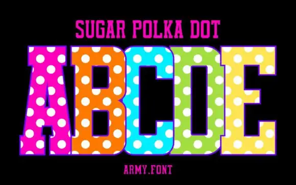
Slab capitals with polka dots
Sugar Polka Dot is a colour display on a black ground: tall slab-like capitals in vivid pink, orange, blue, green and yellow, each covered with large white dots, with a thin outline, a plain name line above and a studio credit beneath.
Ideas for this font
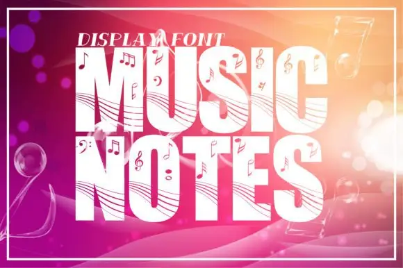
Staff-lined music display
Music Notes is a tall heavy display in white on a warm gradient ground: fat capitals crossed by curved staff-like lines and scattered with note heads, clefs, sharps and flats, with a small line above, a thin frame around the sheet and bokeh circles behind the type.
Ideas for this font
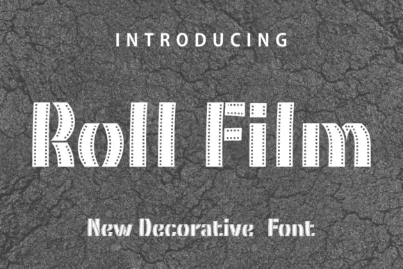
Film-strip band display
Roll Film is a display face in white on cracked grey asphalt: tall capitals built from narrow vertical bands with a row of small perforations down each side, slotted ends and a stepped, segmented silhouette, with tracked lines above and beneath.
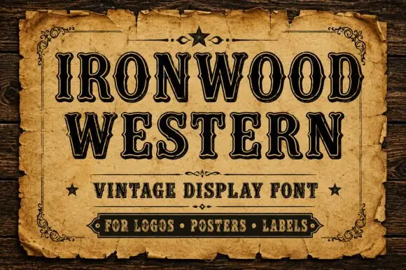
Western capitals with narrow inset lines and notched sides
Ironwood Western shows heavy black capitals with fine pale inset contours and repeated small notches along the upright sides, where flared serif ends and tight bowls create a dense two-row sign-like title.
Same independent foundry
Allow optional Google Analytics to measure visits and catalogue actions. Your search words and notes are not included. Privacy & storage



