Modern Grotesque Body

Optimal Jersey + Inkora
Creates crisp high-hierarchy contrast beneath Optimal Jersey headlines across menus, websites and labels.
Inspect Inkora specimenDisclosure: MakerFileHub may earn a commission from qualifying purchases via paid links on this page. How our links work.
Bold jersey athletic display
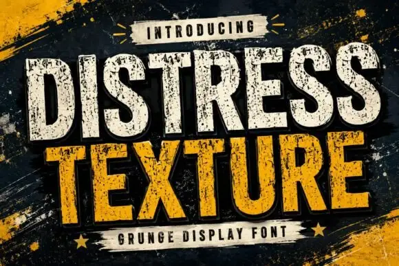
Optimal Jersey is a bold athletic display in deep red with a cream keyline and a dark shadow on a black stadium ground: heavy condensed caps with flat-sided bowls, square shoulders and a small notch, set on two lines inside a pill banner with a tracked line beneath and speed streaks at the corners.
Paid link
Get this fontProject & layout blueprintsAt-a-glance maker compatibility
Sturdy stroke walls and open counters weed cleanly on adhesive vinyl, HTV apparel film, and cut cardstock.
Visual anatomy & craft review
The two words are stacked and the drawing is a sports jersey block: the bowls are flat-sided, the shoulders are square, and the counters are narrow, which is what lets a long word read from a stand. The cream keyline and the dark shadow are part of the construction rather than a post effect, so the same look reproduces on a garment and on a screen, and the plate shows the pair inside a banner with speed streaks, which is how the style is usually presented. Because the letters are condensed and heavy, the face works at large sizes and on fabric, and the specimen keeps the ground dark so the red reads as a fill rather than a flat colour. The tracked line beneath is set in a small condensed sans.
Athletic, bold, jersey, sport
Two-font hierarchy recipes
Tested contrast partners — pairing Optimal Jersey with grounded secondary typography.
Optimal Jersey + Inkora
Creates crisp high-hierarchy contrast beneath Optimal Jersey headlines across menus, websites and labels.
Inspect Inkora specimen
Optimal Jersey + Welcome
Adds a warm human signature touch for 1-to-3-word callouts without competing against structured serif capitals.
Inspect Welcome specimenPractical applications
Concrete hierarchy, scale and production guidance tailored to Optimal Jersey’s stroke geometry.
A jersey display reads from the far side of a stand, and the keyline keeps the letters separated against a busy crowd or a dark wall.
Hierarchy & layout recipe
Print 1,600 by 600 mm: the team at 200 mm cap height, the fixture in a 40 mm condensed sans, and a 6 mm keyline. Keep 35 mm margins and print three colours on a light vinyl.
Pre-production check
Check the banner at fifteen metres, where the keyline can disappear; keep it above 10 mm. Confirm the 40 mm fixture reads at six metres and that the eyelets clear the block.
A jersey face prints cleanly as a single screen on polyester, and the square shoulders hold in sublimation where a rounded face can soften.
Hierarchy & layout recipe
Set the club name at 70 mm on a shirt back, 22 mm on a shorts leg and 12 mm on a sock, keeping the keyline only above 40 mm. Place the number at 200 mm and keep 15 mm between letter and number.
Pre-production check
Check the 12 mm sock mark, where the keyline closes; drop it at that size. Confirm the shirt back reads at ten metres and that the sublimated colour stays true after washing.
A jersey block reads as real kit, which suits a sports-themed birthday better than a novelty face, and the shadow prints in one pass.
Hierarchy & layout recipe
Print a 280 mm chest graphic: the name at 60 mm cap height, the age at 90 mm, and two inks on a light shirt. Keep the keyline at 4 mm and place the graphic 80 mm below the collar.
Pre-production check
Check the screen at actual mesh, where a 4 mm keyline fills; thicken it. Wash-test one shirt and confirm the age stays legible after five cycles.
Technical & licence verification
Confirm included OTF/TTF/WOFF formats, full glyph tables and licence coverage on the live store page before batch production.
Closest visual alternatives
Matched across letterform anatomy, stroke behaviour and craft applications.
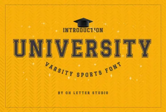
Wide geometric variable sans
Mechacore is a wide geometric sans in black on yellow: square extended letters, a flat-topped C, a stencil variant, five weights from light to bold, and an ultra-expanded width, laid out as a technical sheet with rules, labels and a barcode, so the plate reads as a system rather than a single font.
Ideas for this font
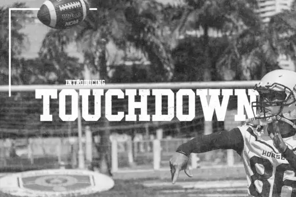
Condensed athletic slab
Touchdown is a solid condensed athletic slab in white over a monochrome photograph of a quarterback: heavy capitals with clipped bowls, square feet and flat terminals, set as one line across the middle of the image with a small tracked note above.
Ideas for this font
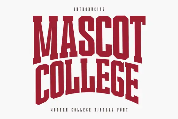
Very condensed collegiate slabs with tall stems and flat feet
Mascot College is a very condensed collegiate slab in which the stems run tall, the slabs are flat and thin and the counters close to slits, so a long name fits one line on a narrow format.
Ideas for this font
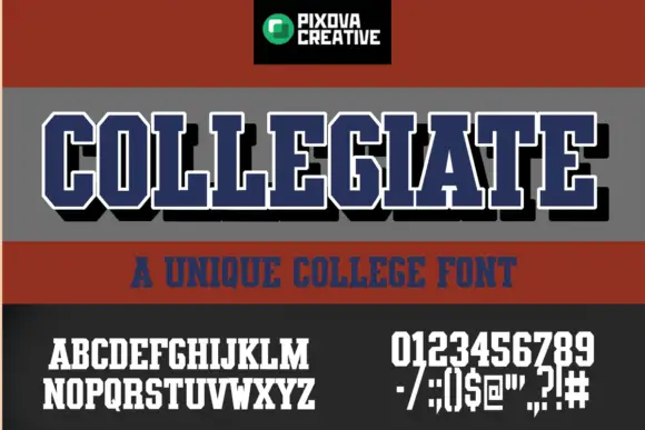
Condensed athletic capitals with clipped corners and slab feet
Collegiate shows narrow block capitals with heavy upright strokes, broad slab feet and clipped outer corners: the main title carries a white outline and a black offset shadow, with smaller alphabet, numeral and punctuation samples printed beneath.
Same independent foundry
Allow optional Google Analytics to measure visits and catalogue actions. Your search words and notes are not included. Privacy & storage