Modern Grotesque Body

Touchdown + Bargain Condensed
Creates crisp high-hierarchy contrast beneath Touchdown headlines across menus, websites and labels.
Inspect Bargain Condensed specimenDisclosure: MakerFileHub may earn a commission from qualifying purchases via paid links on this page. How our links work.
Condensed athletic slab
Touchdown is a solid condensed athletic slab in white over a monochrome photograph of a quarterback: heavy capitals with clipped bowls, square feet and flat terminals, set as one line across the middle of the image with a small tracked note above.
Paid link
Get this fontProject & layout blueprintsAt-a-glance maker compatibility
Sturdy stroke walls and open counters weed cleanly on adhesive vinyl, HTV apparel film, and cut cardstock.
Visual anatomy & craft review
The word runs across the photograph at chest height and the drawing is a condensed athletic slab: the bowls are clipped into rectangles, the feet are square, and the stems are heavy, so the face reads as team lettering printed on a jersey. That construction sets a moderate size floor, because the clipped counters close quickly, and the placement over a busy monochrome image shows that the heavy strokes hold where a light face would break up. The tracked note above is small and plain. Because the letters are condensed and solid, the face fits a long name on a banner and reads at distance, and it prints in one screen on a shirt, which is the practical reason a sports identity chooses this shape over a broad collegian.
Slab, condensed, athletic, bold
Two-font hierarchy recipes
Tested contrast partners — pairing Touchdown with grounded secondary typography.
Touchdown + Bargain Condensed
Creates crisp high-hierarchy contrast beneath Touchdown headlines across menus, websites and labels.
Inspect Bargain Condensed specimen
Touchdown + Lovely
Adds a warm human signature touch for 1-to-3-word callouts without competing against structured serif capitals.
Inspect Lovely specimenPractical applications
Concrete hierarchy, scale and production guidance tailored to Touchdown’s stroke geometry.
A condensed athletic slab fits a long team name on a banner, and the square feet hold at distance in a stadium. A team name has to fit one row on a banner.
Hierarchy & layout recipe
Print 1,300 by 480 mm: the team at 160 mm cap height, the fixture in a 32 mm slab, and a 5 mm border. Keep 30 mm margins and print one colour on light vinyl.
Pre-production check
Check the banner at ten metres, where a clipped counter can close; keep it above 6 mm. Confirm the 32 mm fixture reads at five metres and that the eyelets clear the block.
A solid slab prints in one screen and reads as kit, which suits a supporters' shirt seen in a crowd photo. A supporters' shirt reads as kit, not as fashion.
Hierarchy & layout recipe
Print a 250 mm chest graphic: the name at 60 mm cap height, the year at 28 mm, and one ink on a light shirt. Keep the narrowest counter at 4 mm and place the graphic 80 mm below the collar.
Pre-production check
Check the screen at actual mesh, where a 4 mm counter can fill; open the spacing. Wash-test one shirt and confirm the feet stay square after five cycles.
A sports slab names the venue in the language of the game, and the heavy strokes hold on a board that faces the street. A sports bar names the trade in the lettering.
Hierarchy & layout recipe
Paint a 1,000 by 380 mm board: the bar at 120 mm cap height, the fixtures in a 22 mm slab, and a 5 mm rule. Keep 25 mm margins and paint two colours on a primed board.
Pre-production check
Check the board at five metres, where a clipped bowl can look broken; keep the clips consistent. Confirm the 22 mm fixtures read at two metres and that the rule survives a wet season.
Technical & licence verification
Confirm included OTF/TTF/WOFF formats, full glyph tables and licence coverage on the live store page before batch production.
Closest visual alternatives
Matched across letterform anatomy, stroke behaviour and craft applications.
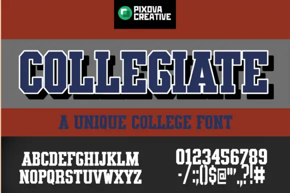
Condensed athletic capitals with clipped corners and slab feet
Collegiate shows narrow block capitals with heavy upright strokes, broad slab feet and clipped outer corners: the main title carries a white outline and a black offset shadow, with smaller alphabet, numeral and punctuation samples printed beneath.
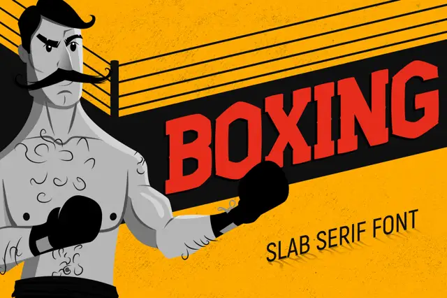
Angular condensed athletic blocks with compact counters
Boxing places red capitals across a rising black band inside a yellow ring illustration, where the O and G have clipped corners, the X runs sharply diagonal and short slab ends keep the word compact.
Ideas for this font
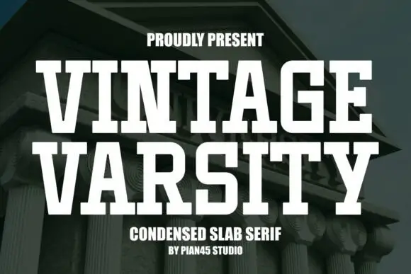
Condensed athletic slab
Vintage Varsity is a clean condensed slab in white over a photograph of a classical building: tall capitals with broad horizontal feet, flat terminals and even strokes, set in two lines with a small tracked line above and two plain notes beneath.
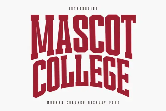
Very condensed collegiate slabs with tall stems and flat feet
Mascot College is a very condensed collegiate slab in which the stems run tall, the slabs are flat and thin and the counters close to slits, so a long name fits one line on a narrow format.
Ideas for this font
Same independent foundry
Allow optional Google Analytics to measure visits and catalogue actions. Your search words and notes are not included. Privacy & storage