Modern Grotesque Body

Old Vintage Victorian + One More
Creates crisp high-hierarchy contrast beneath Old Vintage Victorian headlines across menus, websites and labels.
Inspect One More specimenDisclosure: MakerFileHub may earn a commission from qualifying purchases via paid links on this page. How our links work.
Period display serif
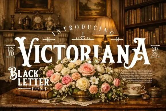
Old Vintage Victorian is a period display serif in cream on an aged sepia ground: capitals with a curled O, a tall sweeping V, fine hairlines and bracketed serifs, set in three stacked lines with small rules and a date at each side, over a photograph of a motorcycle among roses.
Paid link
Get this fontProject & layout blueprintsAt-a-glance maker compatibility
Sturdy stroke walls and open counters weed cleanly on adhesive vinyl, HTV apparel film, and cut cardstock.
Visual anatomy & craft review
The plate is a period advertisement, and the type is set the way a Victorian printer would set it: three lines of different widths, small rules and a date split across the sides, with the ornament doing as much work as the letters. The drawing is a display serif with a curled O and a tall sweeping V, so the face reads as a printed placard rather than as a book face, and the hairlines set a size floor because they close first. The roses and the motorcycle are staging. The small line at the foot is product copy. It suits a poster, a label and a sign for a heritage subject, and the three-line setting is the model for how it should be used.
Serif, victorian, display, antique
Two-font hierarchy recipes
Tested contrast partners — pairing Old Vintage Victorian with grounded secondary typography.
Old Vintage Victorian + One More
Creates crisp high-hierarchy contrast beneath Old Vintage Victorian headlines across menus, websites and labels.
Inspect One More specimen
Old Vintage Victorian + Silken Luxe
Adds a warm human signature touch for 1-to-3-word callouts without competing against structured serif capitals.
Inspect Silken Luxe specimenPractical applications
Concrete hierarchy, scale and production guidance tailored to Old Vintage Victorian’s stroke geometry.
A period serif frames a heritage cover, and the curled O gives the title a printed character that a modern face cannot. It carries a heritage cover.
Hierarchy & layout recipe
Set the title at 90 mm cap height on three lines, the subtitle in an 11 pt serif, and the date at 8 pt. Print two colours on a textured stock and keep 22 mm margins.
Pre-production check
Check the title at 90 mm, where a hairline can break; keep it above 0.3 mm. Confirm the 11 pt subtitle holds on the stock and that the date survives lamination.
A period label reads as a house with history, and the three-line setting fits a lot of information on a narrow bottle. It reads as a house with age.
Hierarchy & layout recipe
Print a 55 by 90 mm label: the house at 12 pt, the expression at 8 pt, and the year at 7 pt. Keep 5 mm inside the die and keep the hairlines above 0.25 mm.
Pre-production check
Check the 12 pt house on a curved bottle, where a hairline can fill; keep it above 0.25 mm. Confirm the 7 pt year reads on the shelf and that the label holds in a cellar.
A period serif reads as a printed bill, and the stacked lines fill a poster with a hierarchy rather than a block. It fills a bill with hierarchy.
Hierarchy & layout recipe
A2 poster: the fair at 100 mm cap height, the dates in a 24 mm serif, and the field at 11 mm. Keep 28 mm margins and print two colours on a light stock.
Pre-production check
Check the A2 at five metres, where a hairline can break; keep it above 2 mm. Confirm the 11 mm field reads at two metres and that the rules clear the block.
Technical & licence verification
Confirm included OTF/TTF/WOFF formats, full glyph tables and licence coverage on the live store page before batch production.
Closest visual alternatives
Matched across letterform anatomy, stroke behaviour and craft applications.
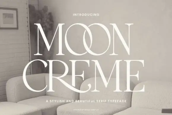
Fine contrasting capitals with overlapping circular bowls
Moon Creme shows tall white serif capitals with fine hairlines and broad round O forms on a muted interior photograph, where the two O letters overlap into a single linked shape and the R leg of the lower row sweeps beneath the following letters before curling away.
Ideas for this font
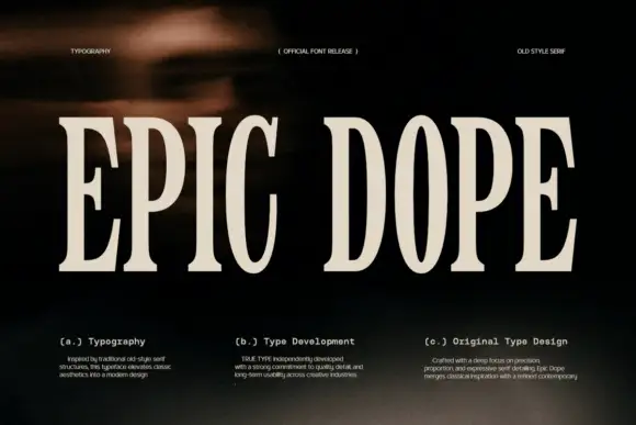
Condensed old-style serif with tall narrow letterspaced capitals
Epic Dope is a condensed old-style serif in which the capitals stretch tall, the serifs finish in small balls and the fit runs narrow, so a two-word title reads as a film credit card rather than as a headline.
Ideas for this font
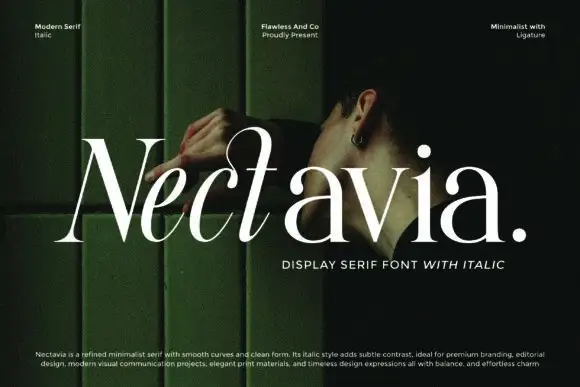
Minimalist display serif with italic
Nectavia is a refined minimalist serif in white over a dark green portrait: moderate contrast, smooth curves, a clean stem and sharp serifs, set in title case on one line with a small italic line beneath and three tracked notes across the top.
Ideas for this font
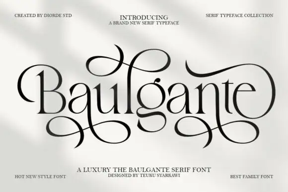
Tall high-contrast serif with looping figure-eight extensions in regular and slant
Baulgante is an elegant high-contrast serif in which the stems stay narrow, the bowls round broadly and repeated figure-eight extensions loop above and below the line, and the family ships in regular and slant so a suite can shift its axis.
Ideas for this font
Same independent foundry
Allow optional Google Analytics to measure visits and catalogue actions. Your search words and notes are not included. Privacy & storage