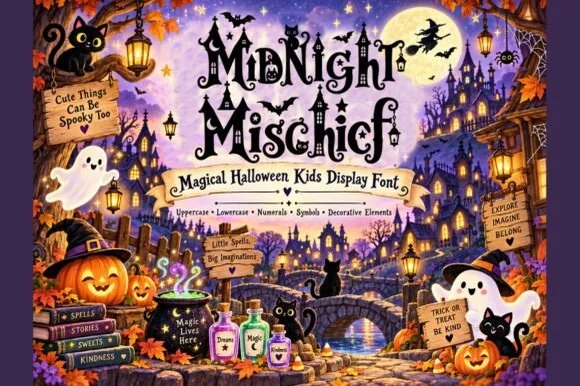
Neutral Sans Workhorse

Blood Throne + Homies
Lets Blood Throne own the focal silhouette while handling secondary copy, sizing and subheads cleanly.
Inspect Homies specimenDisclosure: MakerFileHub may earn a commission from qualifying purchases via paid links on this page. How our links work.
Spiked blackletter with thorny loops and hanging drip-like ends
Blood Throne shows black lettering against a red glow, where heavy narrow stems carry long upward hooks, curved outer thorns and thin hanging ends below the baseline, and one central upright extends far past its neighbours.
Paid link
Get this fontProject & layout blueprintsAt-a-glance maker compatibility
Sturdy stroke walls and open counters weed cleanly on adhesive vinyl, HTV apparel film, and cut cardstock.
Visual anatomy & craft review
The stems stay dense, the hooks rise sharply, the thorns curve outward and several strokes hang below the line like drips. That hanging end is the character: the word looks like a title cut into a horror poster rather than a dense blackletter text face, which is why the sample sets one large focal word. The flame glow behind it is a presentation effect, so keep this to short headings, allow 22 mm beneath from 40 pt and avoid small labels where the tiny gaps and thin ends vanish.
Spiked · Blackletter · Hanging ends
Two-font hierarchy recipes
Tested contrast partners — pairing Blood Throne with grounded secondary typography.
Blood Throne + Homies
Lets Blood Throne own the focal silhouette while handling secondary copy, sizing and subheads cleanly.
Inspect Homies specimen
Blood Throne + Lumera Editorial
Grounds bold display lettering with classic typographic authority on posters, badges and apparel.
Inspect Lumera Editorial specimenPractical applications
Concrete hierarchy, scale and production guidance tailored to Blood Throne’s stroke geometry.
The spiked blackletter sets a horror poster, and the hanging ends add the right menace at 52 pt on an A3 sheet, with the thorns inside the trim.
Hierarchy & layout recipe
Print an A3 poster: set the title at 52 pt on one row, keep 22 mm of clear ground beneath for the hanging strokes, and keep 24 mm of margin so the outer thorns stay inside the trim.
Pre-production check
Thin hanging ends printed at 30 pt look like ink drops; check the proof and hold the title at 44 pt or above.
The thorny letters set a fiction heading, and the narrow stems hold a one-word title at 48 pt on a page, dark without turning to noise.
Hierarchy & layout recipe
Print a 210 mm page: set the heading at 48 pt on one row, keep 20 mm beneath before the standfirst at 10 pt, and keep the block on a plain field so the thorns read as drawn.
Pre-production check
Two dense blackletter rows on one page compete; check the spread and keep the second line in a serif.
The spiked face gives a bar label a theme, and the heavy stems hold a short name at 30 pt on a 60 mm panel, above the street line.
Hierarchy & layout recipe
Print a 60 by 45 mm label: set the name at 30 pt, keep 12 mm of clear ground beneath for the hanging ends, and set the street at 6 pt in a plain caps at the foot.
Pre-production check
Hanging ends cut by the label border look broken; check the artwork and keep 8 mm of clear panel.
Technical & licence verification
Confirm included OTF/TTF/WOFF formats, full glyph tables and licence coverage on the live store page before batch production.
Closest visual alternatives
Matched across letterform anatomy, stroke behaviour and craft applications.
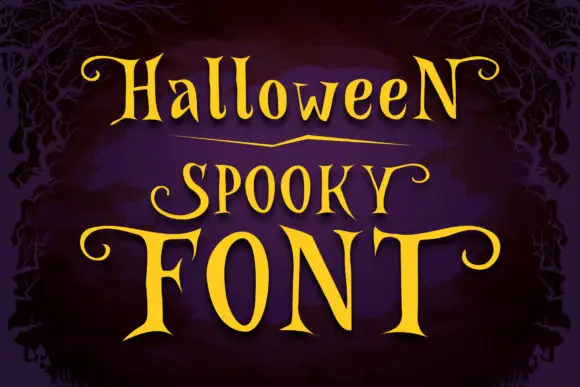
Narrow spooky serifs with curled ends
Halloween Spooky shows tall high-contrast letters with pointed serif tips and long curling terminals, and the enlarged F and T extend horizontally across the lowest word of the composition.
Ideas for this font
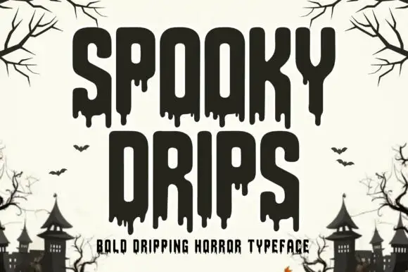
Bold dripping horror display
Spooky Drips is a bold dripping display in near-black on a bone ground: very heavy condensed letters with long viscous drips running from the baseline and the counters, flat terminals and a squared top, framed by bare branches and a row of haunted houses along the foot.
Ideas for this font
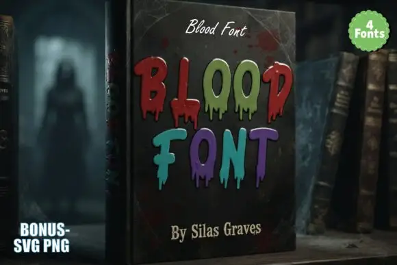
Tall irregular horror capitals with thin hanging drips and mixed colours
Blood is a decorative horror set in which narrow upright letters keep soft corners, thin drips hang unevenly from the lower edges and the words are drawn in mixed dark reds, greens and violets, so a heading reads as lettering running down a page.
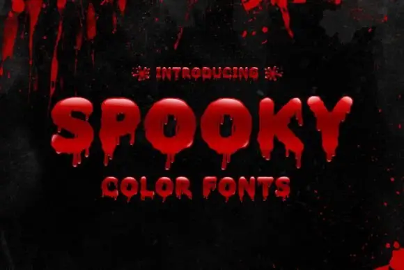
Glossy drip colour display
Spooky is a colour display on a black ground: glossy red bubble capitals with rounded forms, pale highlights and short hanging drops below several letters, set as one word with a plain line beneath, with blood splashes across the top of the frame.
Same independent foundry
Allow optional Google Analytics to measure visits and catalogue actions. Your search words and notes are not included. Privacy & storage