Neutral Sans Workhorse

Drackursa + Bielchon
Lets Drackursa own the focal silhouette while handling secondary copy, sizing and subheads cleanly.
Inspect Bielchon specimenDisclosure: MakerFileHub may earn a commission from qualifying purchases via paid links on this page. How our links work.
Symmetrical dark-fantasy & death-metal crest font (859+ glyphs)
Drackursa is a monumental 859-glyph dark-fantasy & death-metal typeface engineered with tall vertical blade stems and sweeping wing ligatures.
Paid link
Get this fontProject & layout blueprintsAt-a-glance maker compatibility
Fine grain and micro-texture excel in 300 DPI print, sublimation, and screen print rather than small vinyl weeding.
Visual anatomy & craft review
Drackursa is a monumental dark-fantasy typeface with more than 859 glyphs, built on tall vertical blade stems with sweeping wing ligatures and symmetrical crest configurations. The stems are heavy and the ligatures are the point, so a word becomes a heraldic object rather than a line of text, and the alternates let a designer tune how wide the crest spreads. It needs 40 mm and up for the blade detail to hold, and it is a logo, cover and apparel face with a multilingual set for international releases.
859-glyphs · Symmetrical-blade · Mythic-metal
Two-font hierarchy recipes
Tested contrast partners — pairing Drackursa with grounded secondary typography.
Drackursa + Bielchon
Lets Drackursa own the focal silhouette while handling secondary copy, sizing and subheads cleanly.
Inspect Bielchon specimen
Drackursa + Auretha
Grounds bold display lettering with classic typographic authority on posters, badges and apparel.
Inspect Auretha specimenPractical applications
Concrete hierarchy, scale and production guidance tailored to Drackursa’s stroke geometry.
Symmetrical wing ligatures give a title a crest without a commissioned illustration, which is what small labels and indie publishers need. Multilingual coverage lets the same crest work across a release in another language.
Hierarchy & layout recipe
Sleeve 312 x 312 mm plus 3 mm bleed, crest 220 mm wide, credits 7 pt. Jacket 152 x 229 mm, title 54 pt, author 16 pt, 18 mm margins. Title screen 1920 x 1080, crest 800 px wide, safe margin 5 percent.
Pre-production check
Wing ligatures extend the artwork box well beyond the word, and a printer fitting the file to a page will clip them. Declare the full crest box, and check one 1:1 proof before the sleeve goes on press.
A crest reads as a house mark, which lets a small label put one object across a deck, a bottle and a shirt. Heavy stems survive a one-colour screen print.
Hierarchy & layout recipe
Deck 210 x 810 mm, crest 150 mm on a 200 mm centre panel, 25 mm to the bolt holes. Label 90 x 110 mm, crest 30 mm, abv 4.5 pt on a 6 mm baseline. Shirt print 300 x 320 mm, crest 240 mm, 40 mm margins.
Pre-production check
A crest scaled to 30 mm on a bottle closes every blade gap and reads as a solid shape. Keep small labels to the initials or a simplified alternate, and reserve the full crest for large surfaces.
Heraldic blades read as an old house crest, which is what a costume event or a themed haunt wants on its signage. Symmetry makes the mark read level on a wall.
Hierarchy & layout recipe
Poster A2, crest 400 mm wide, times 22/28 pt, 30 mm margins. Invitation 120 x 180 mm, crest 45 mm, details 8.5/12 pt. Tome spine 50 mm wide, crest 12 mm repeated.
Pre-production check
Invitations are read in low light and a 45 mm crest with 8.5 pt detail lines is illegible. Keep practical copy in a plain serif at 9 pt or above, and test one invitation under evening light.
Technical & licence verification
Confirm included OTF/TTF/WOFF formats, full glyph tables and licence coverage on the live store page before batch production.
Closest visual alternatives
Matched across letterform anatomy, stroke behaviour and craft applications.
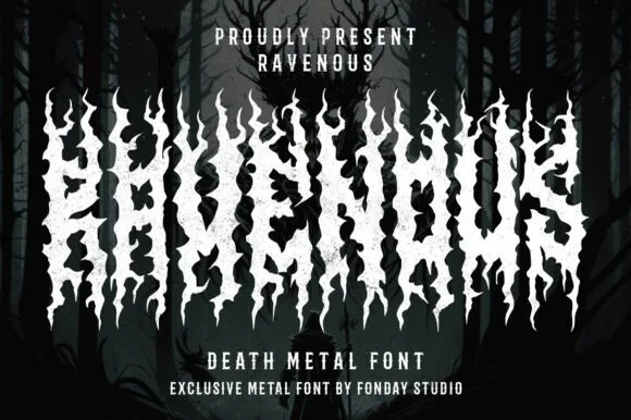
Death metal logo display
Ravenous is a death metal display in white on a dark forest: letters reduced to branching thorny strokes that merge into a single vertical mass, with a caption cut in a small gothic that names the style and the studio.
Ideas for this font
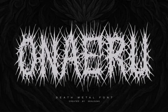
Bristling centipede-thorn extreme black-metal logo font
Onaeru is a fierce extreme-metal display font erupting hundreds of needle-fine centipede spikes out of tall condensed capitals.
Ideas for this font
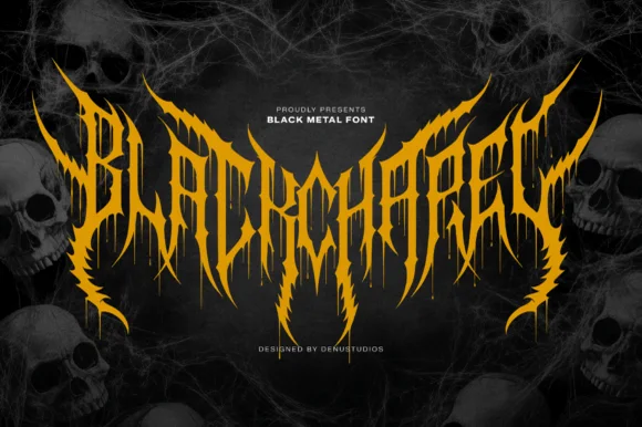
Spiked black-metal sigil lettering with ragged edges and dripping points
Blackchapel is an extreme-metal sigil face in which the letters merge into a spiked mass, the stems split into thorns and the bottoms run into drips, so a word reads as a band logo rather than as readable type.
Ideas for this font
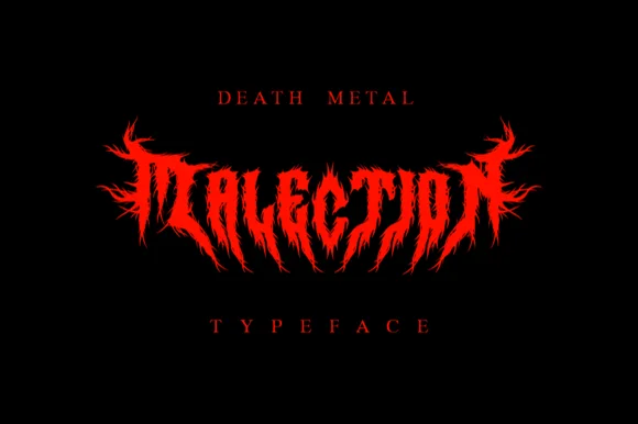
Symmetrical flame-thorned underground death-metal logo font
Malection is a ferocious underground death-metal display font sculpting jagged flame-like thorns into symmetrical band-logo arches.
Ideas for this font
Same independent foundry
Allow optional Google Analytics to measure visits and catalogue actions. Your search words and notes are not included. Privacy & storage